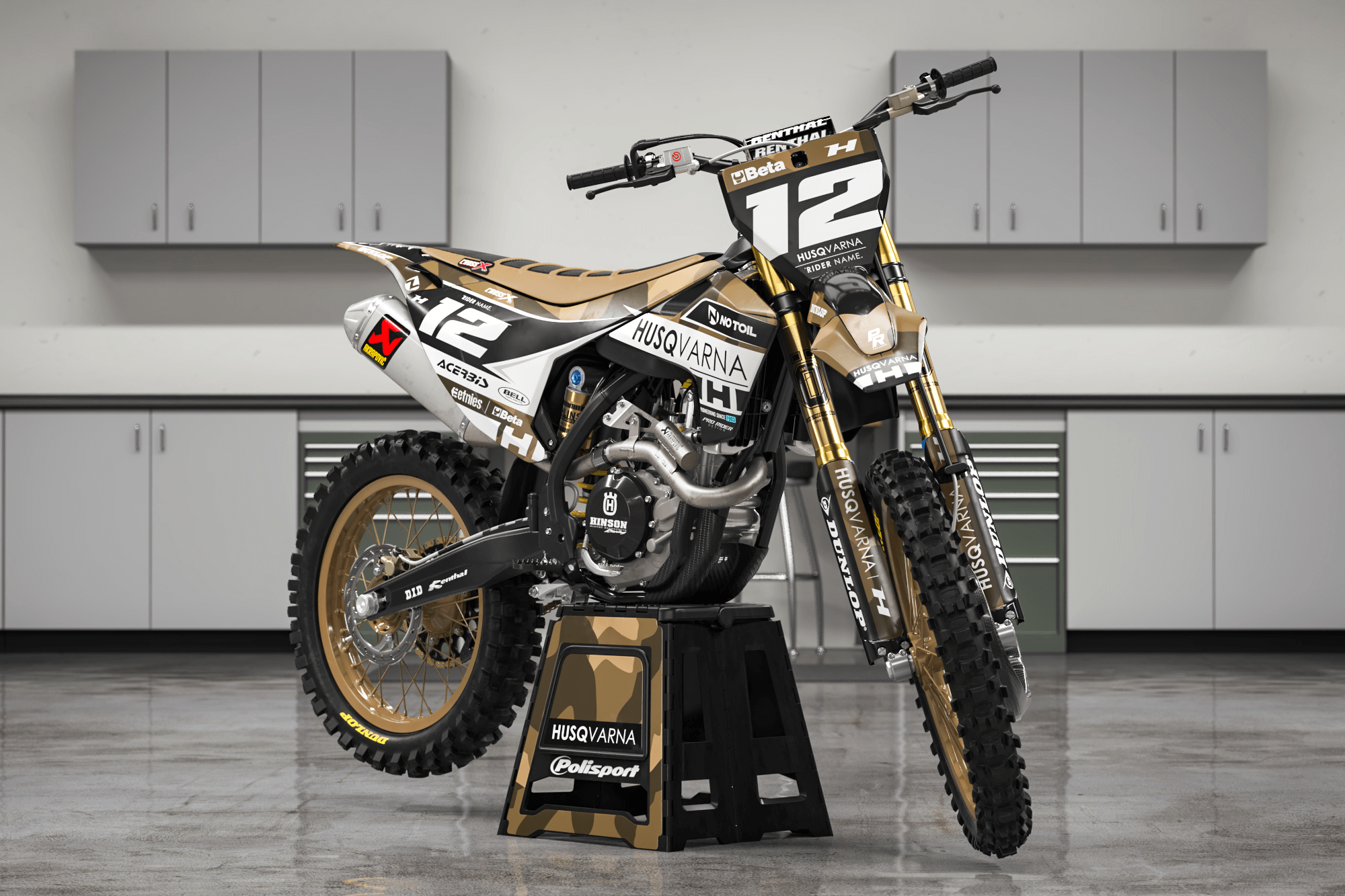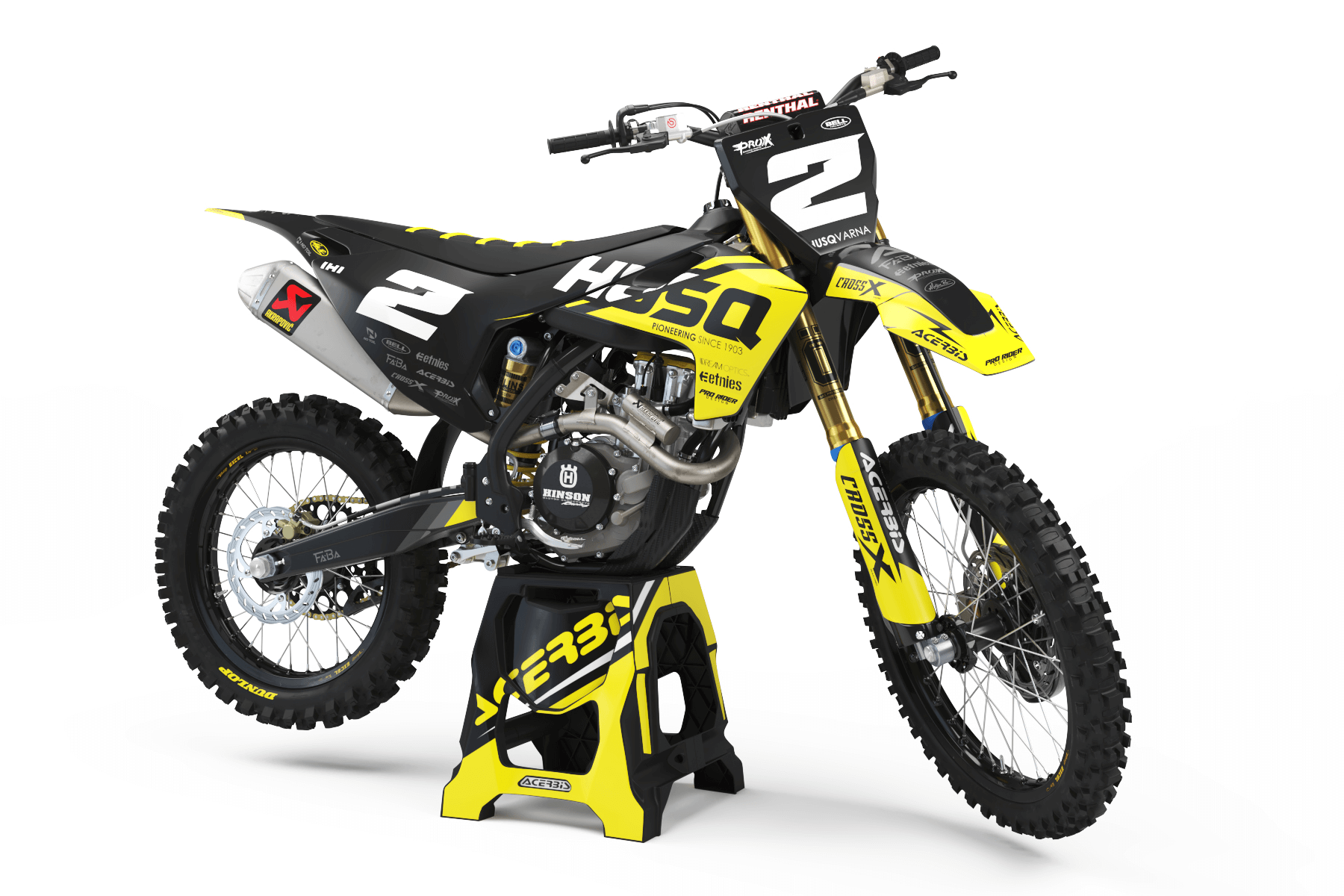

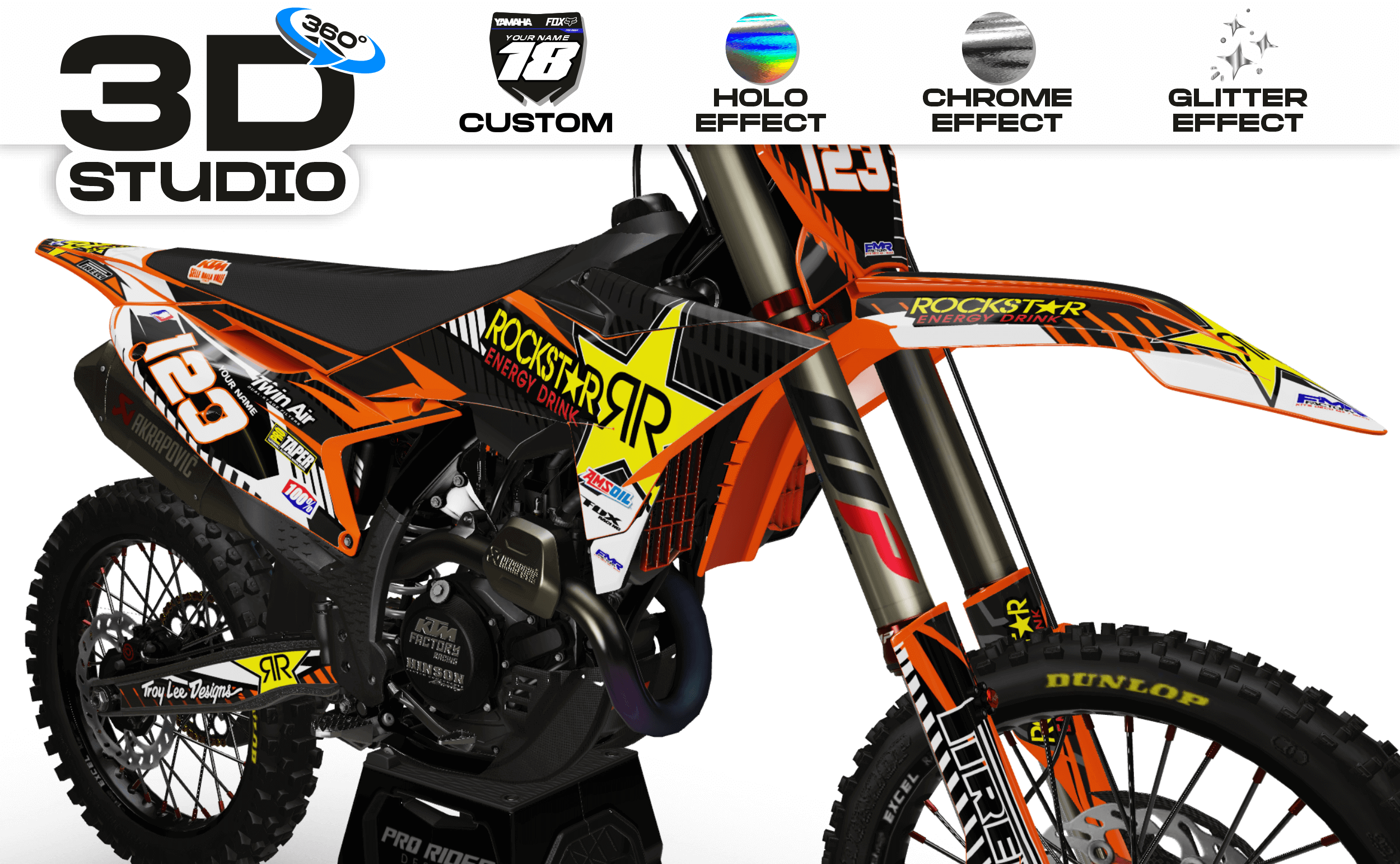
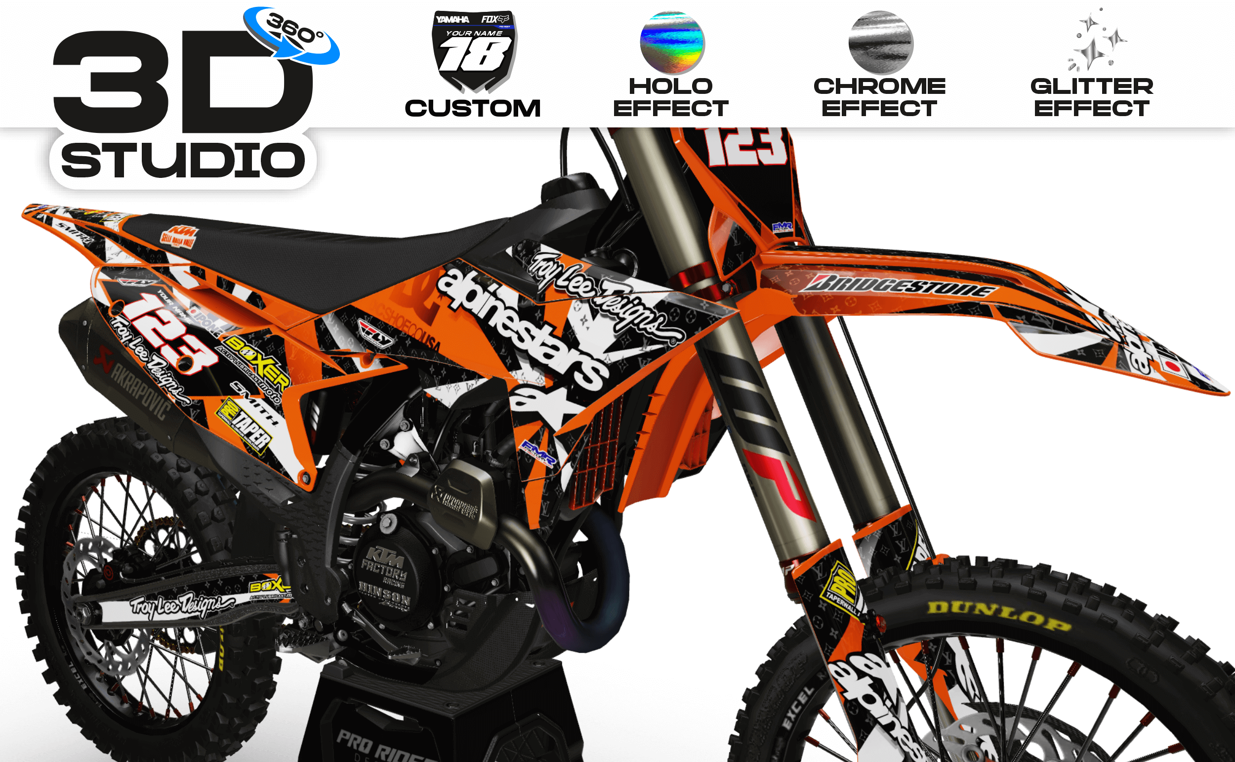


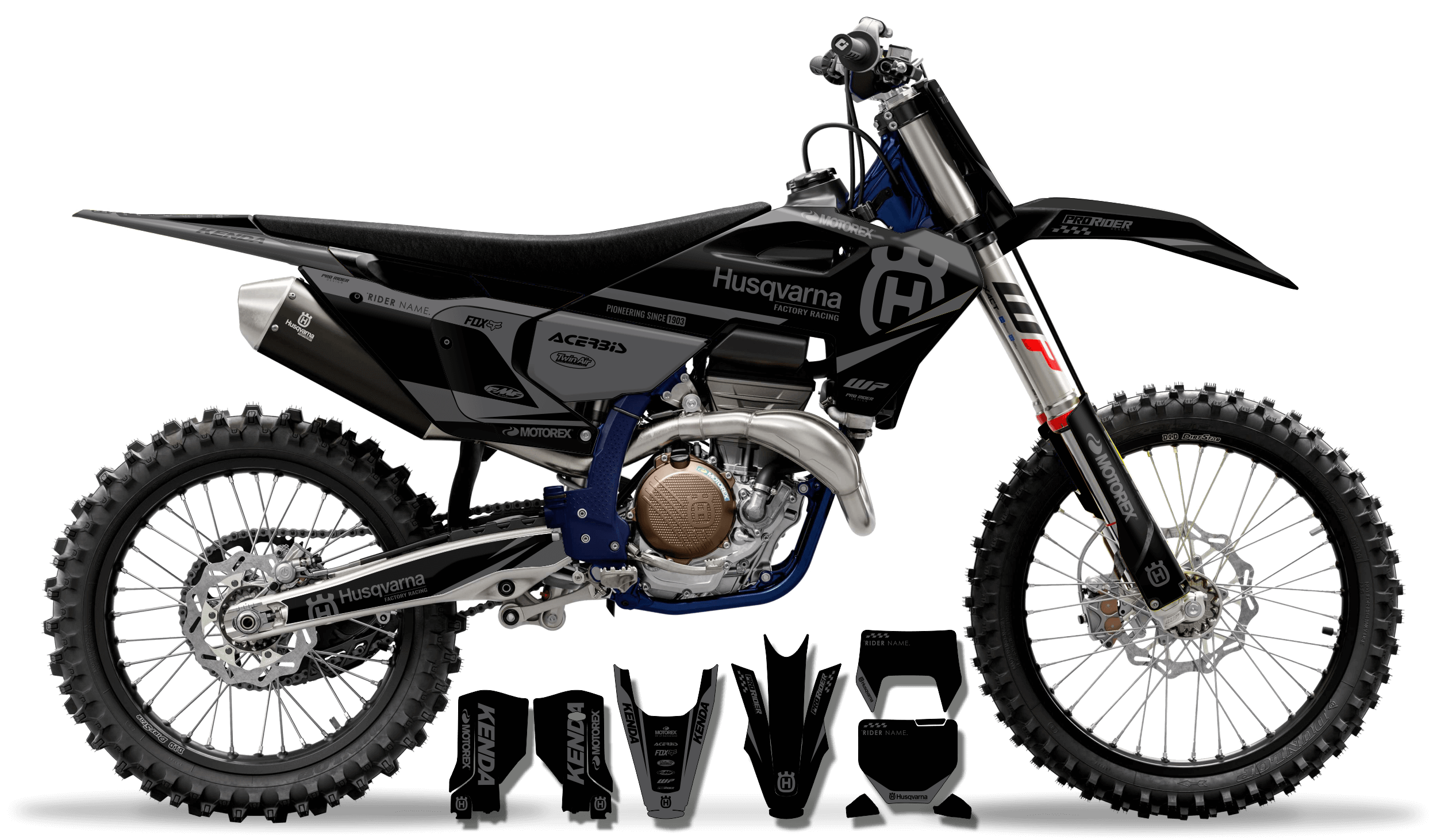
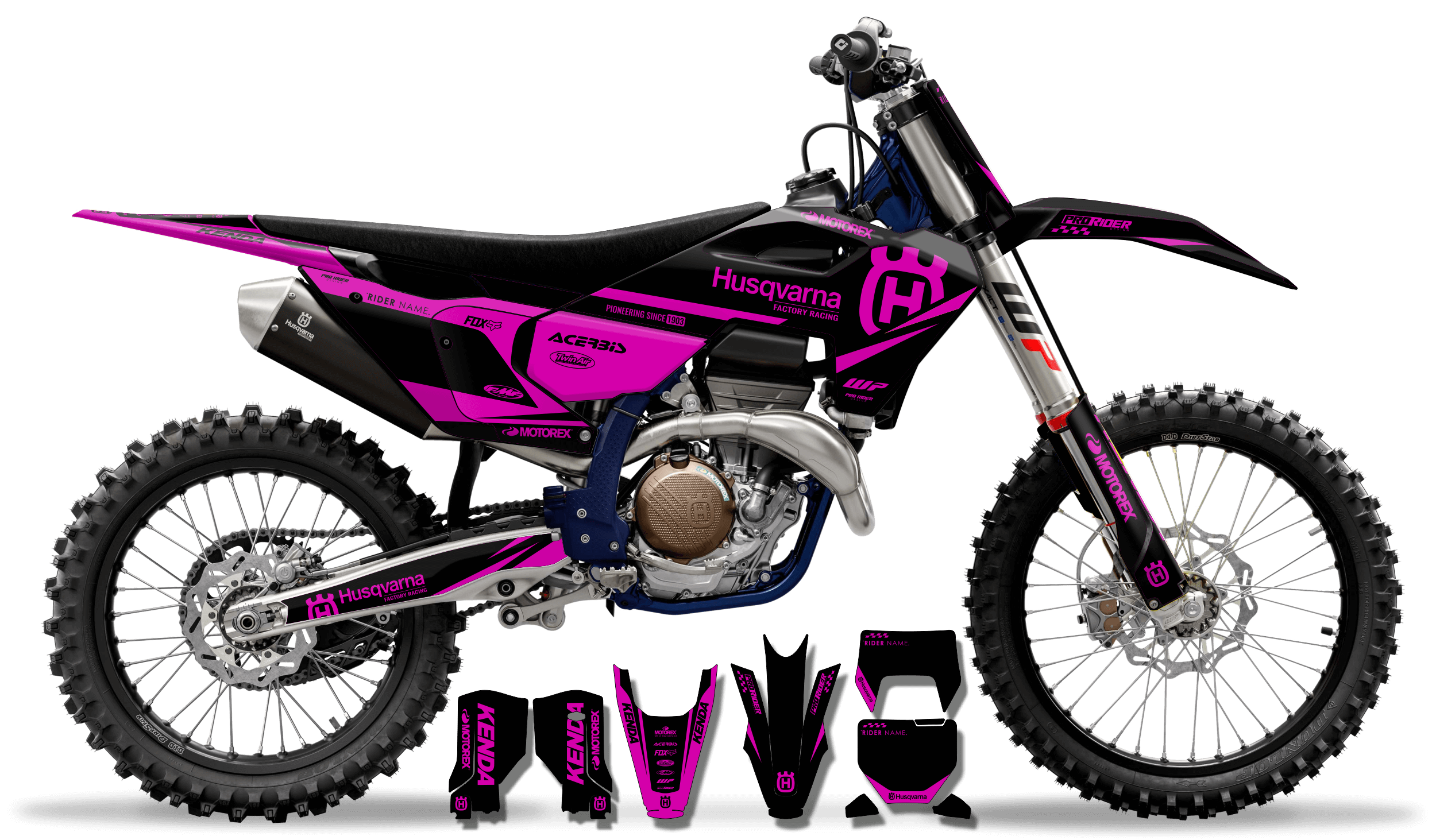
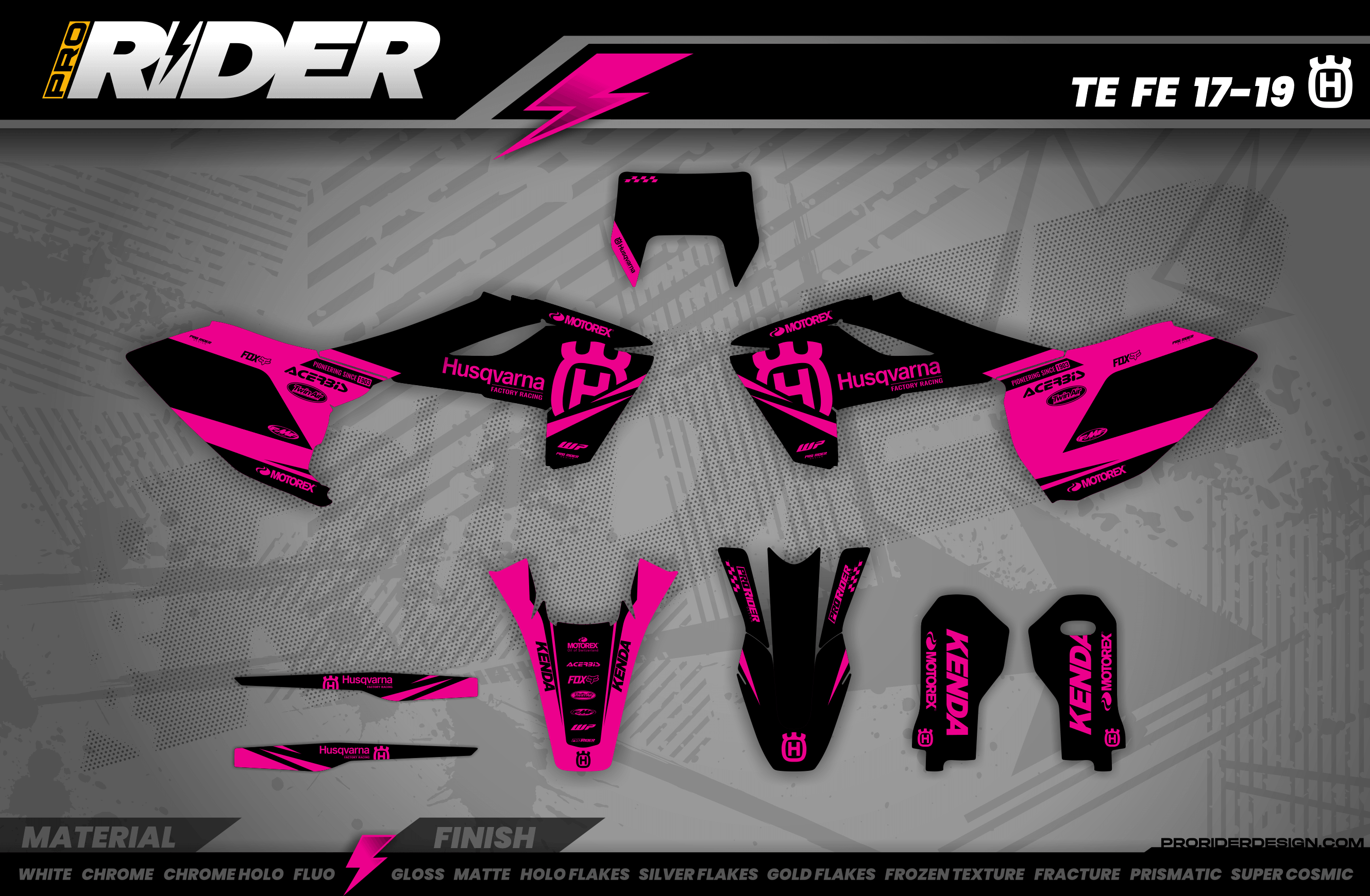
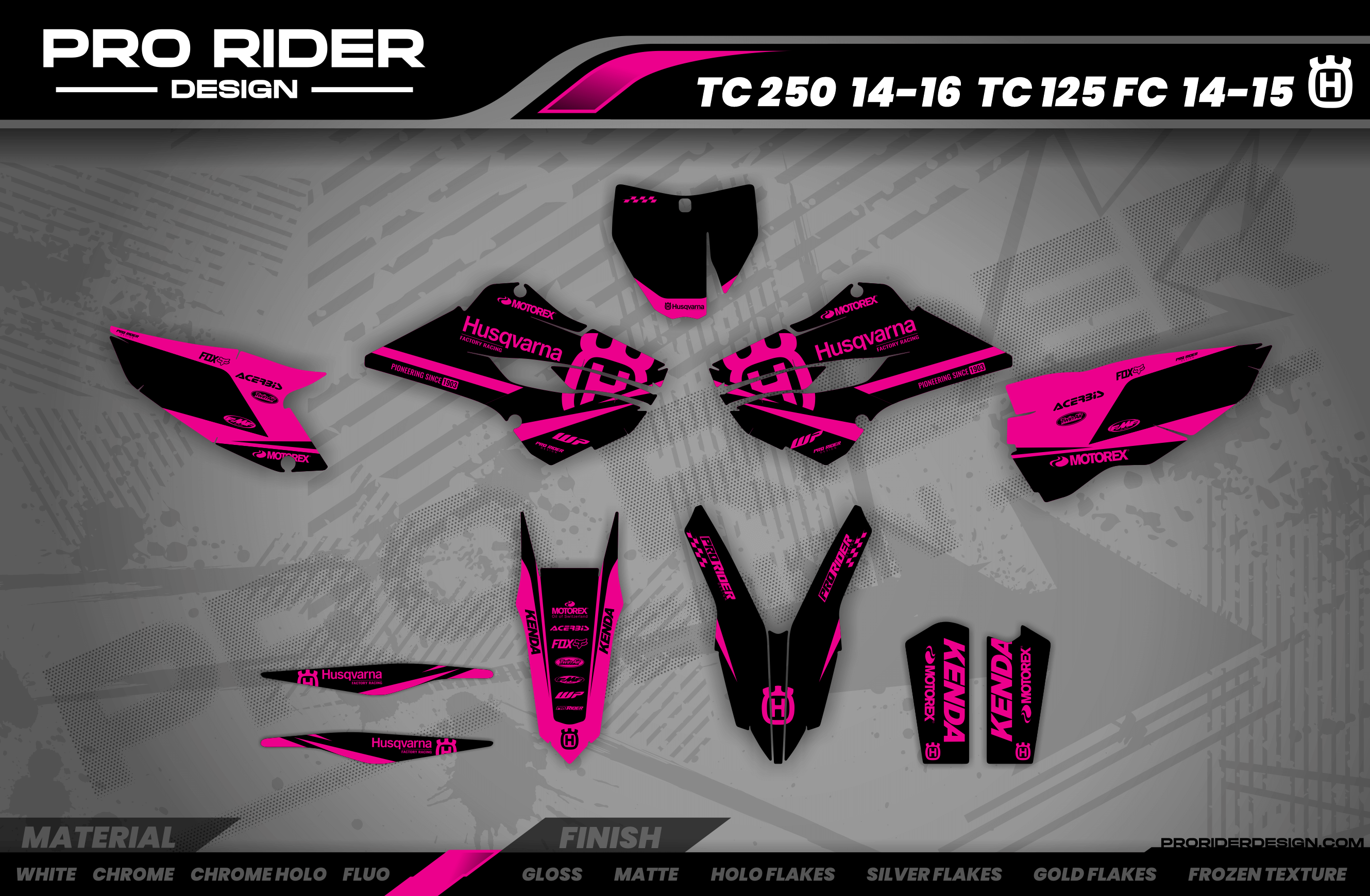
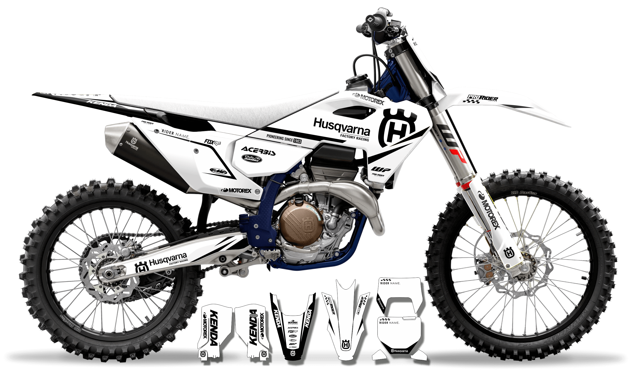
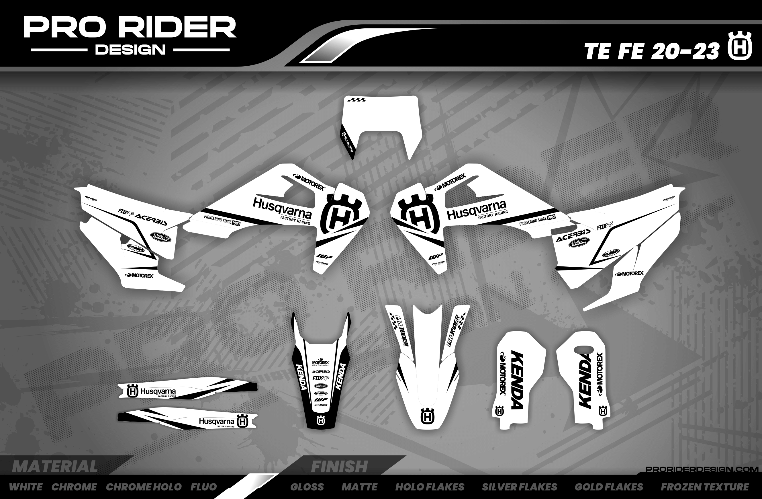
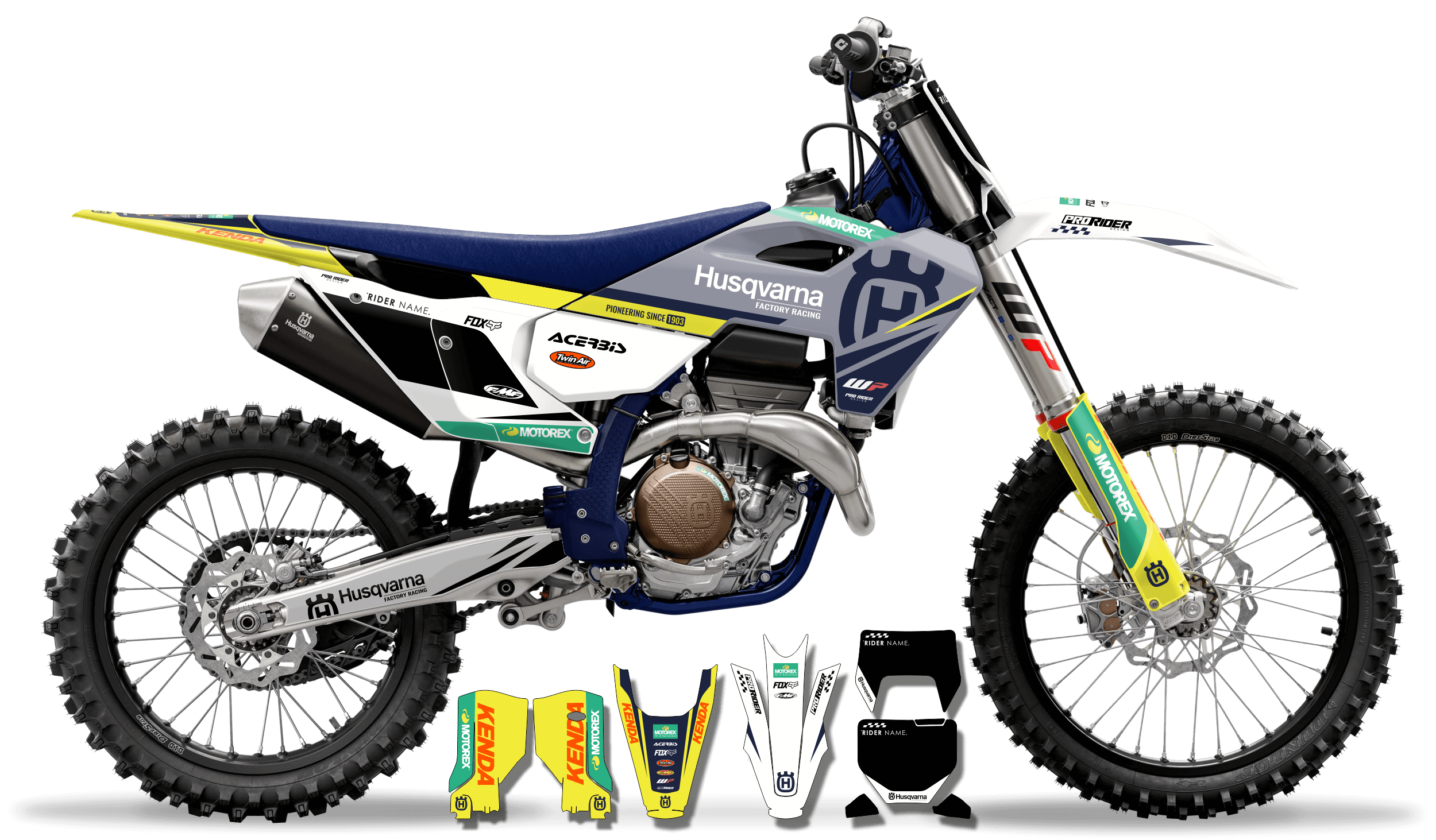
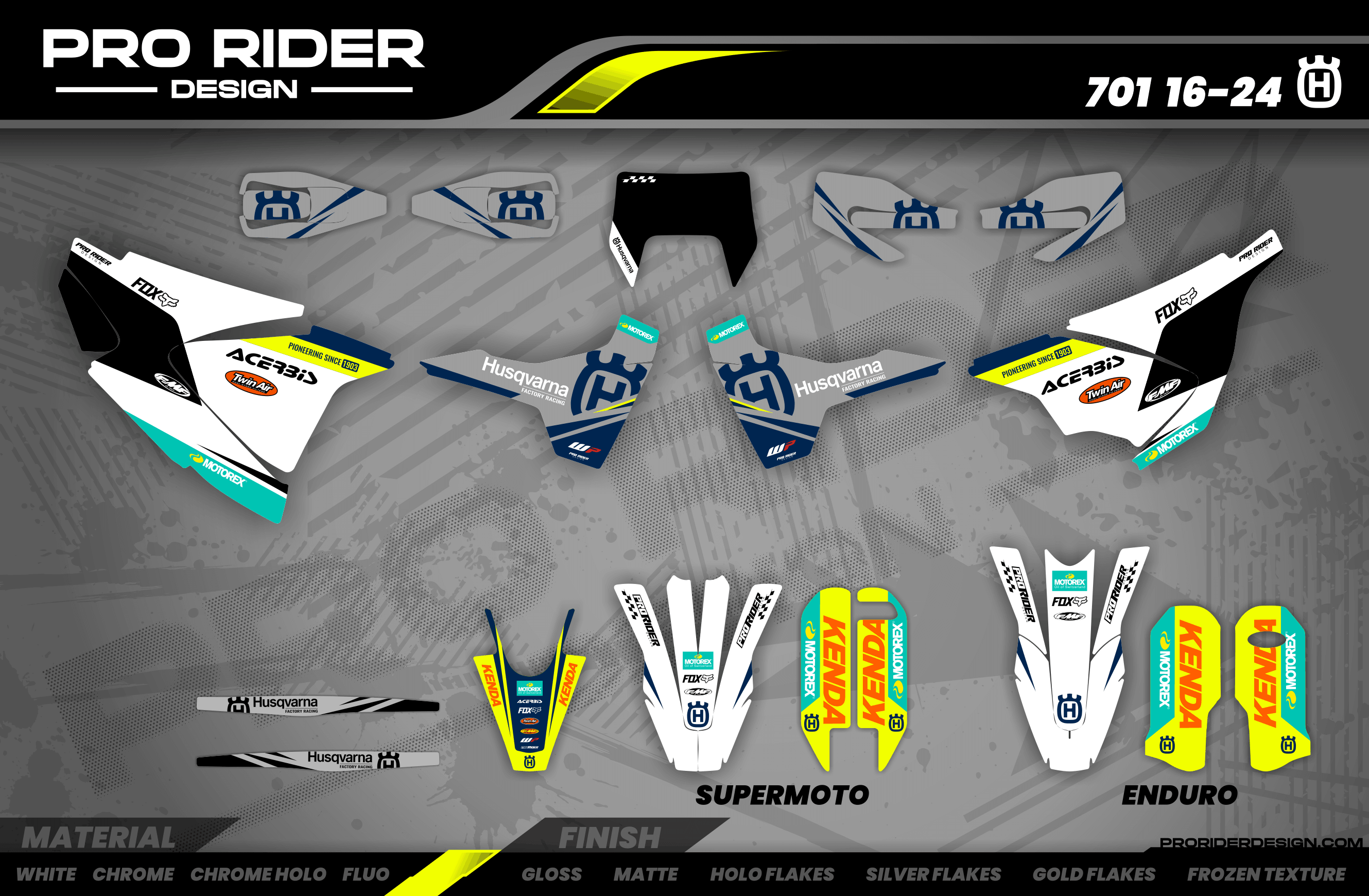
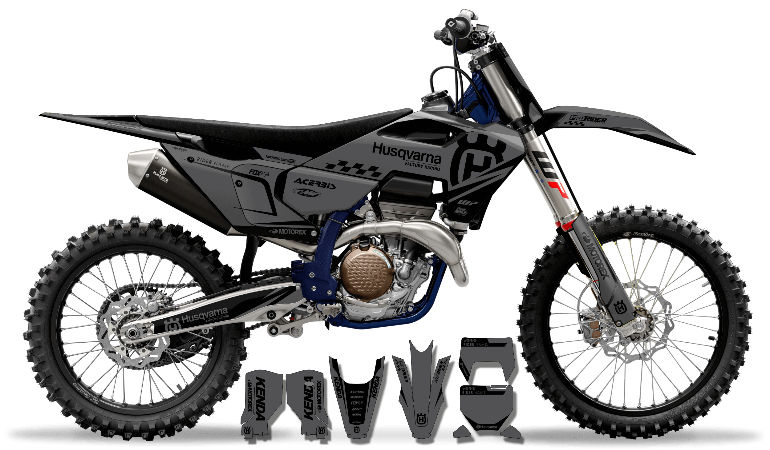
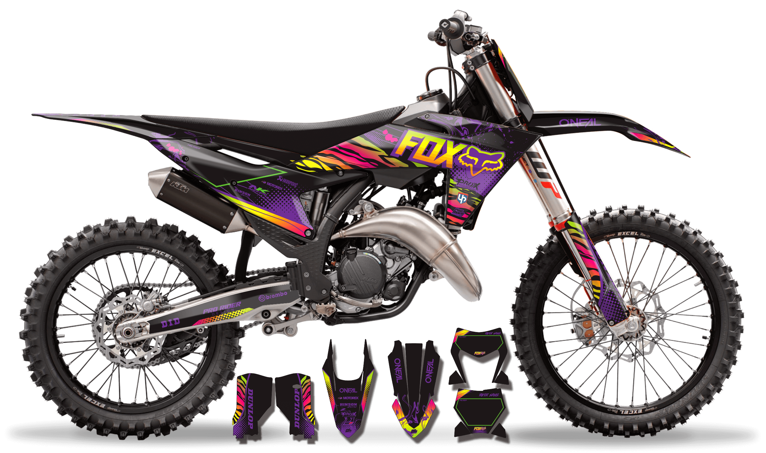
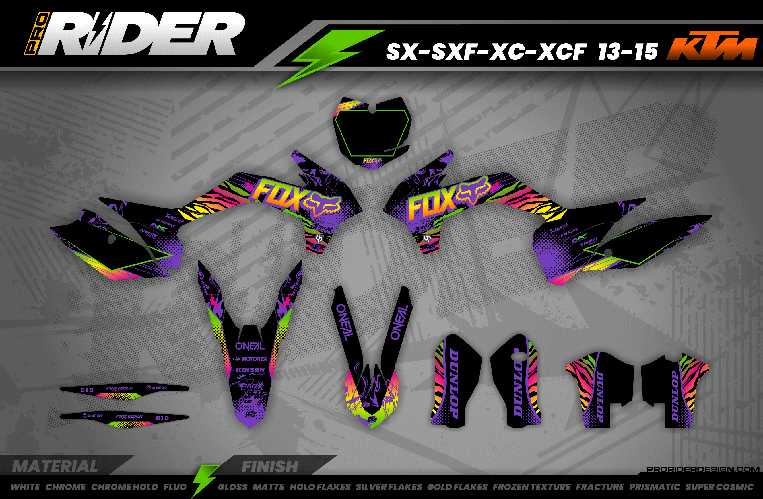
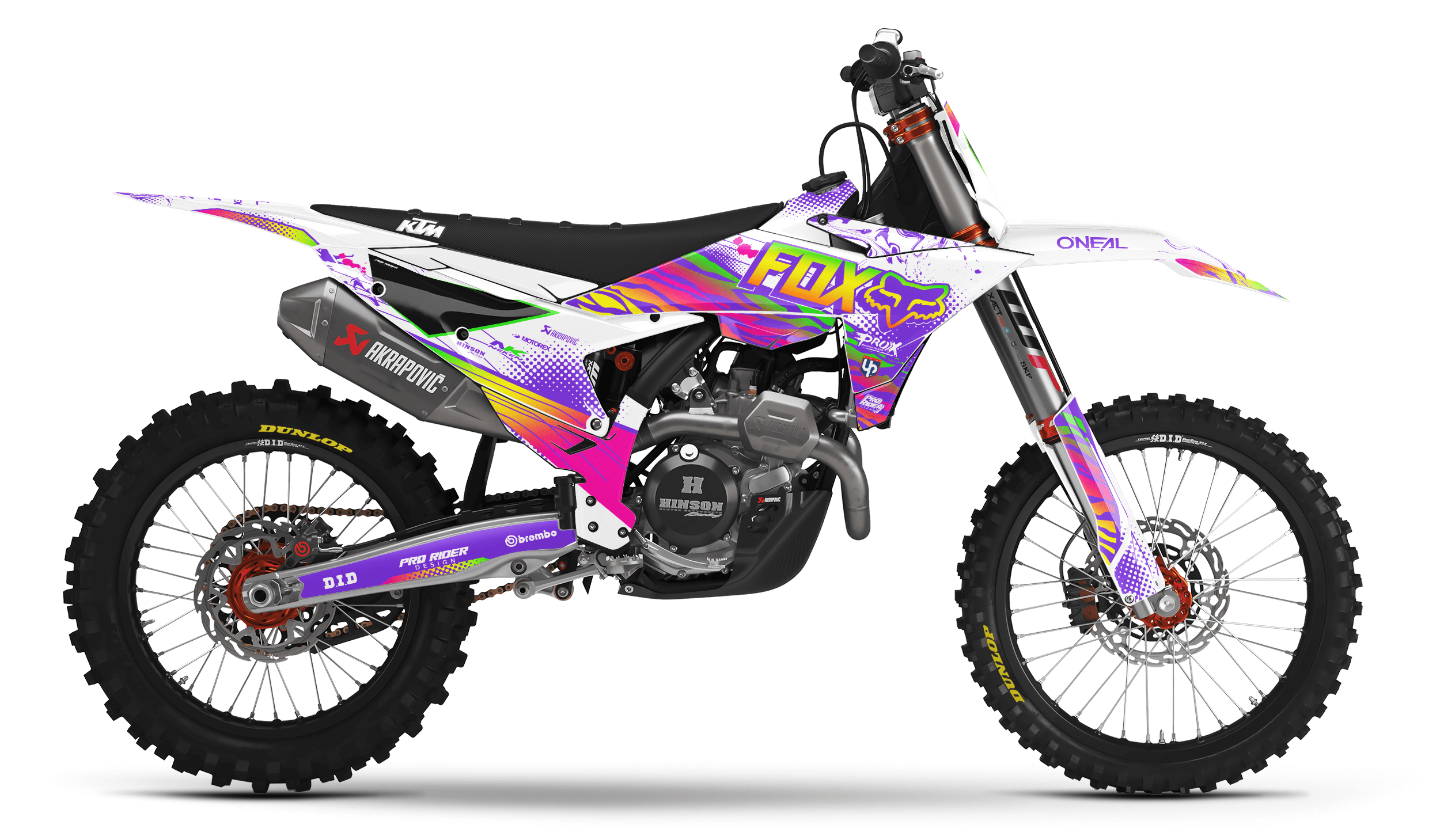
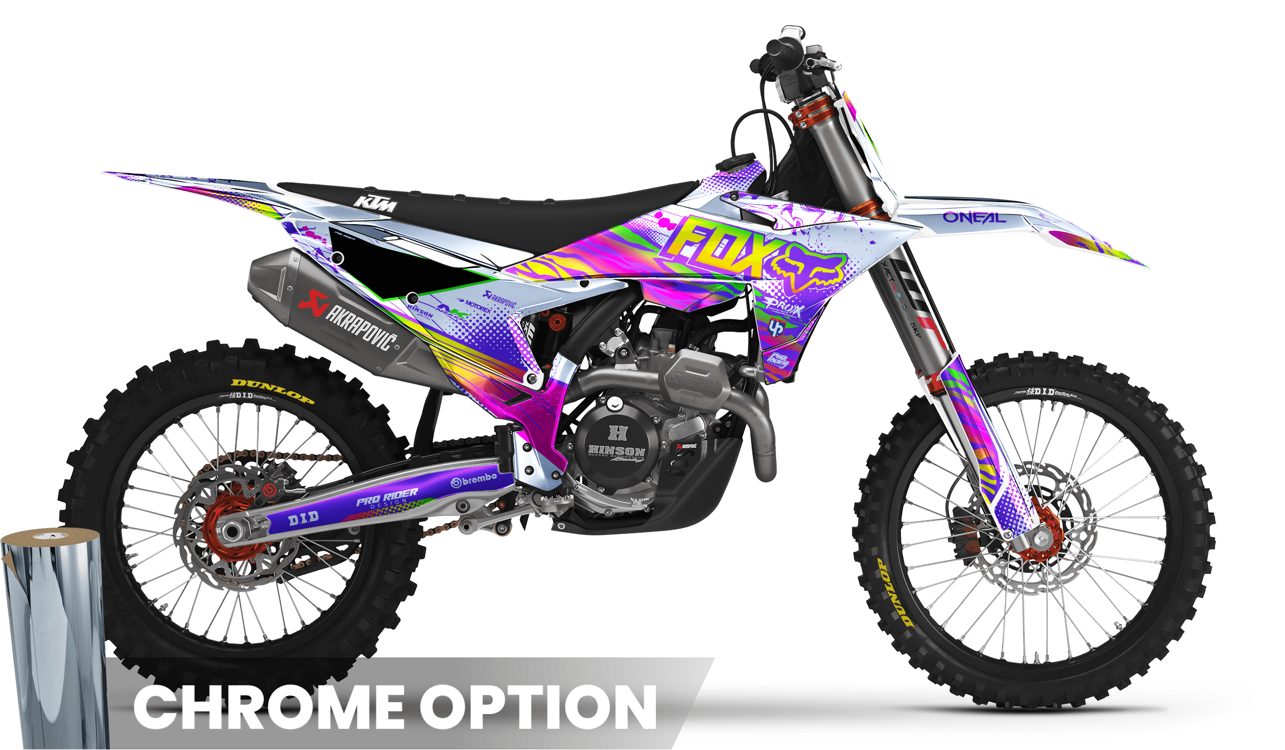
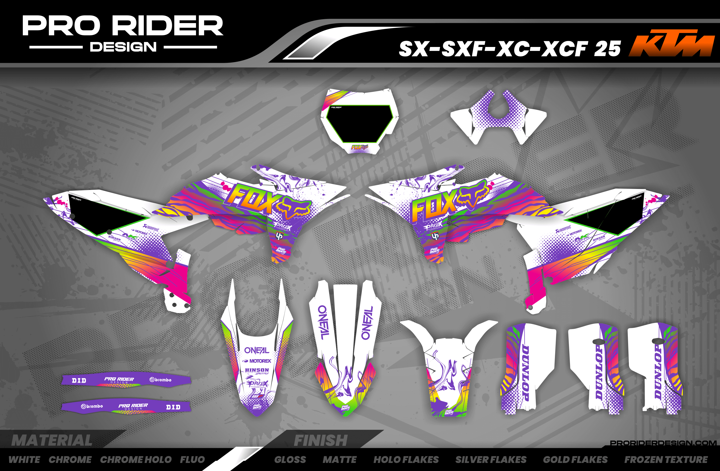
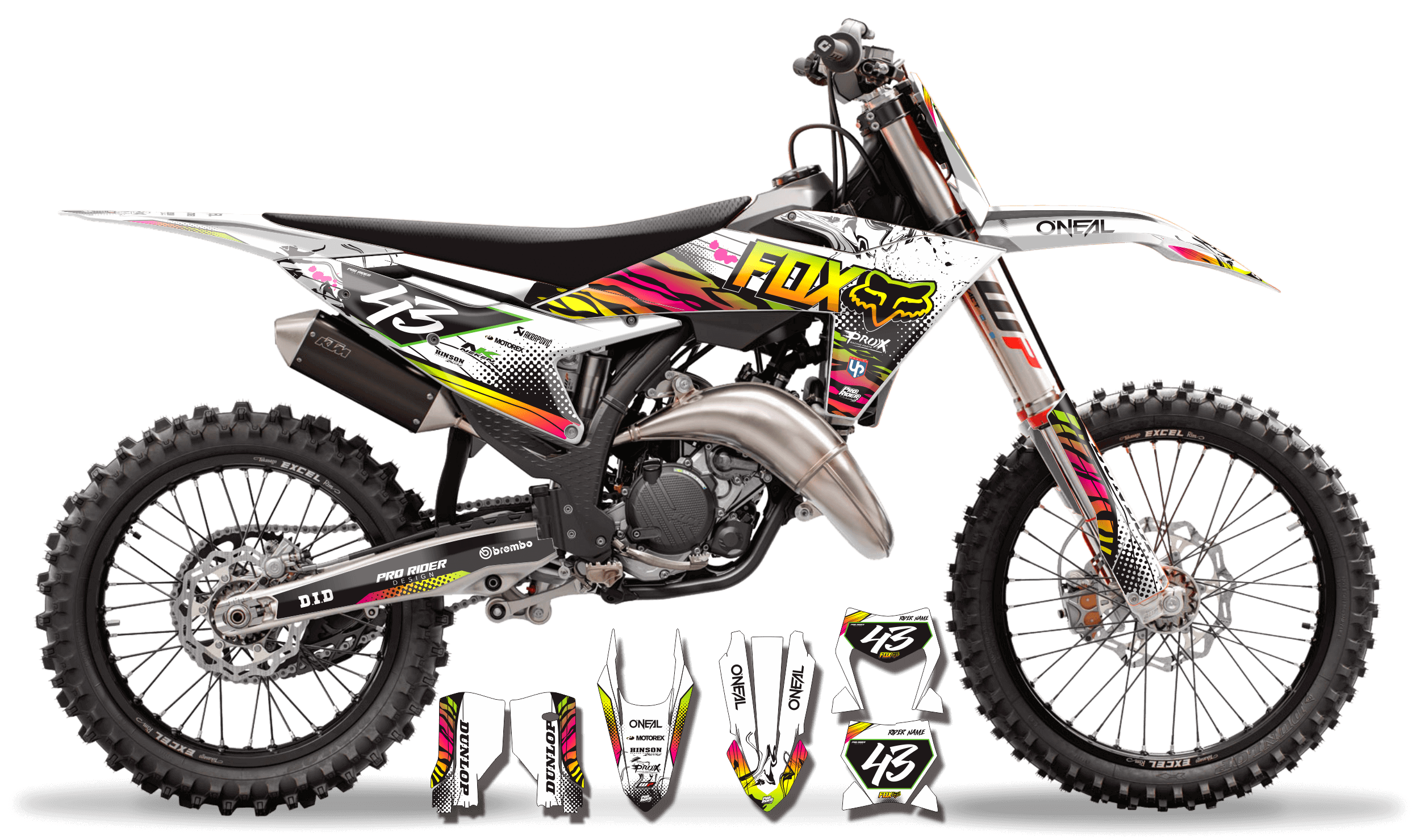
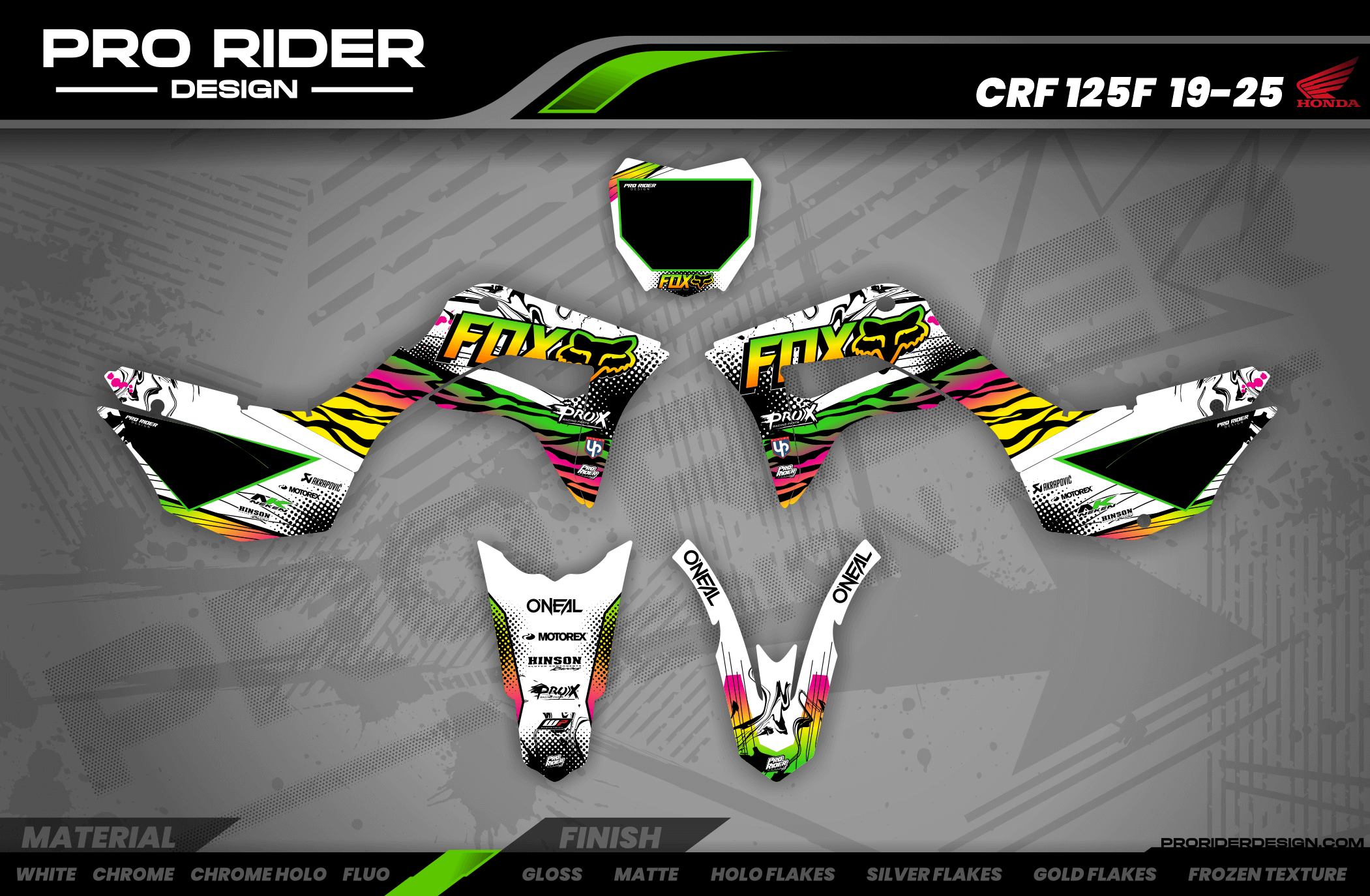
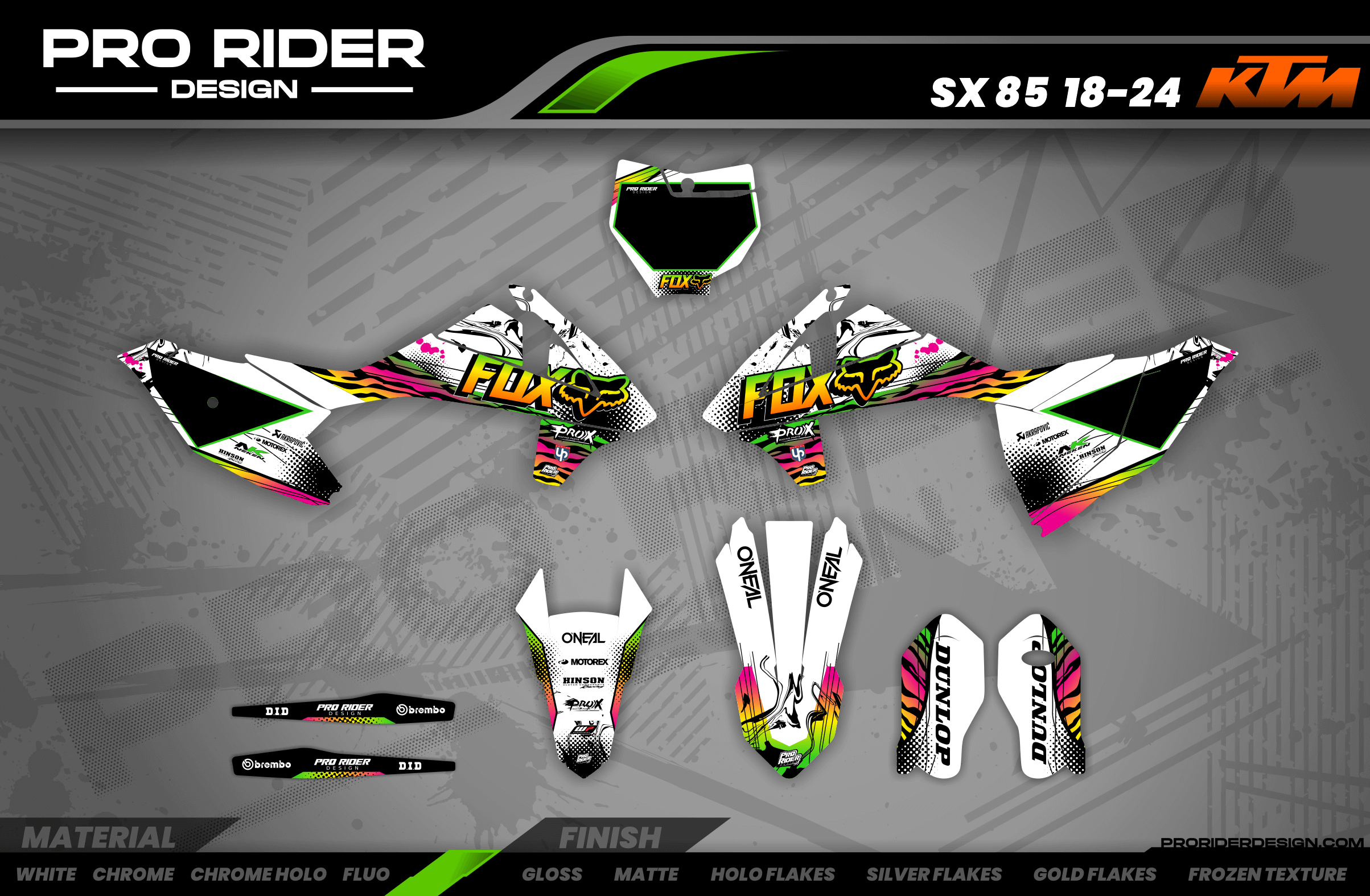
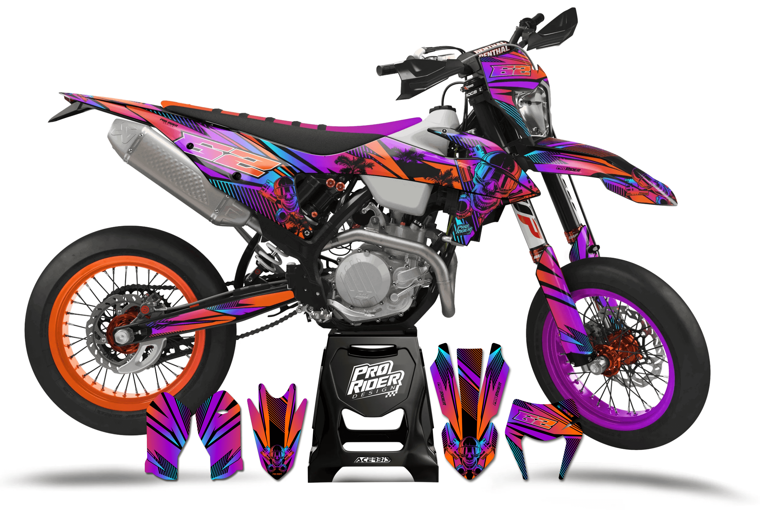
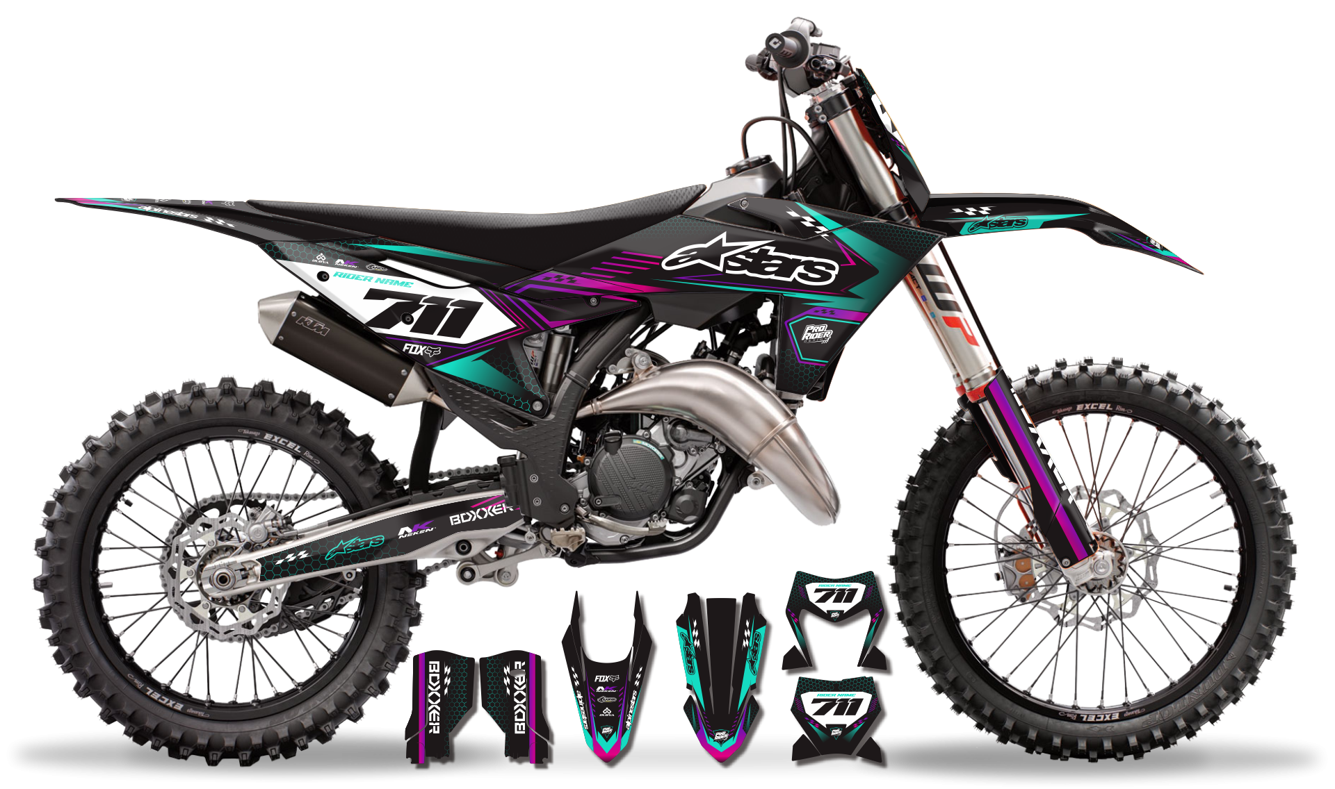
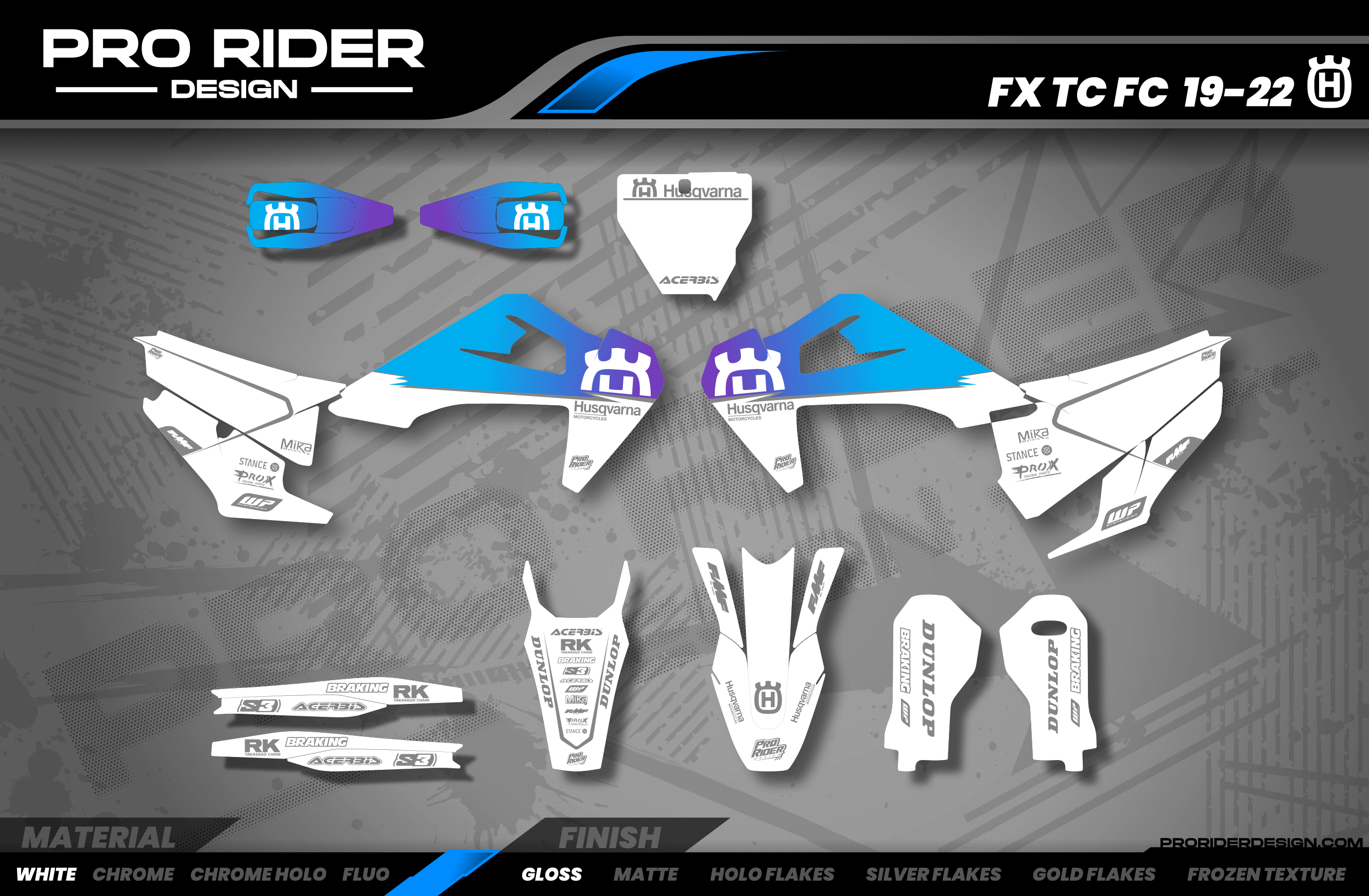
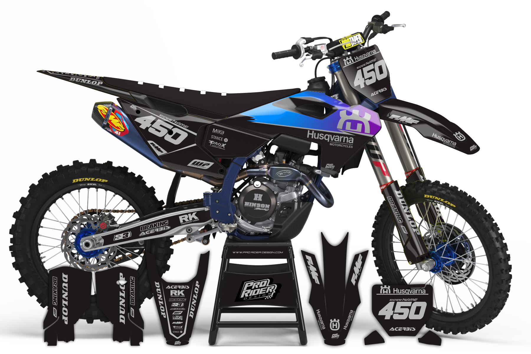
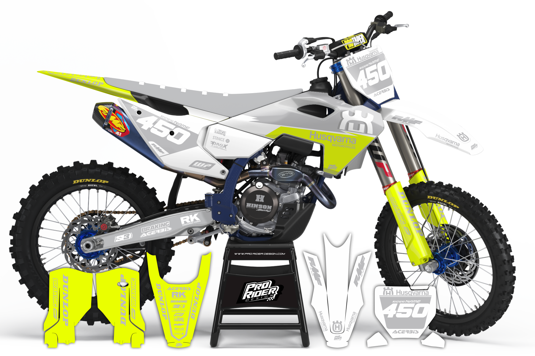
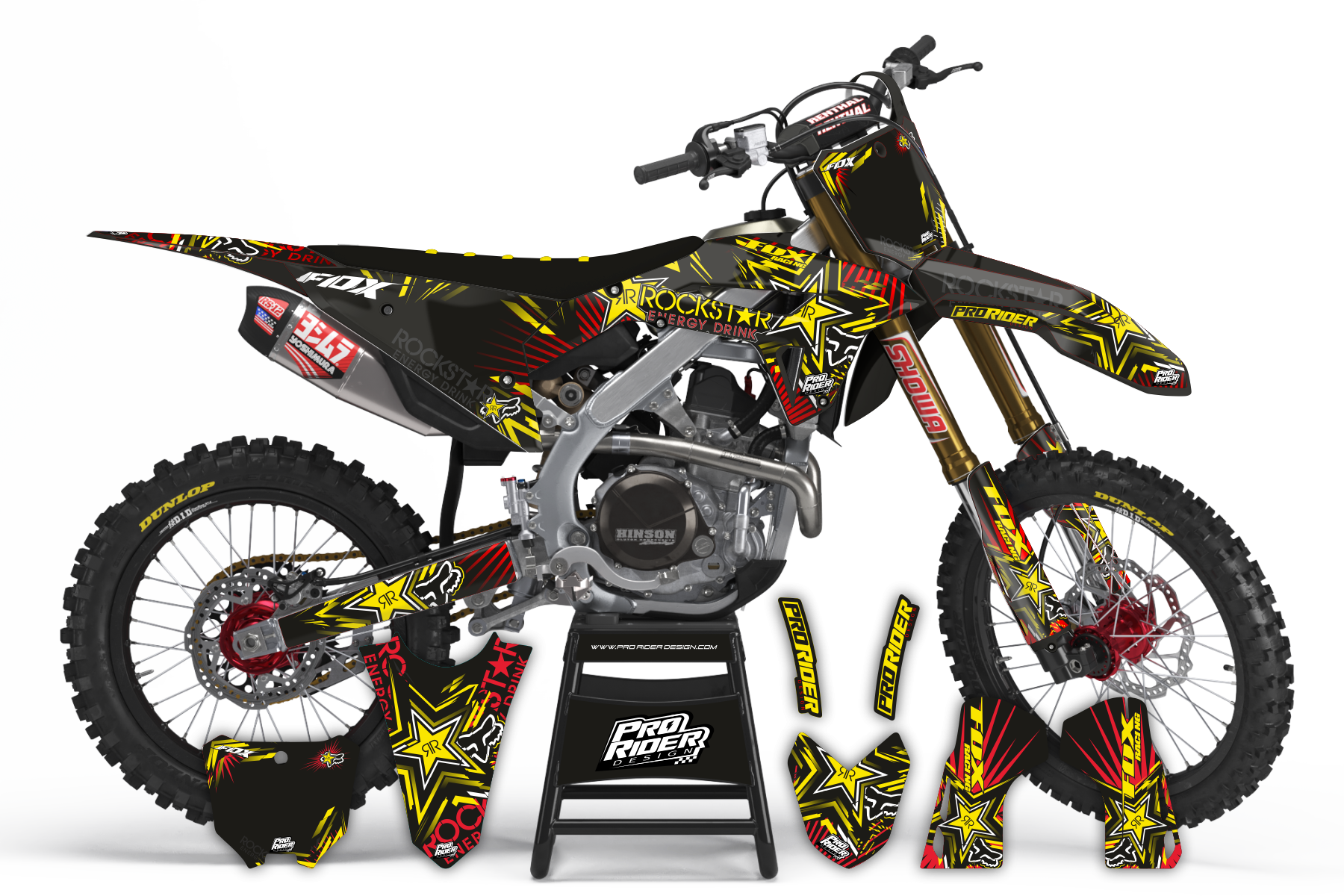
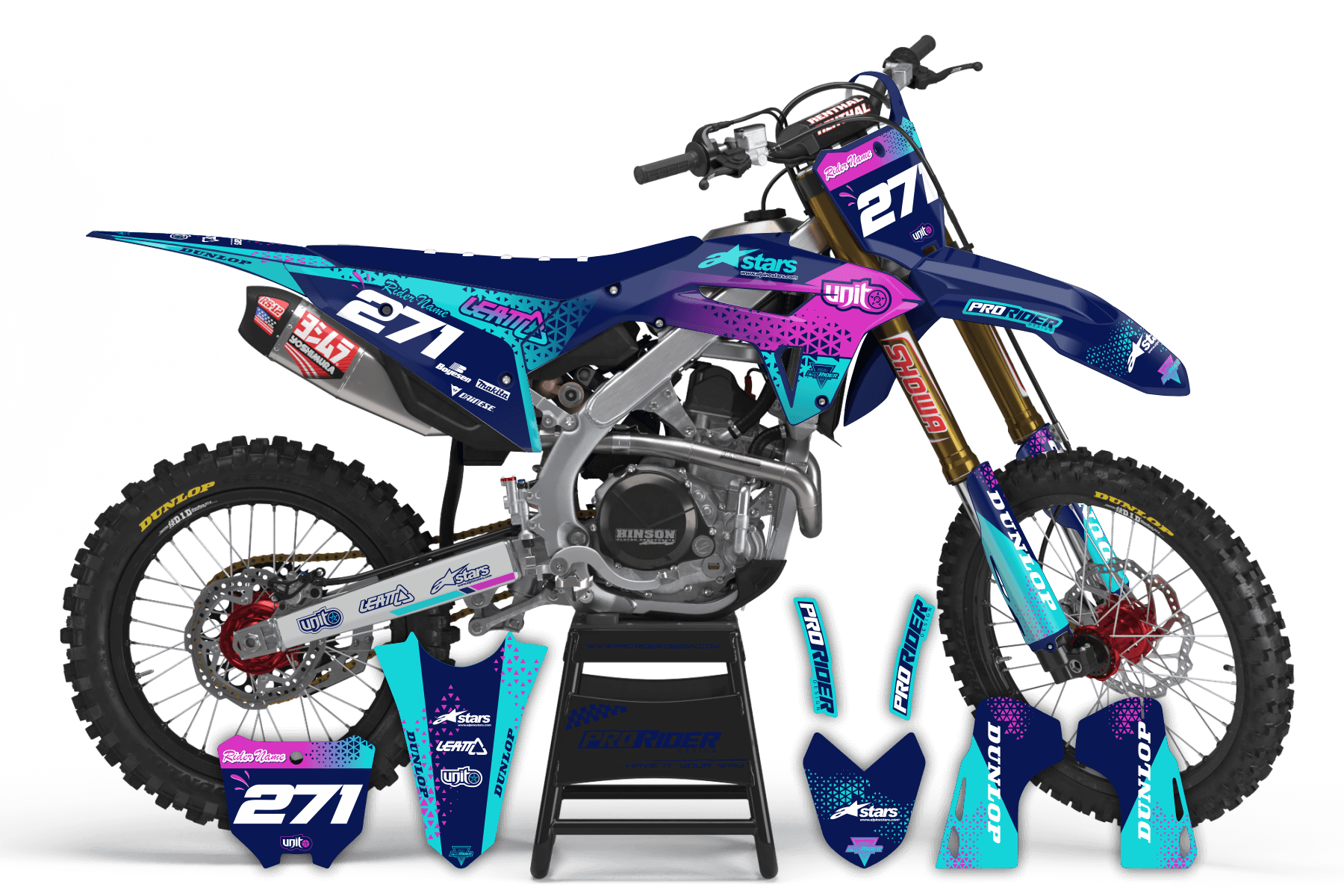
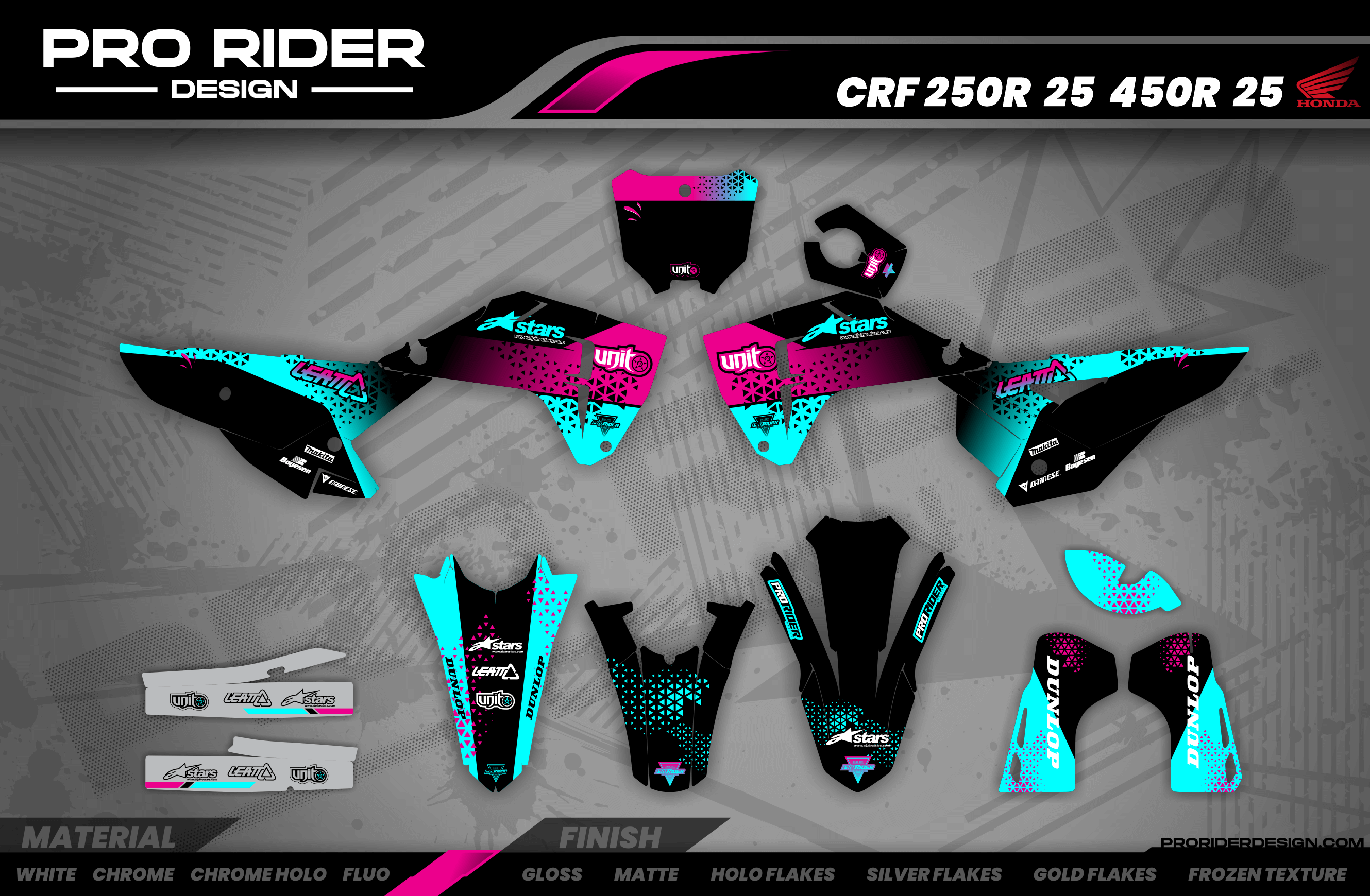
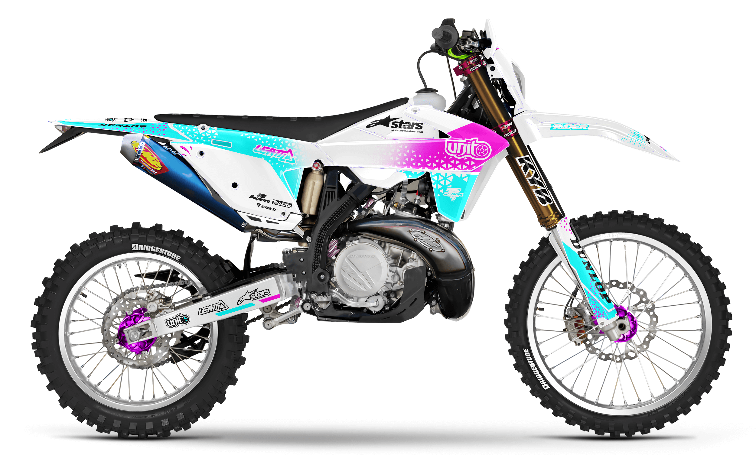
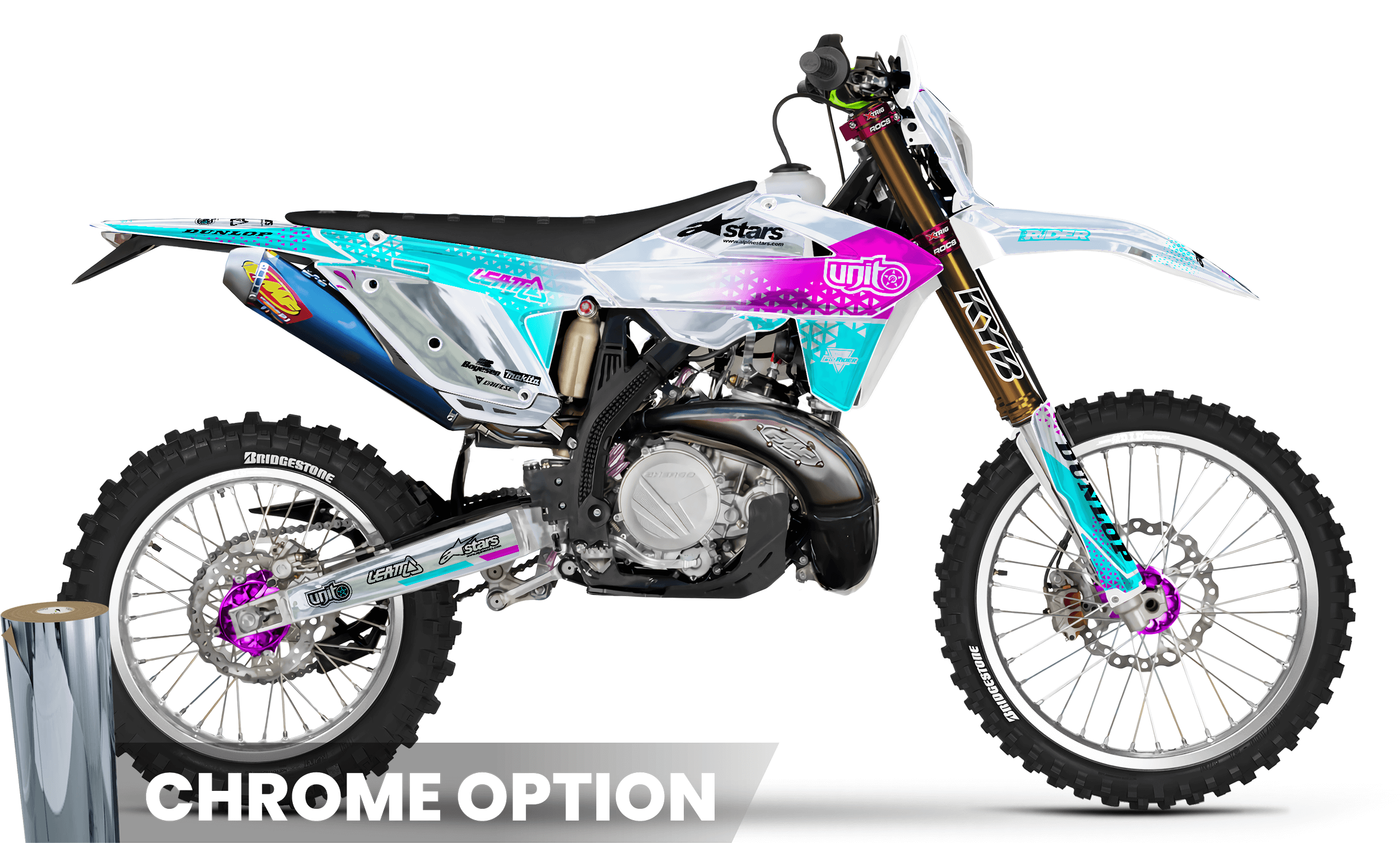
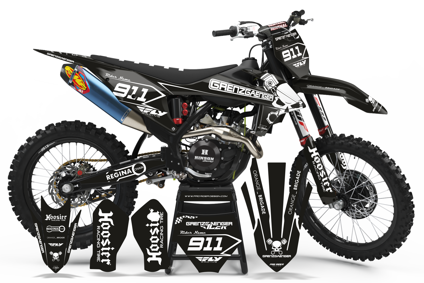
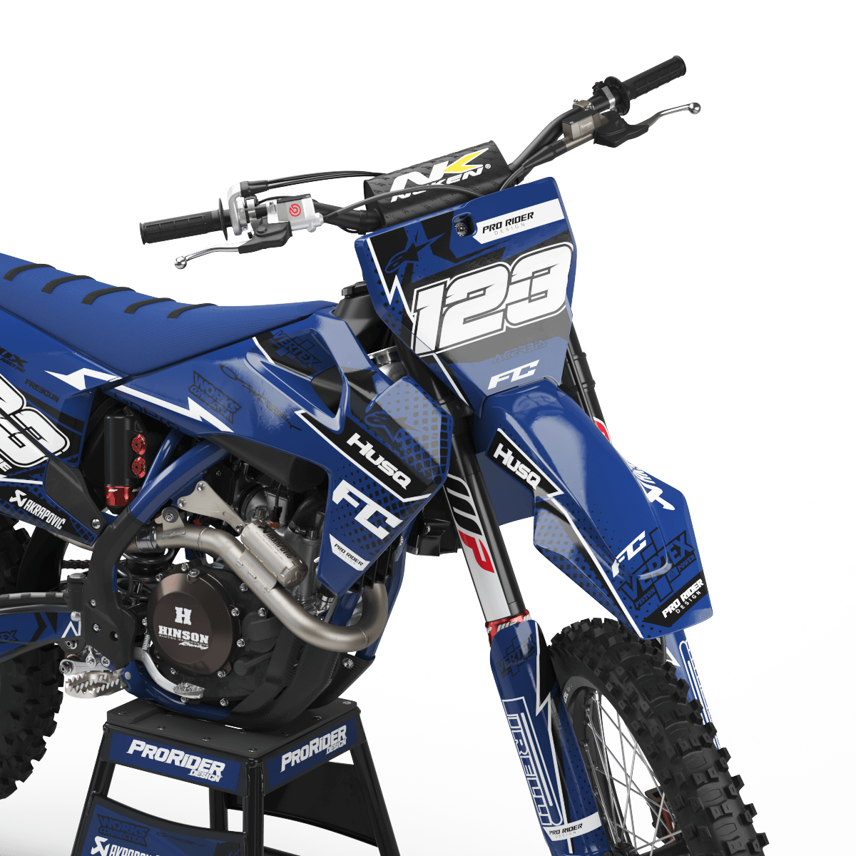
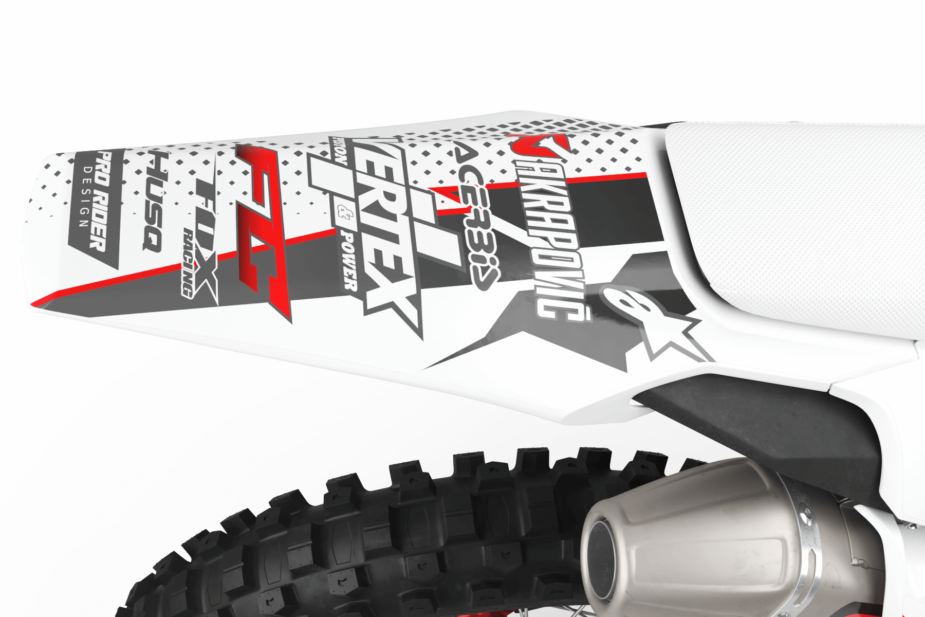
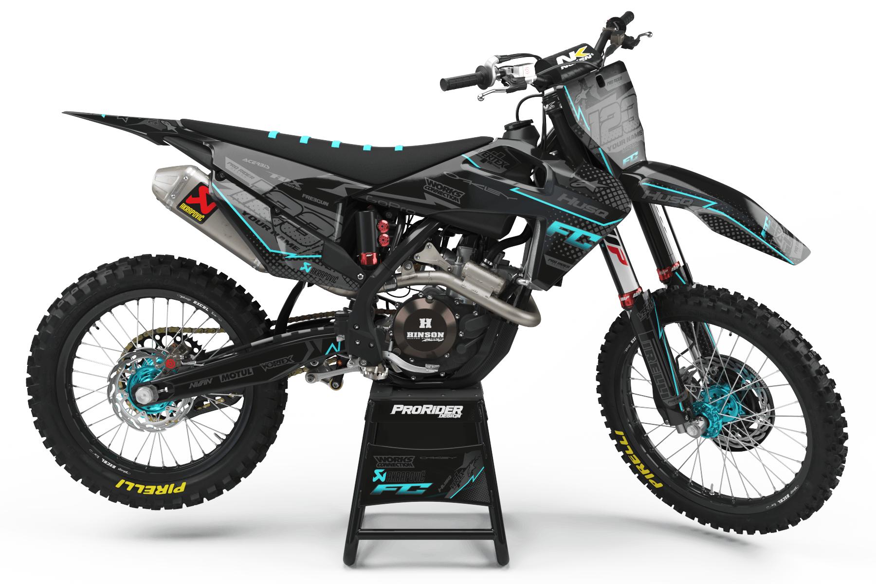
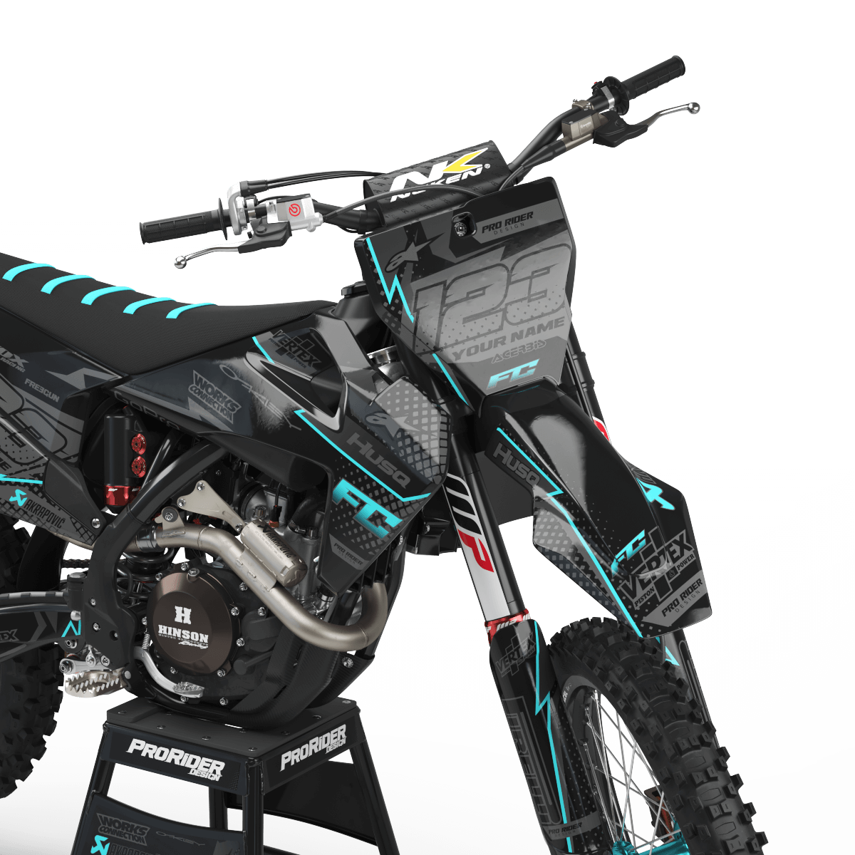
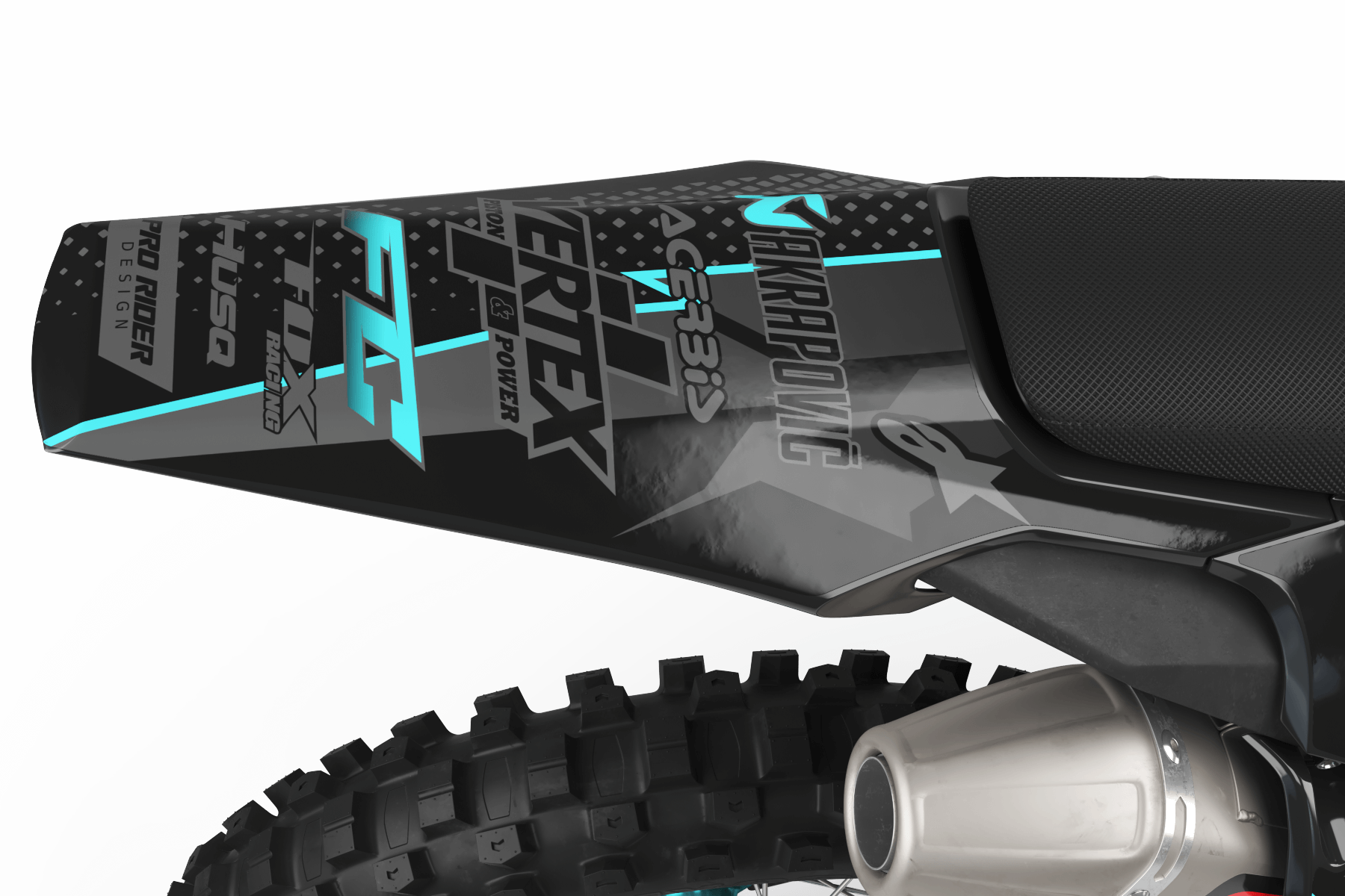
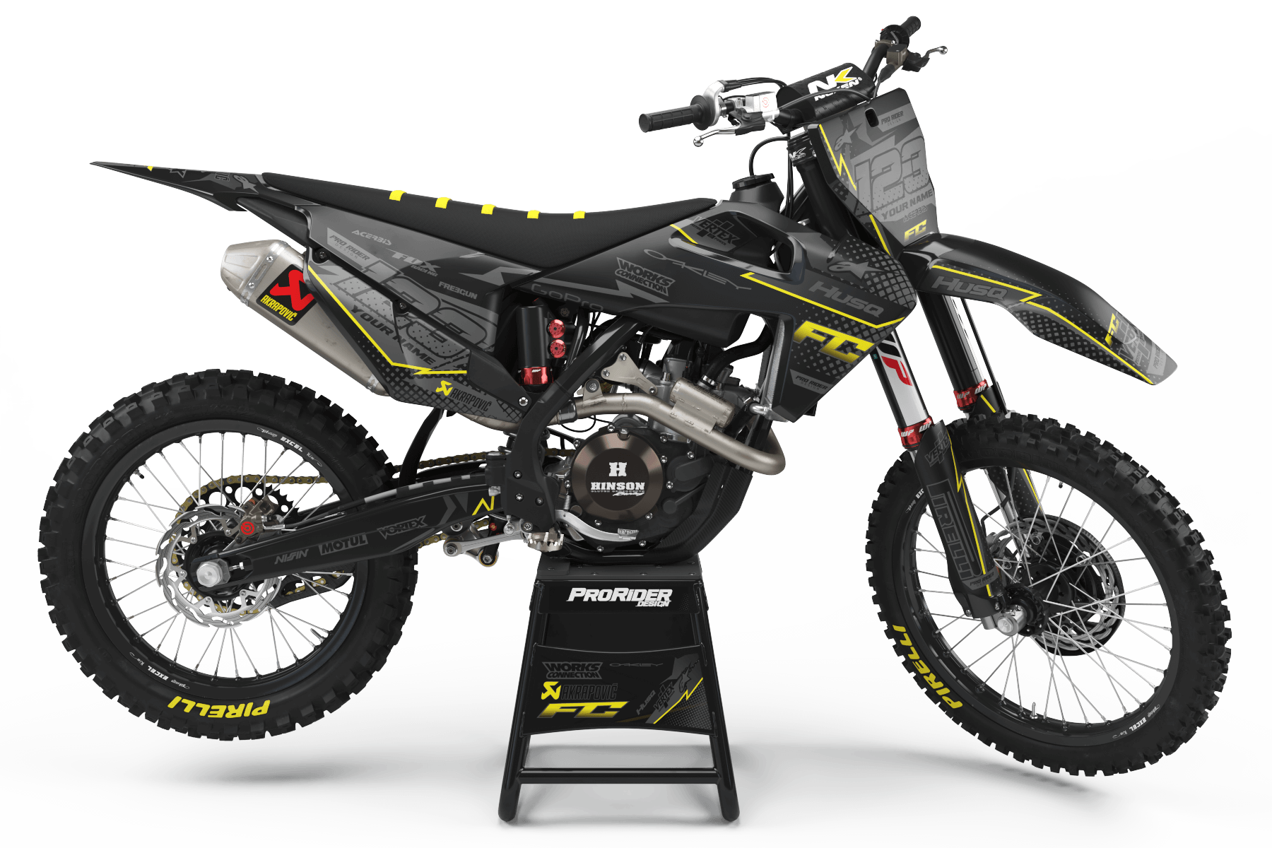
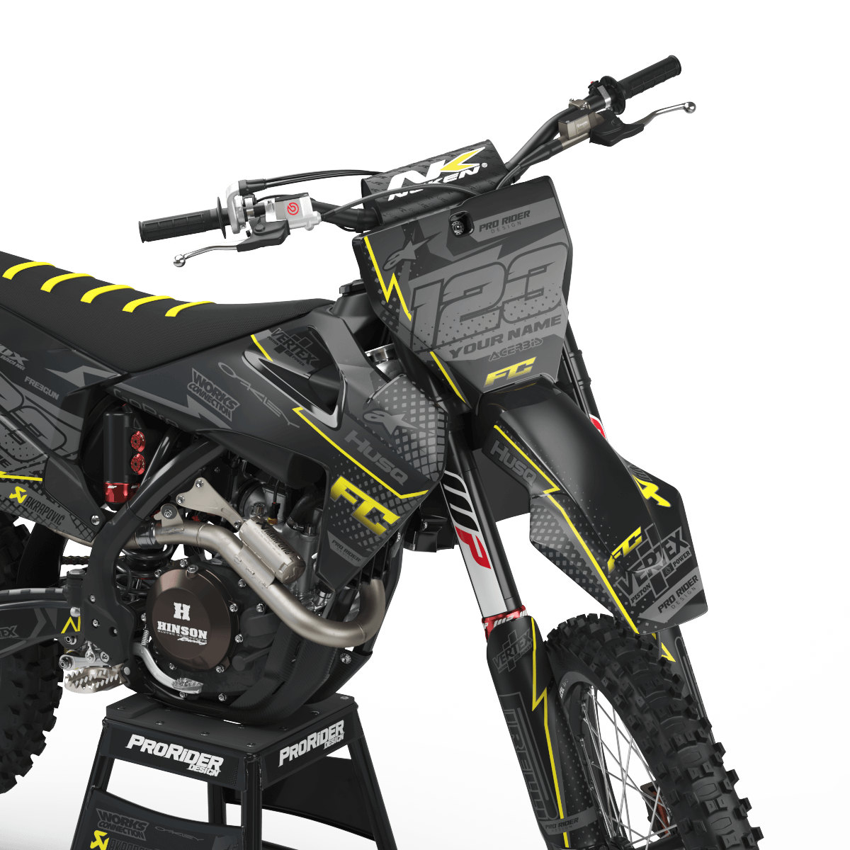
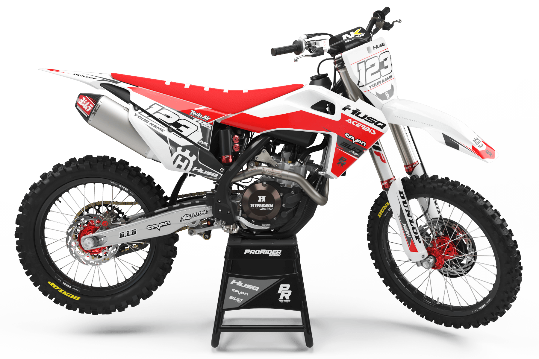
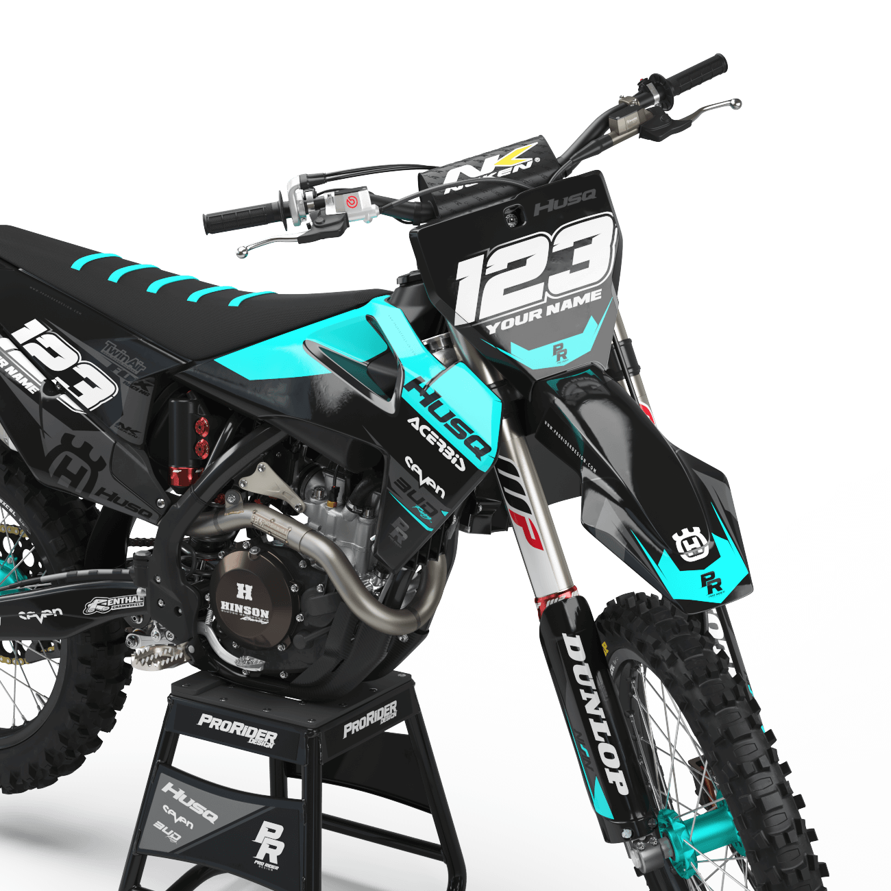
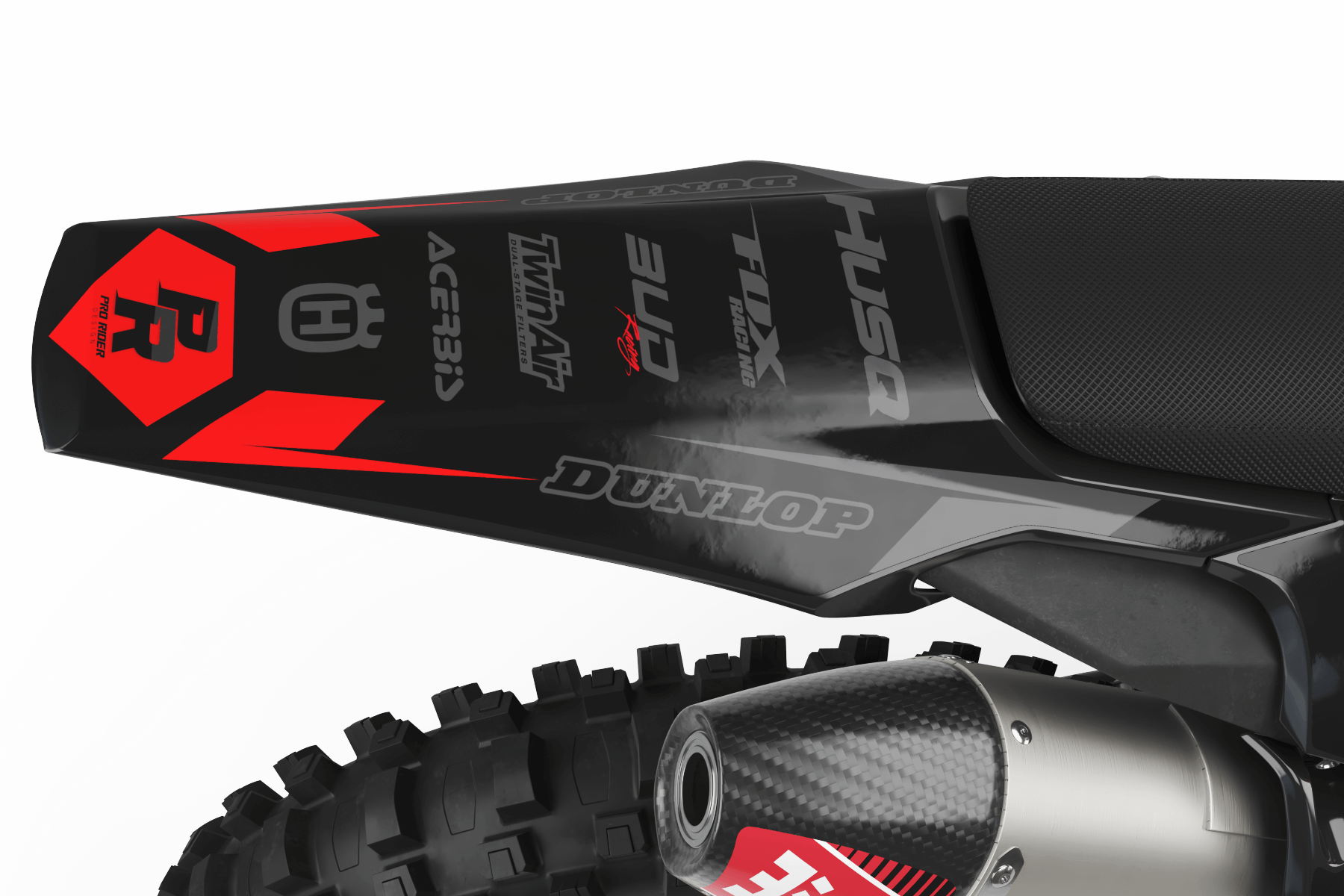
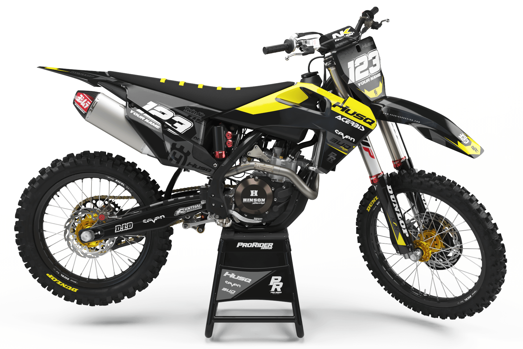
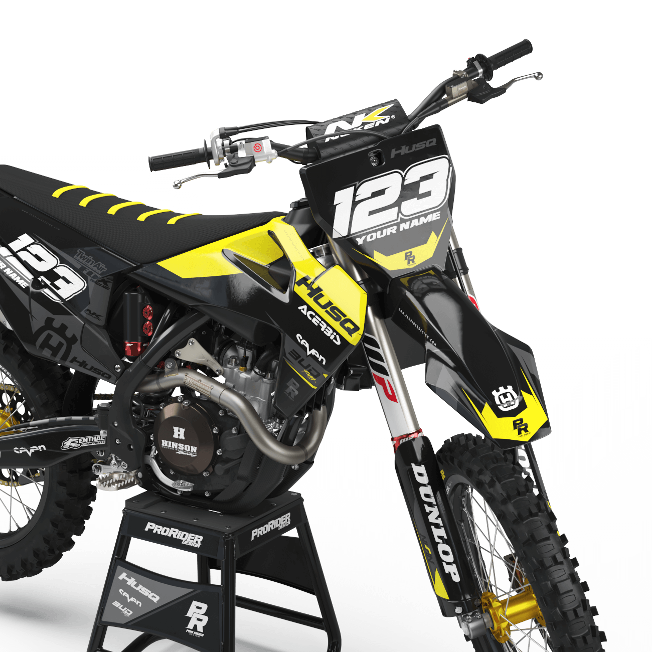
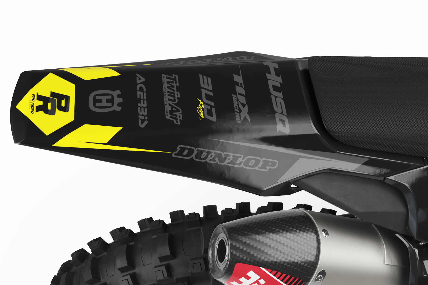
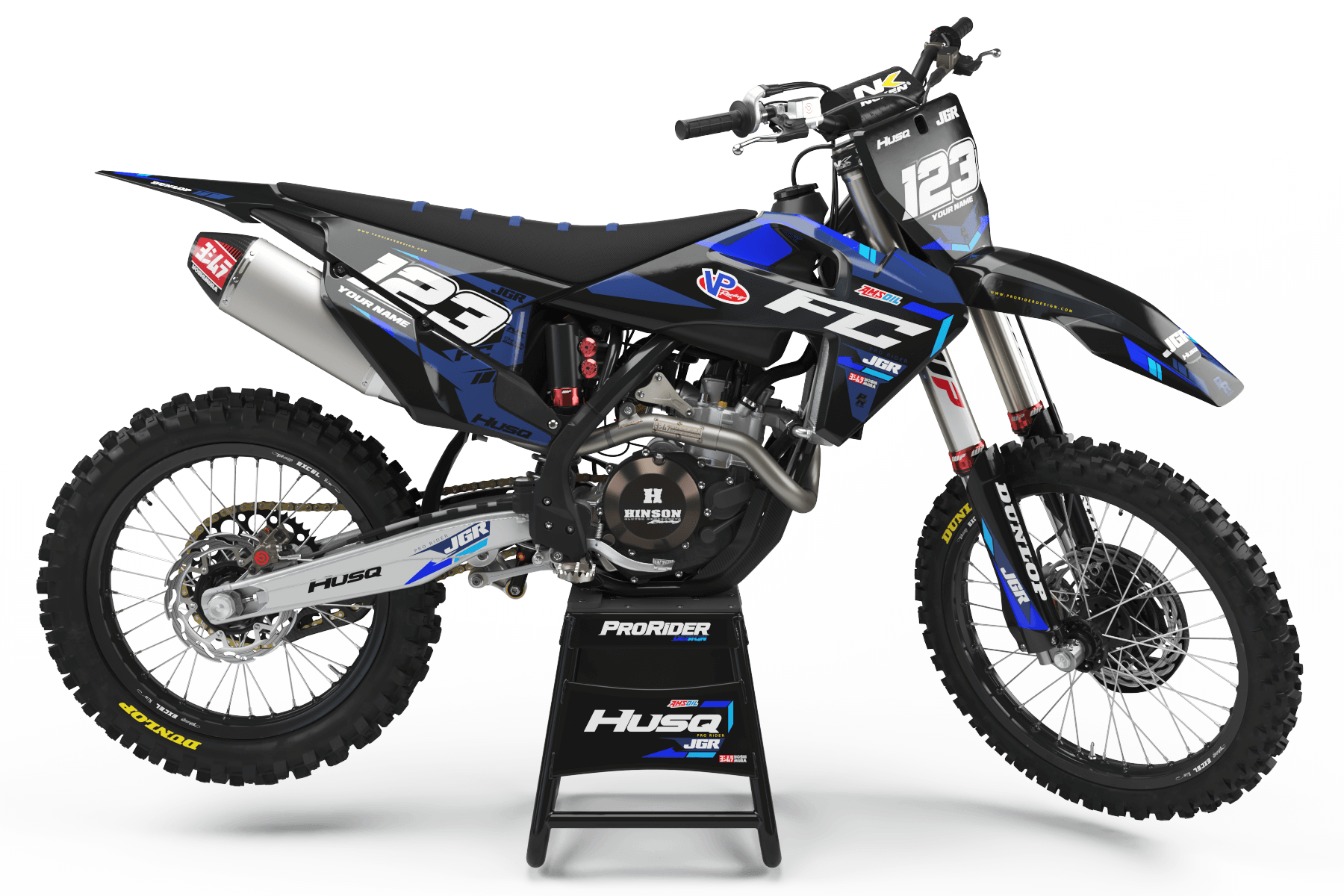
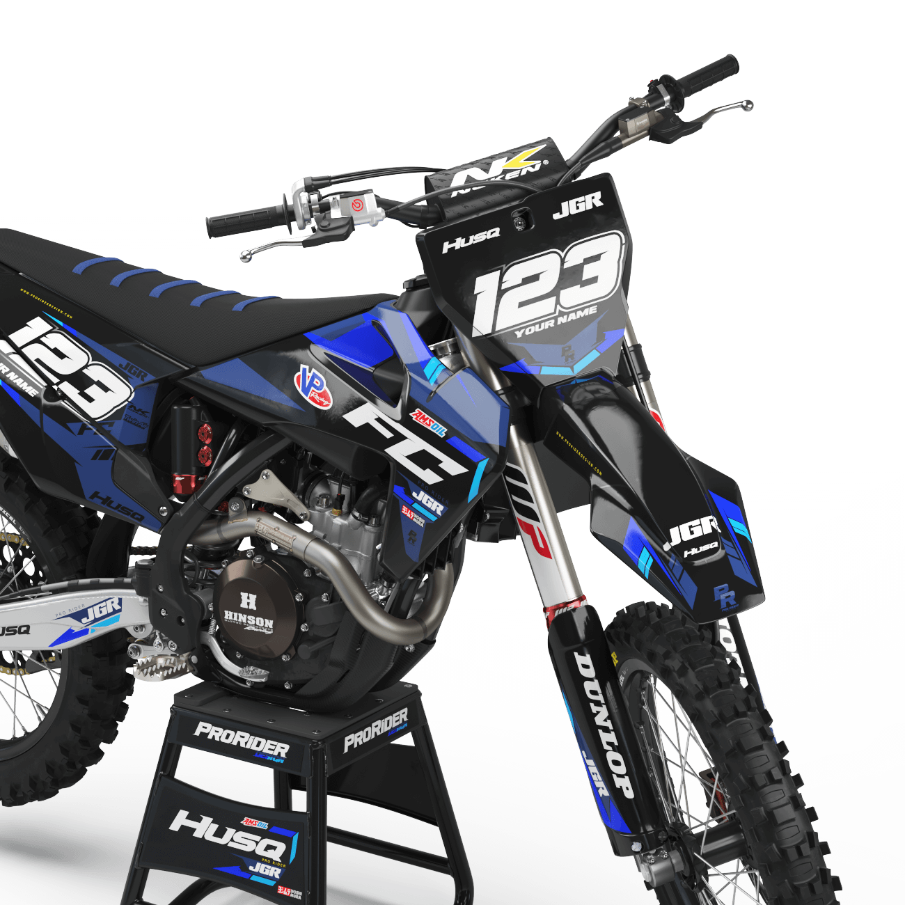
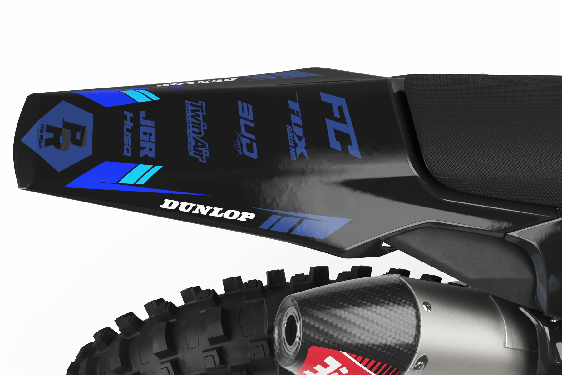
FULL CUSTOM GRAPHICS
One of One. Built from Scratch.
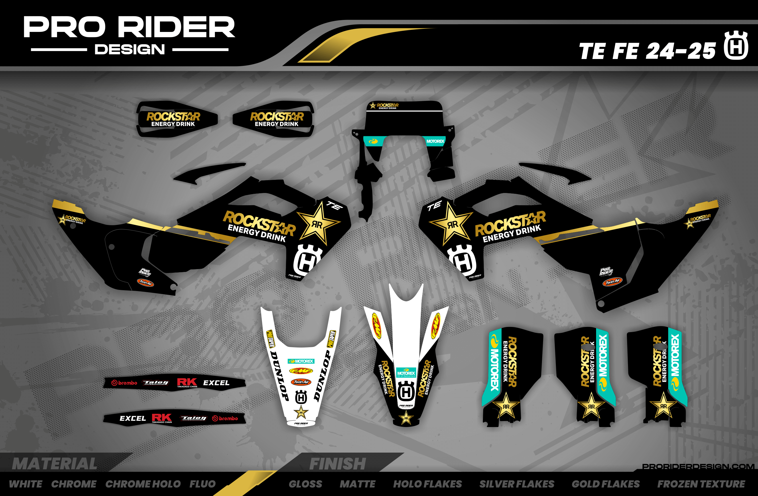
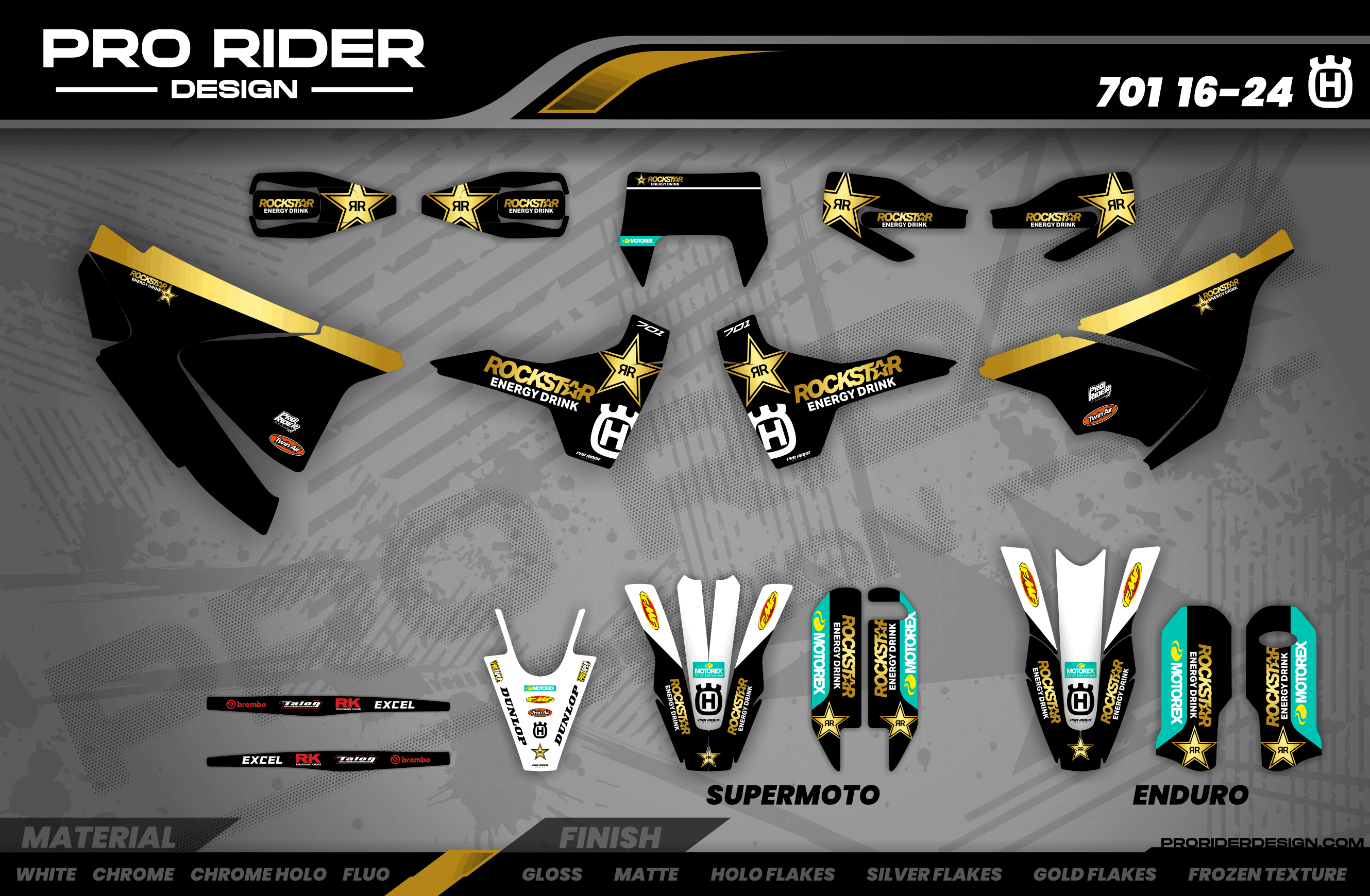
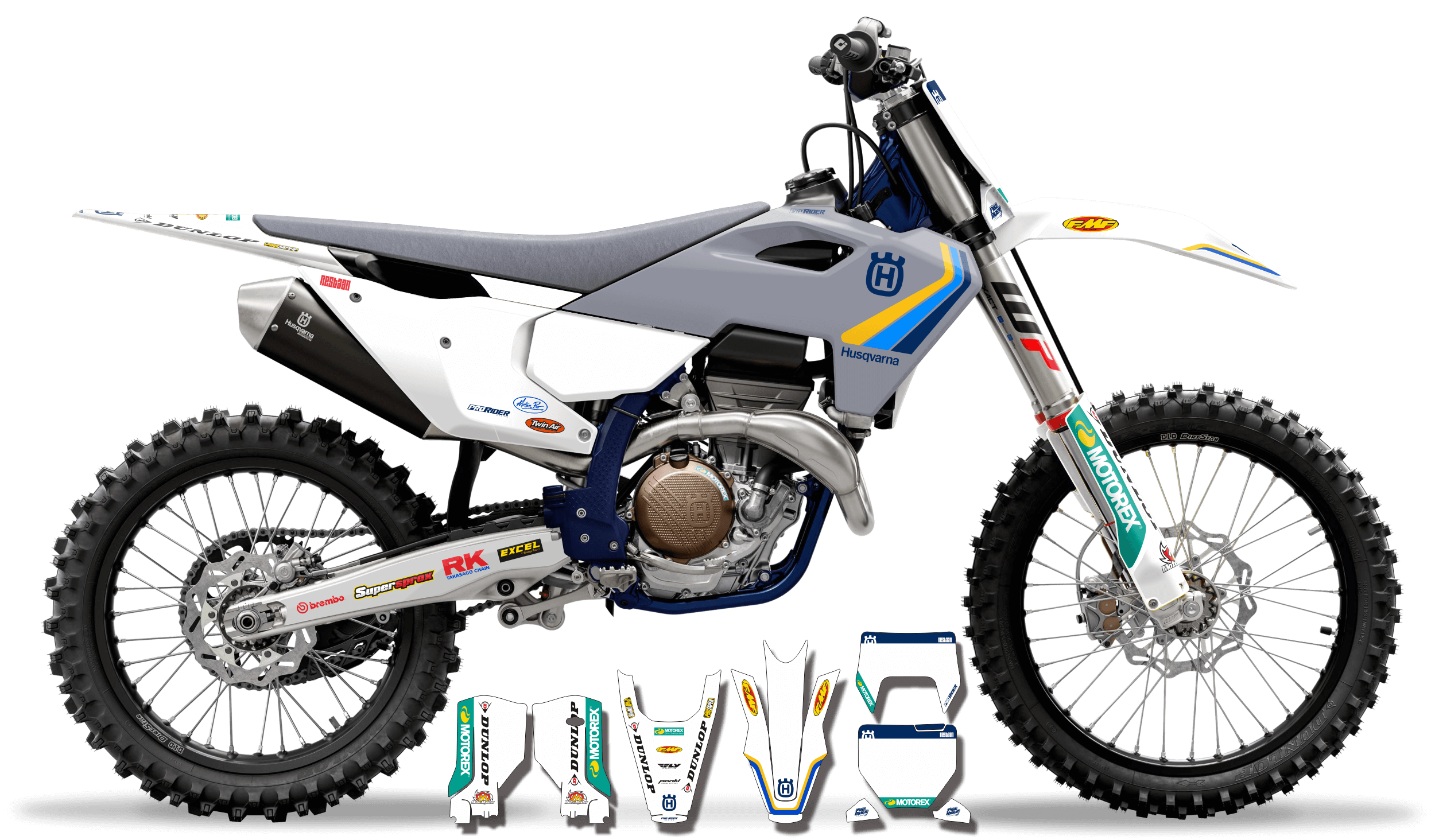

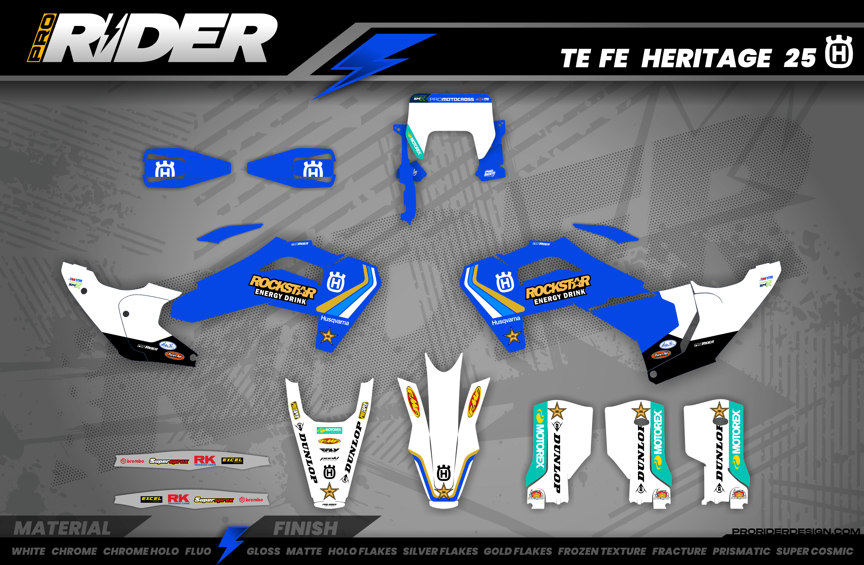
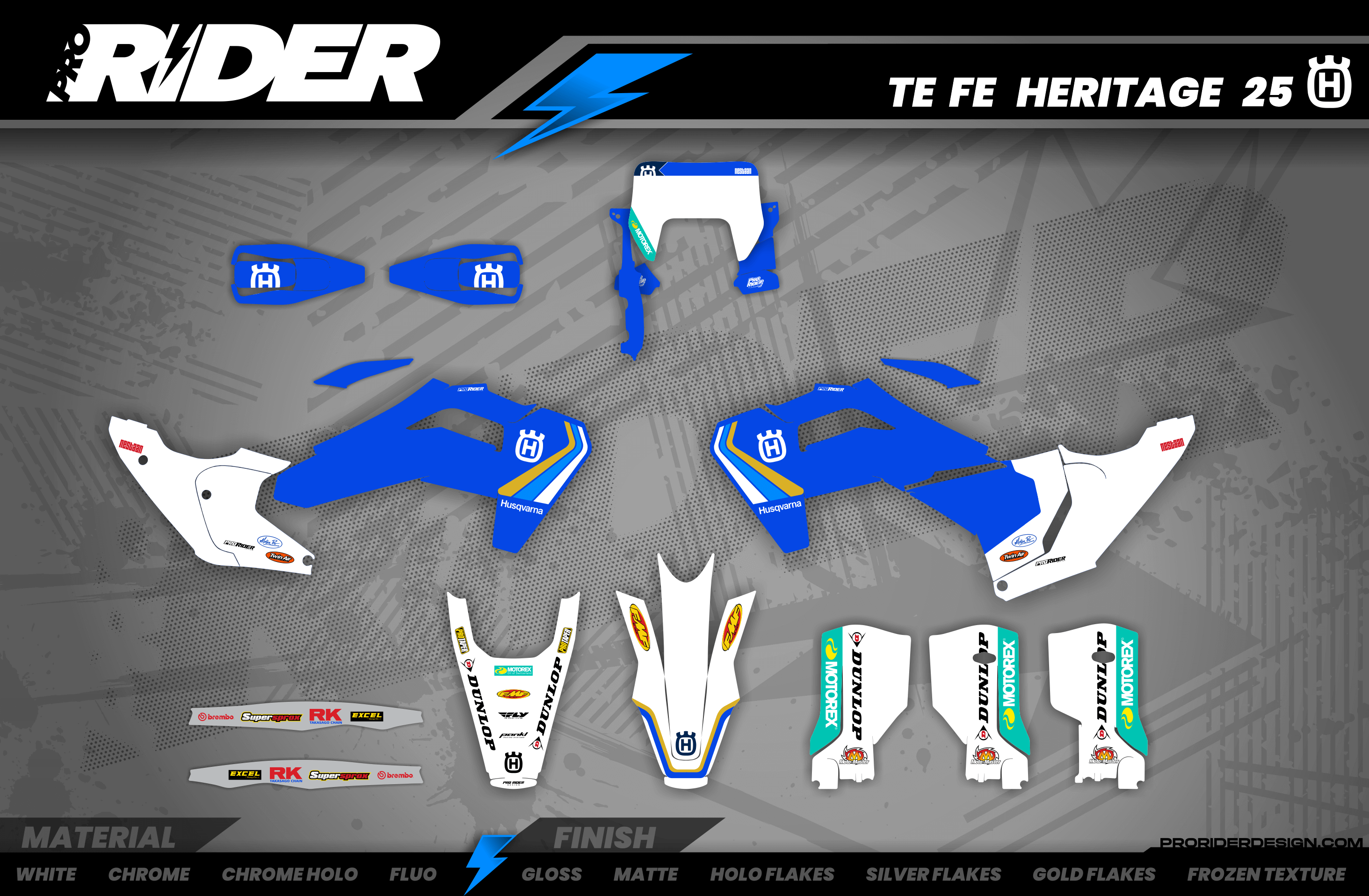
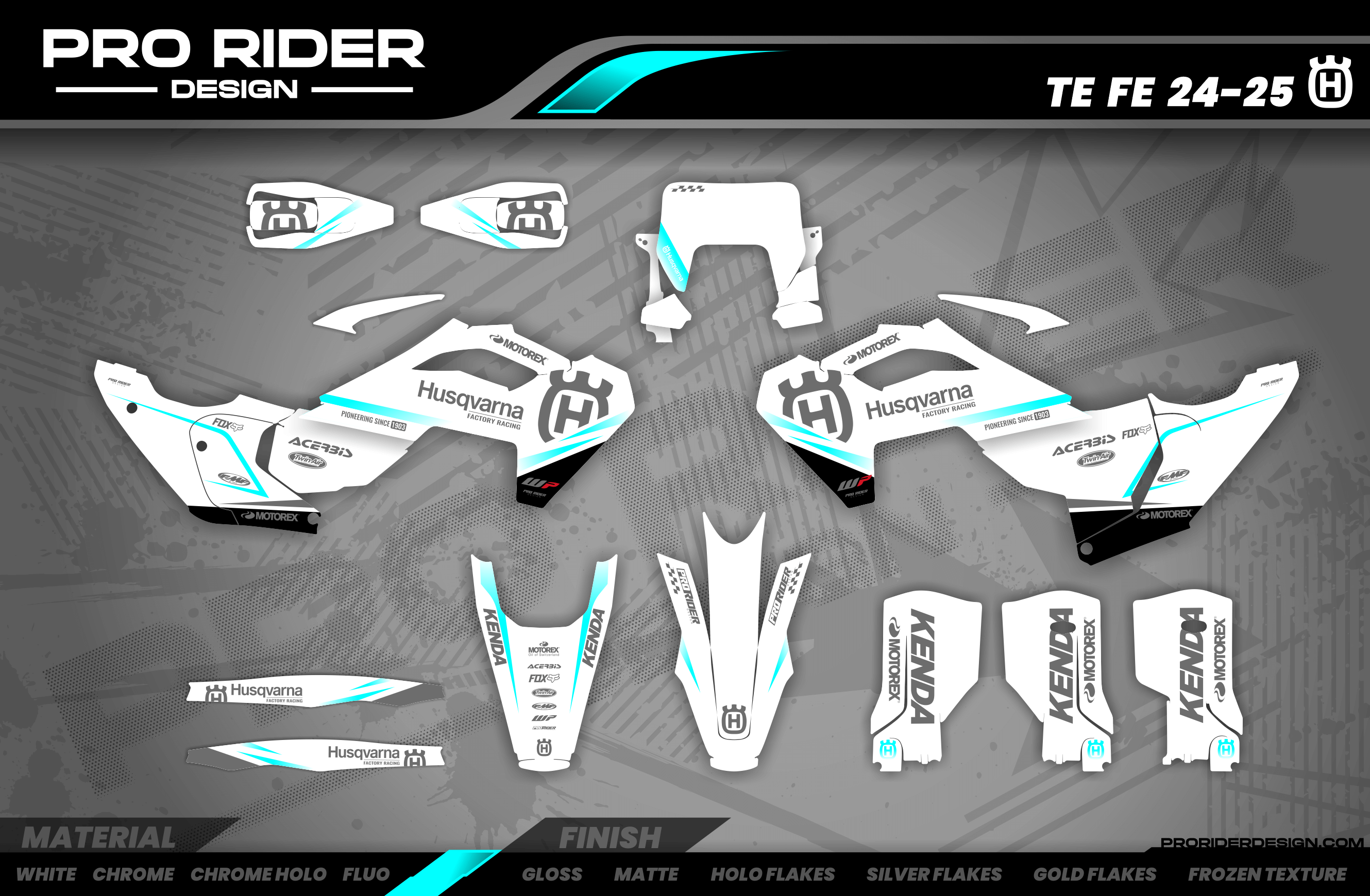
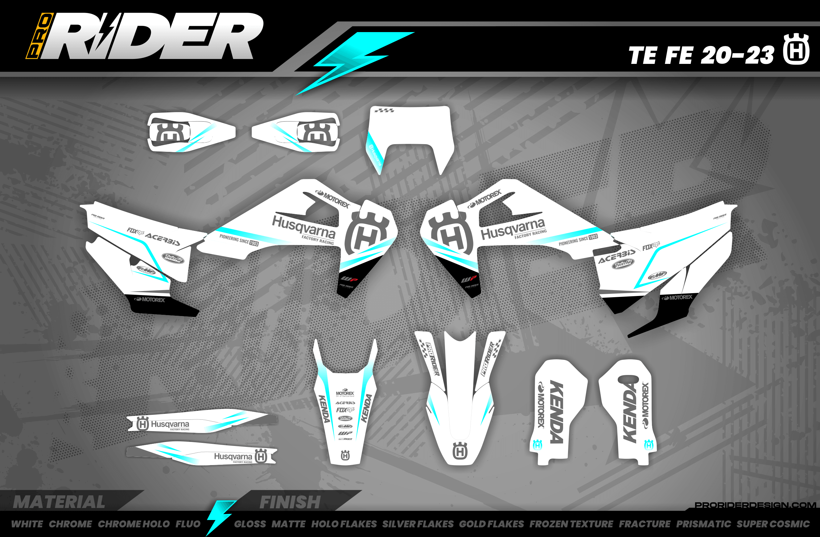
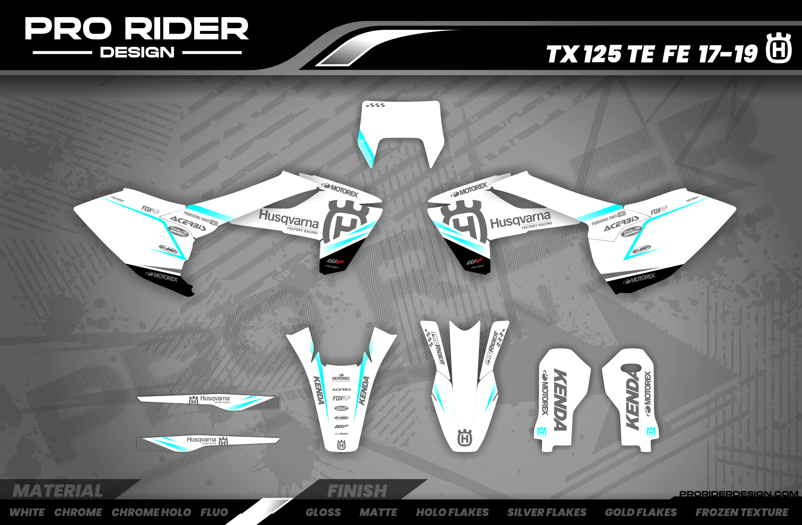
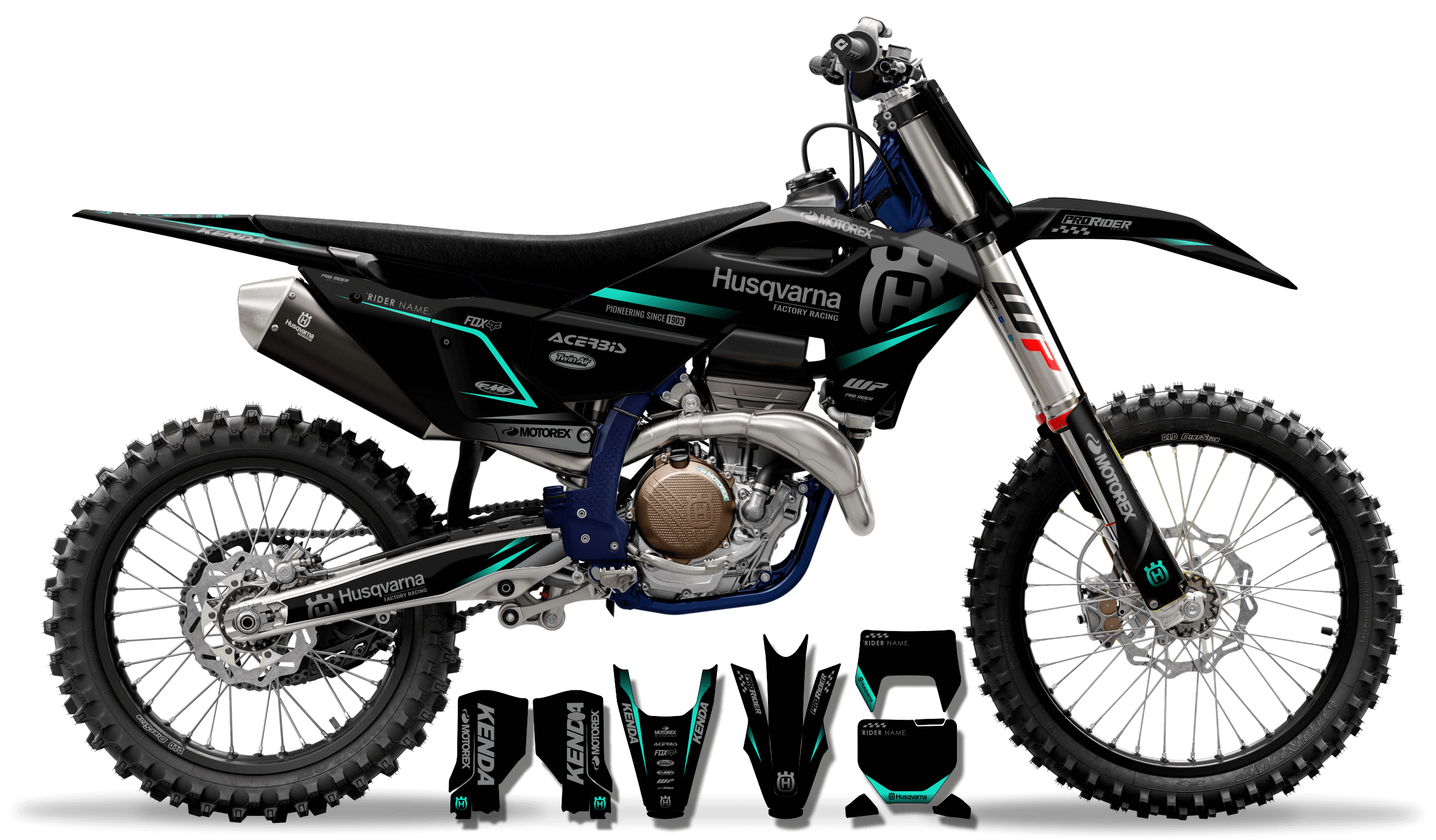
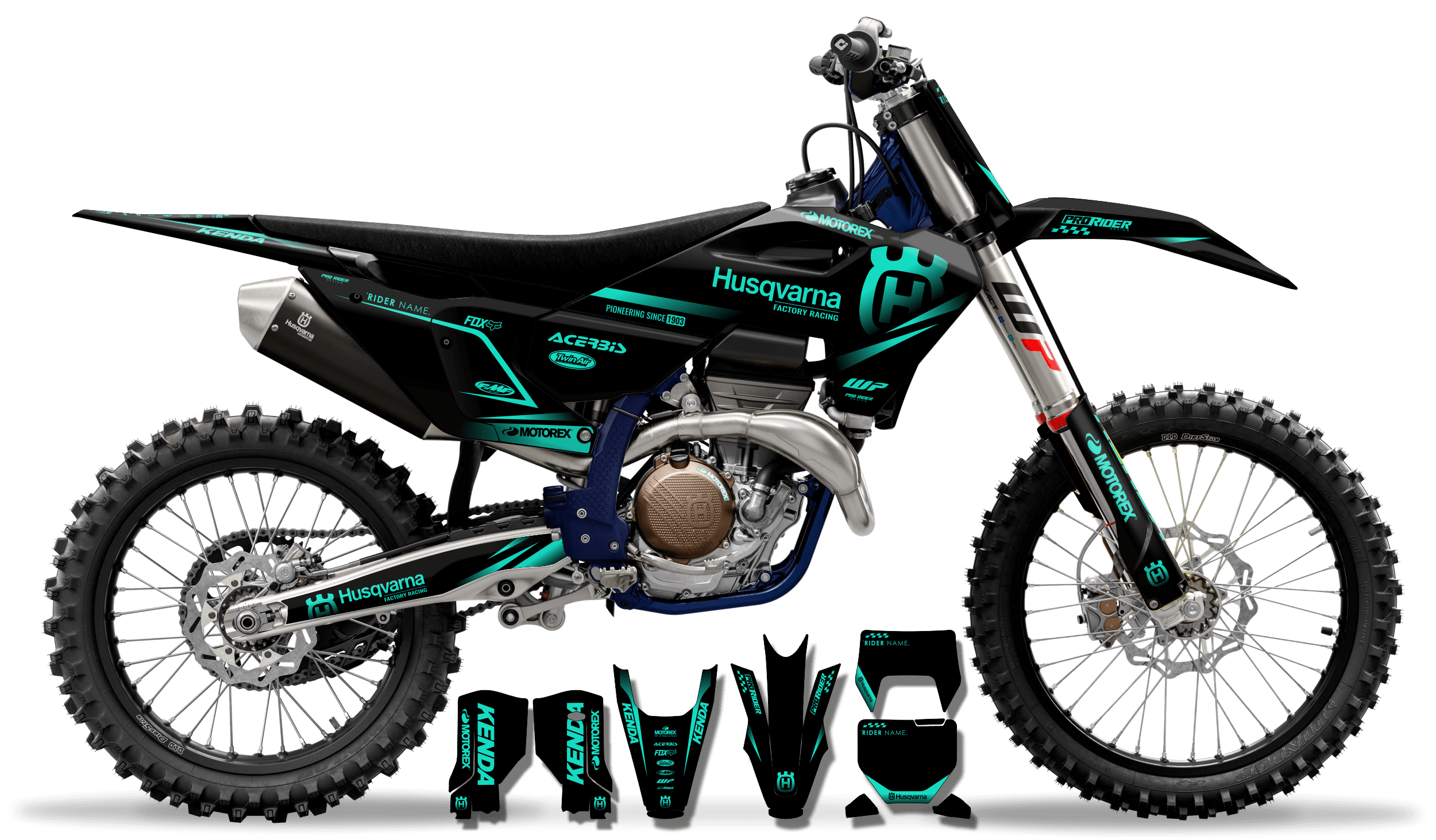
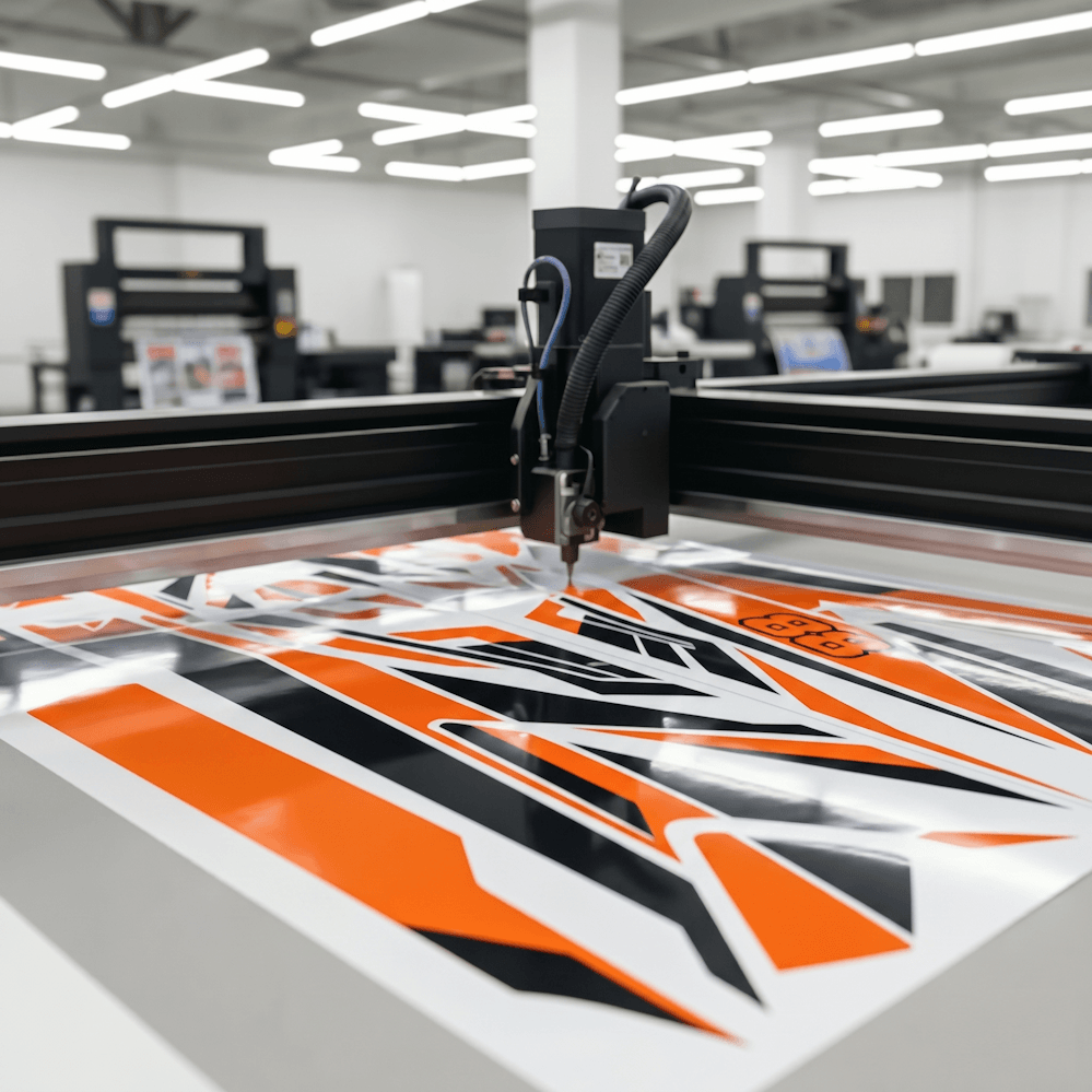
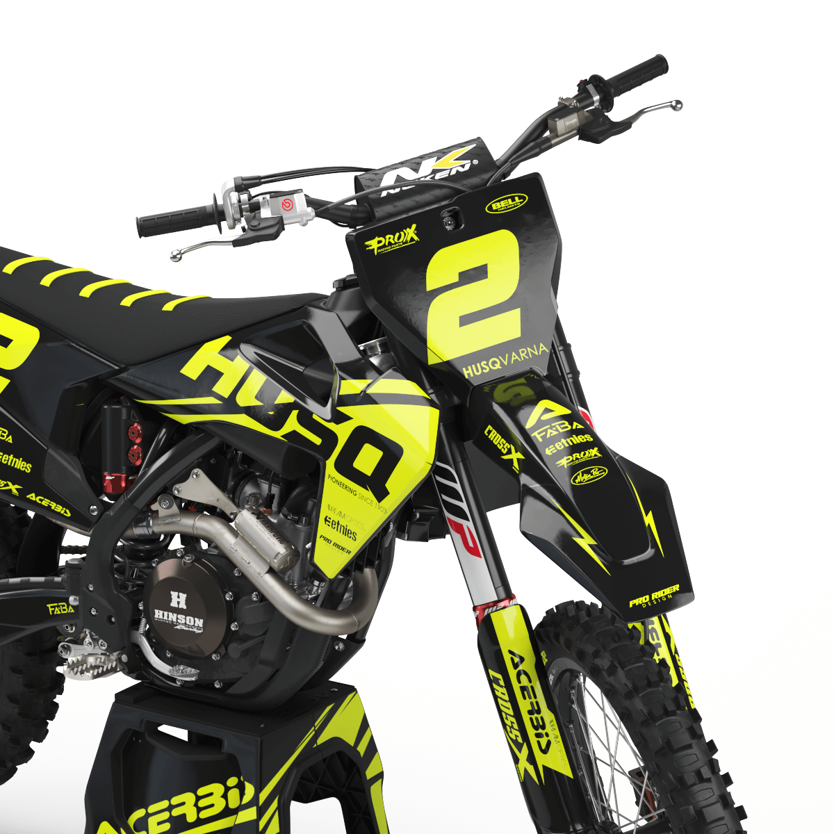
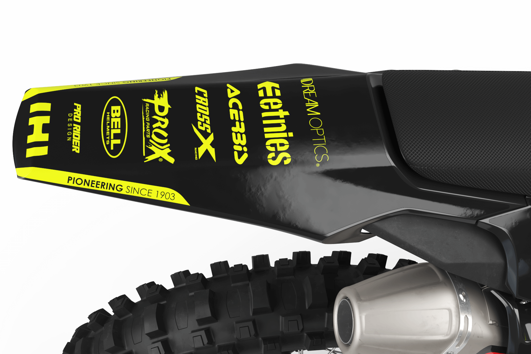
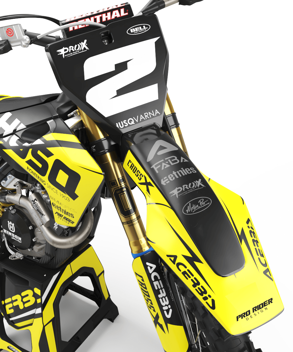
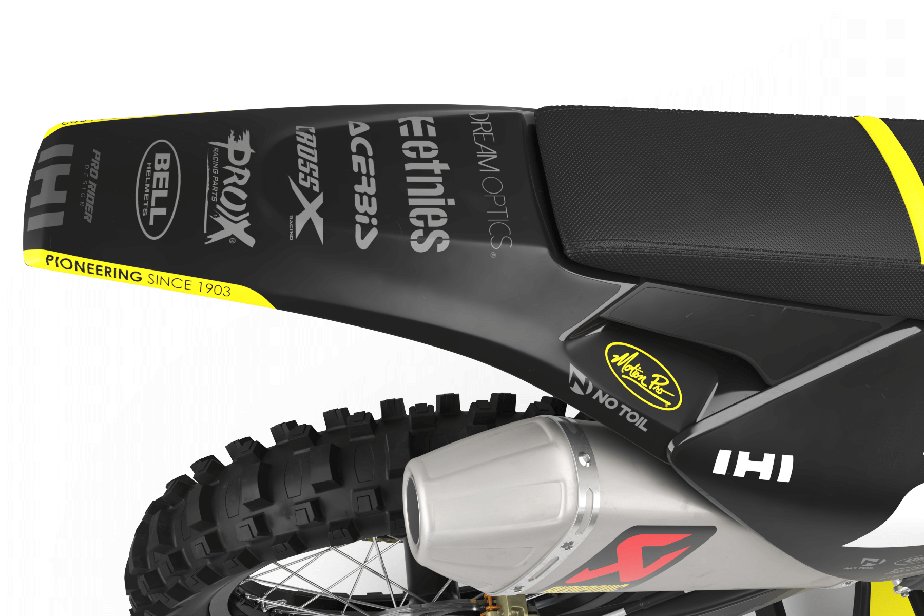
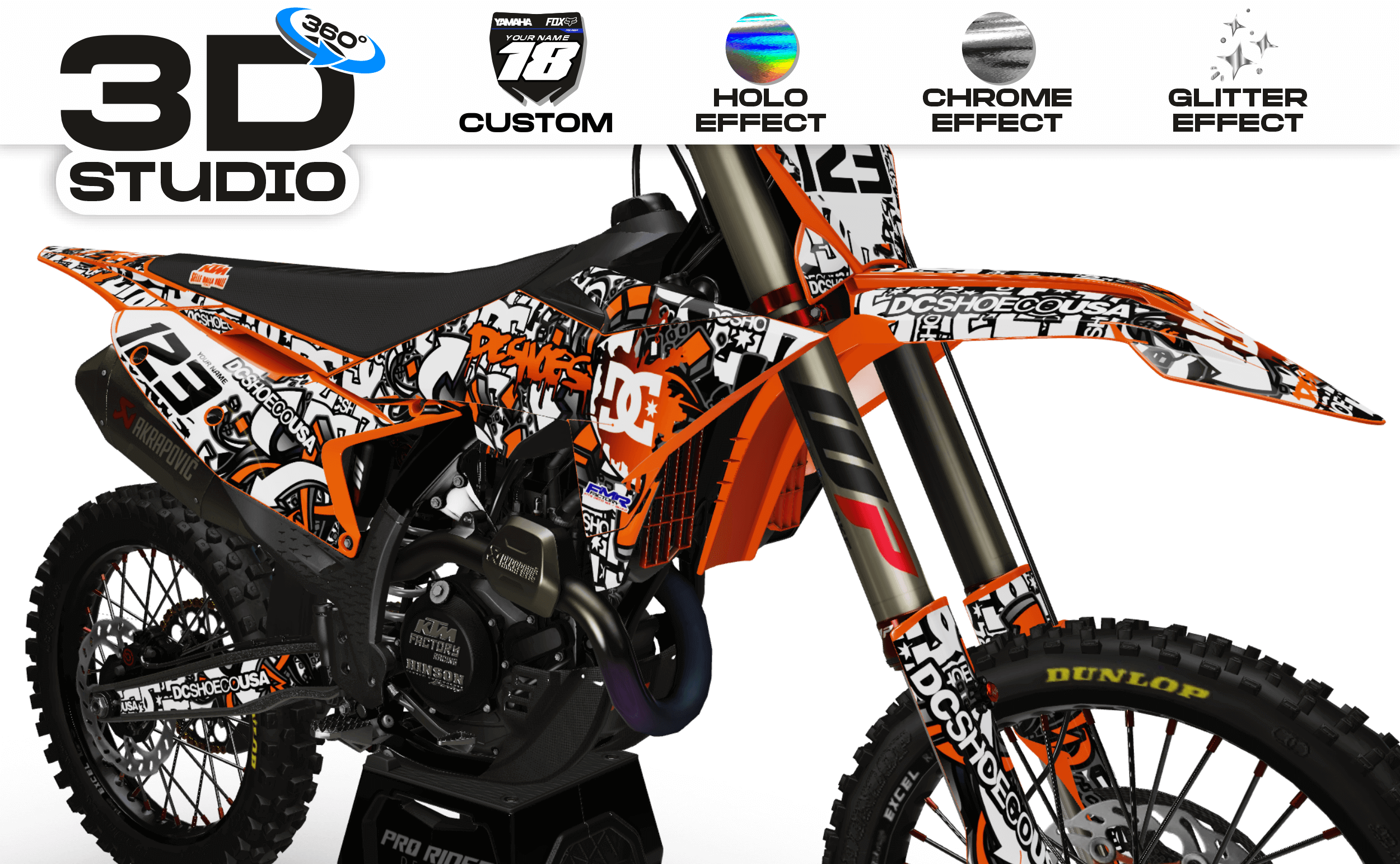
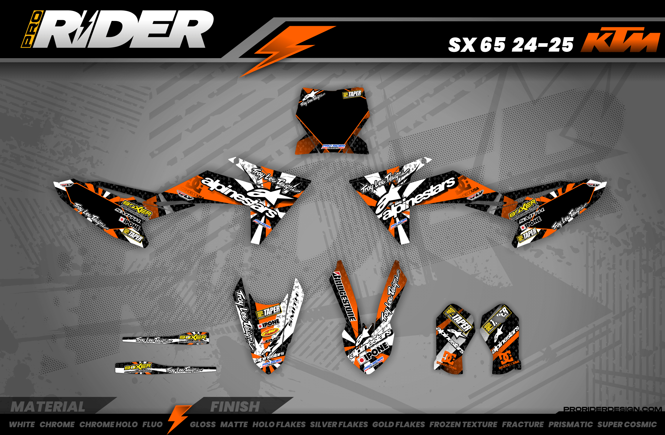
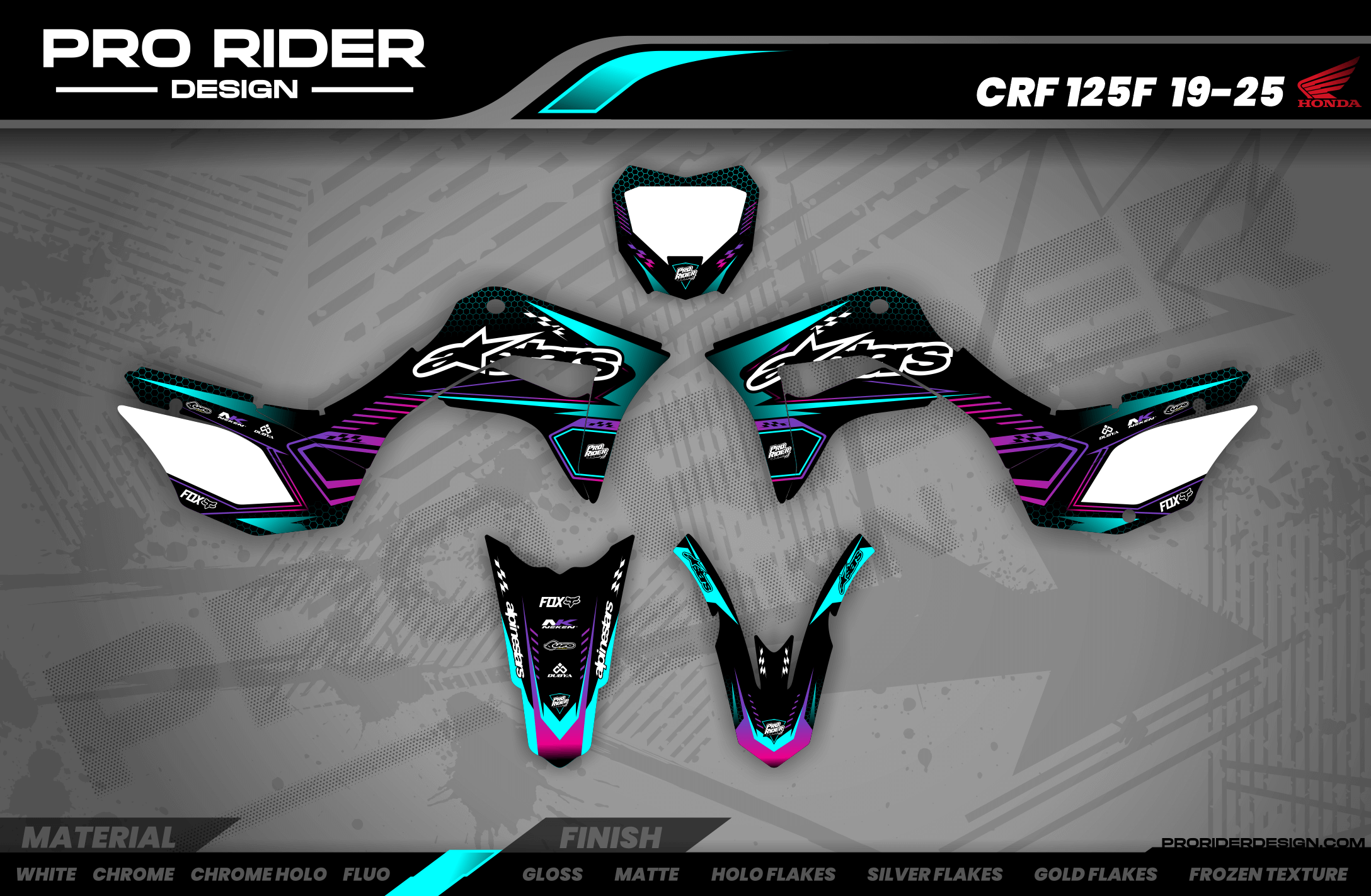
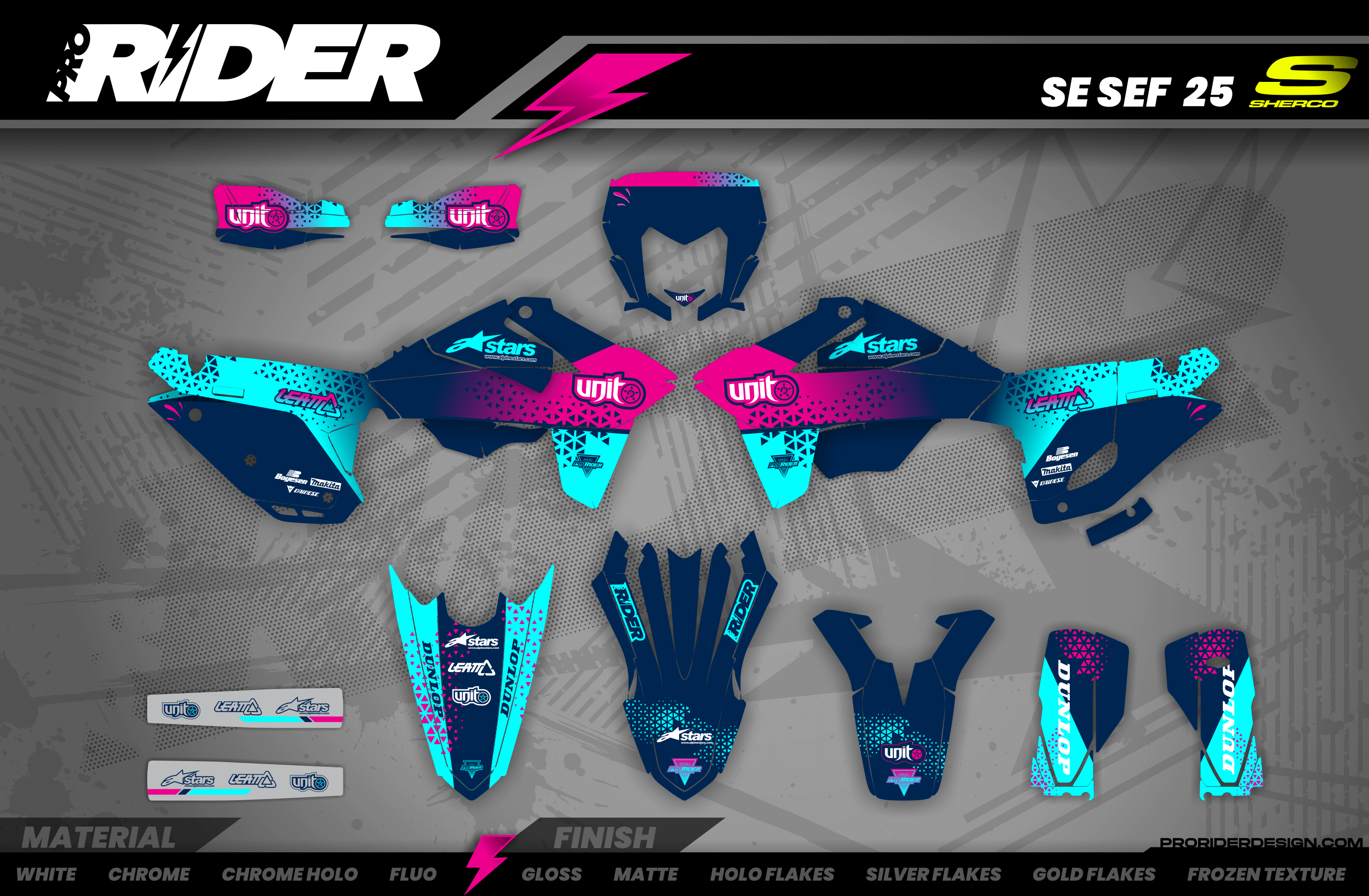
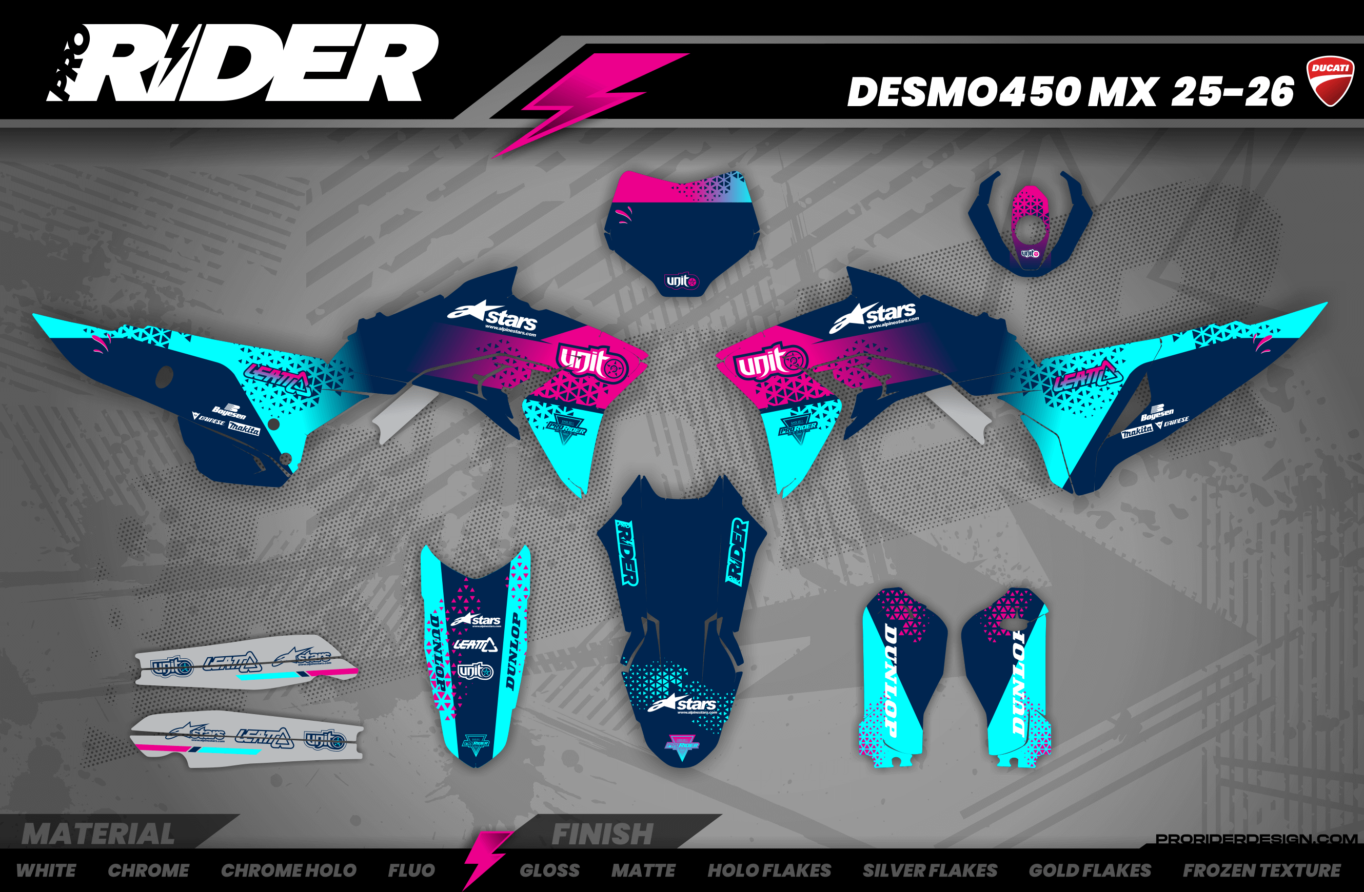
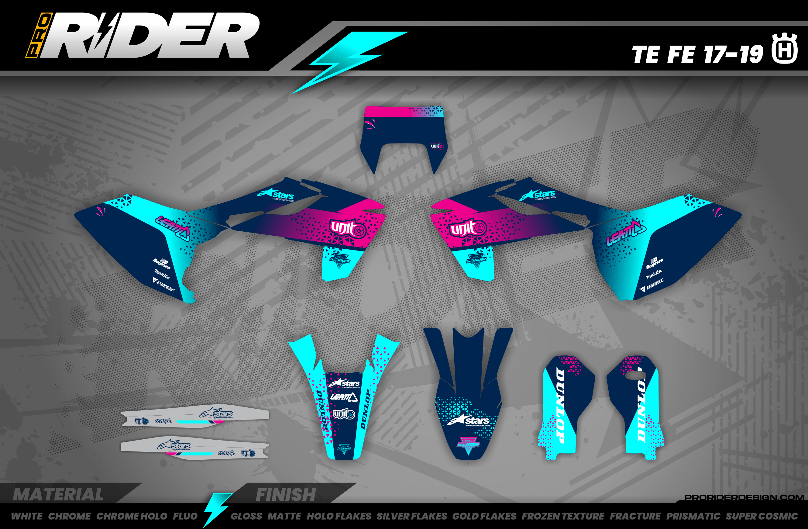
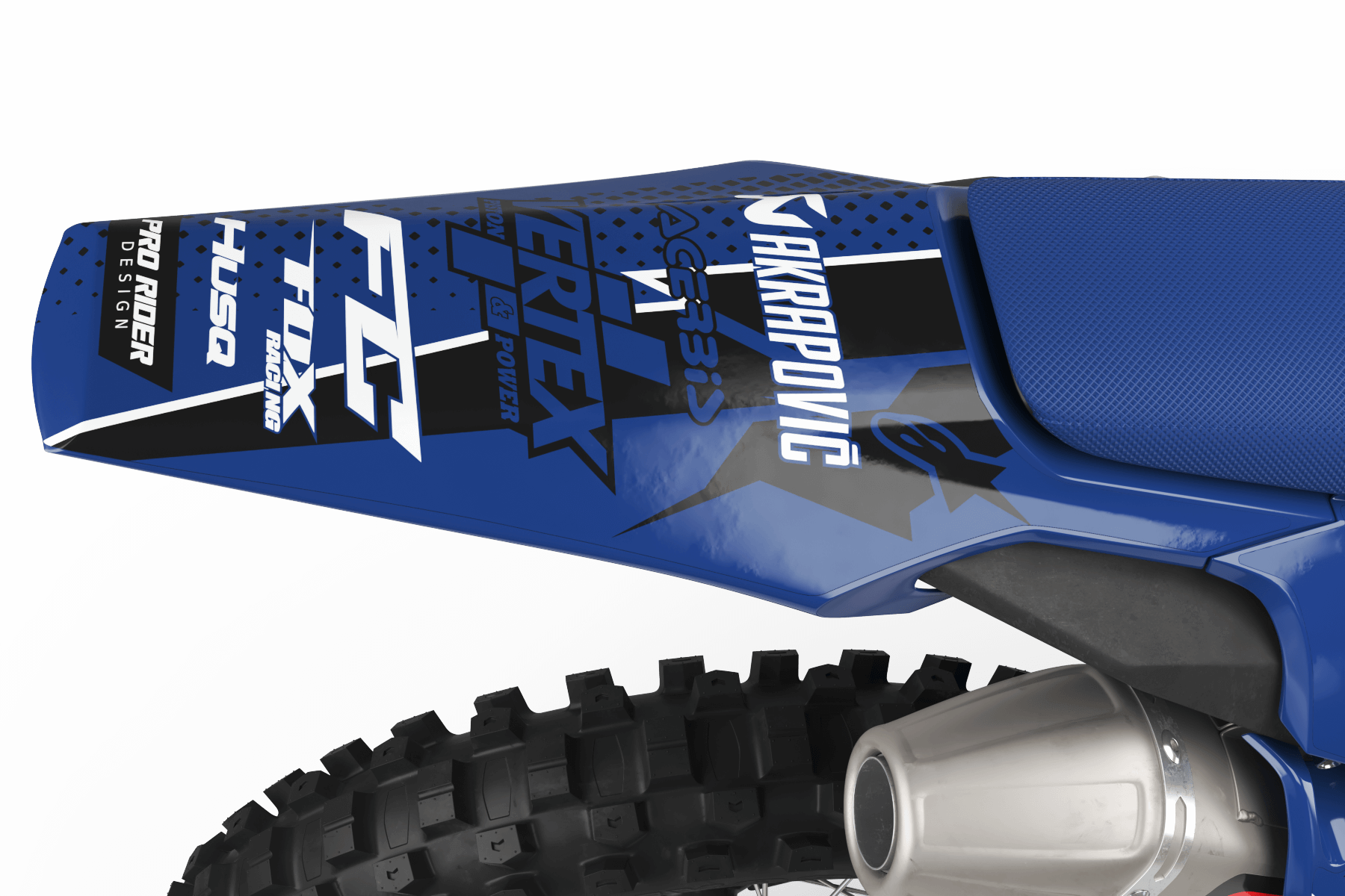
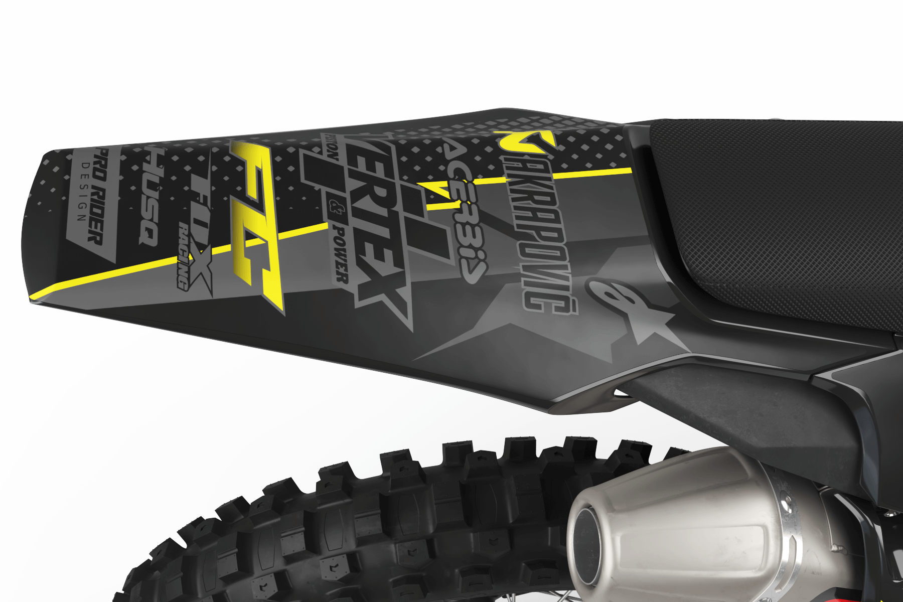
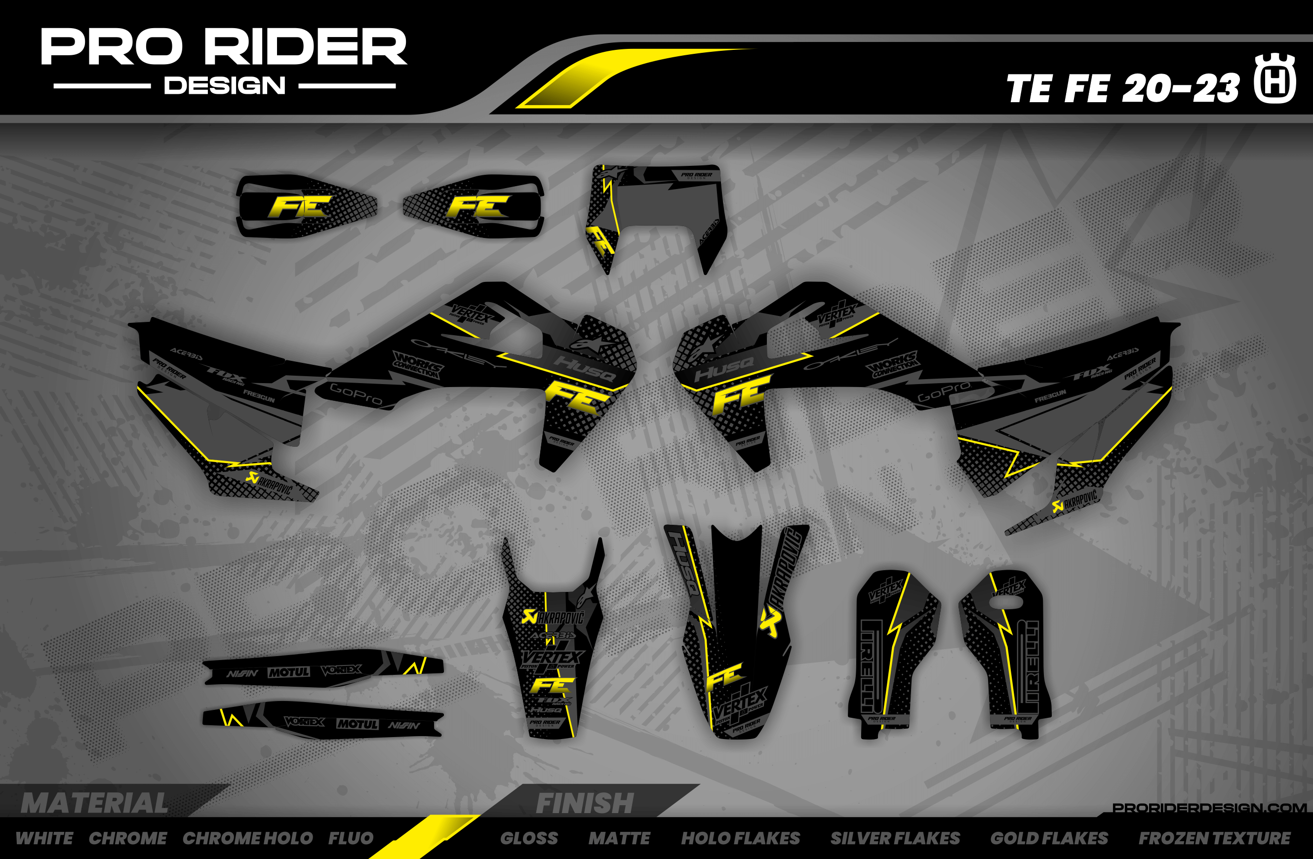
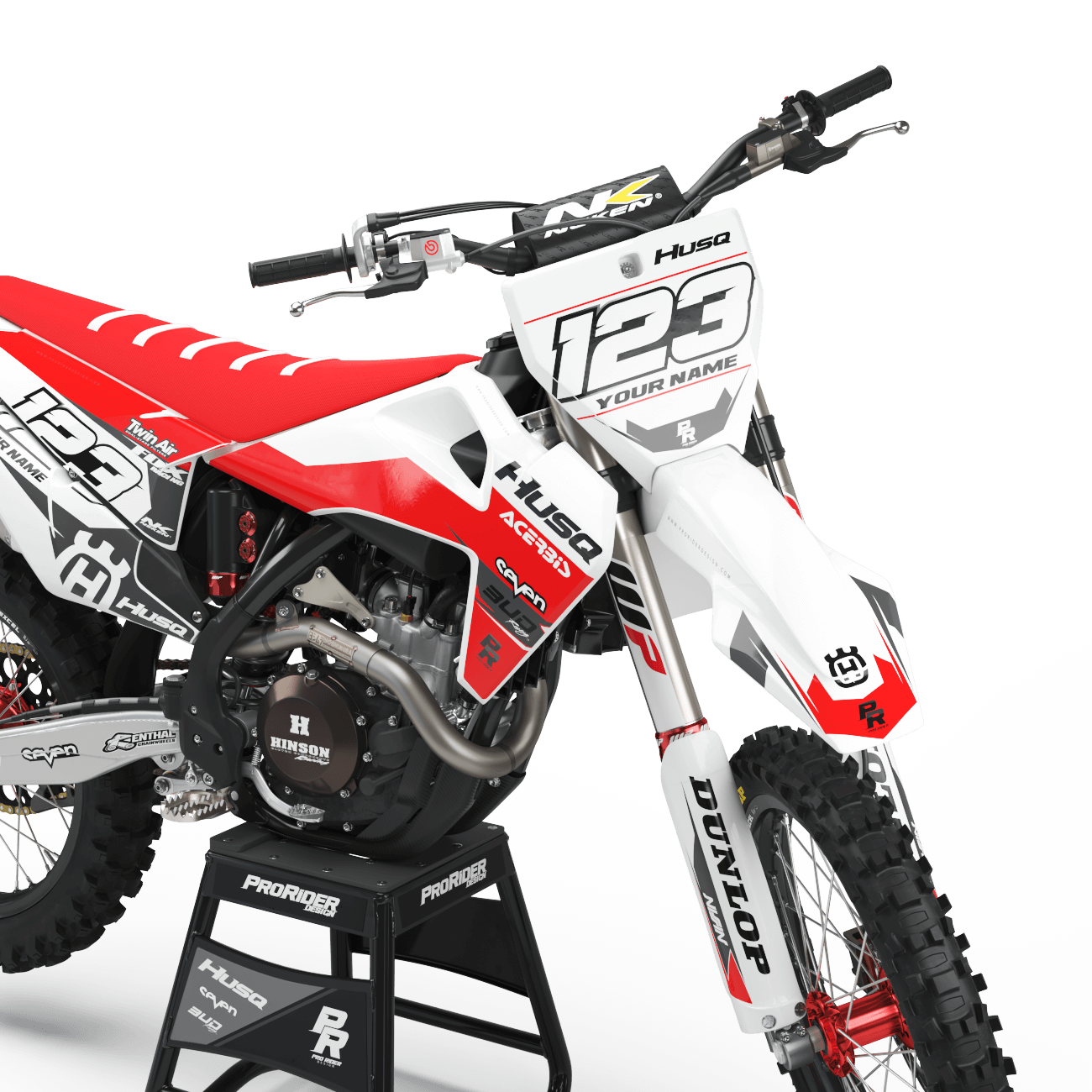
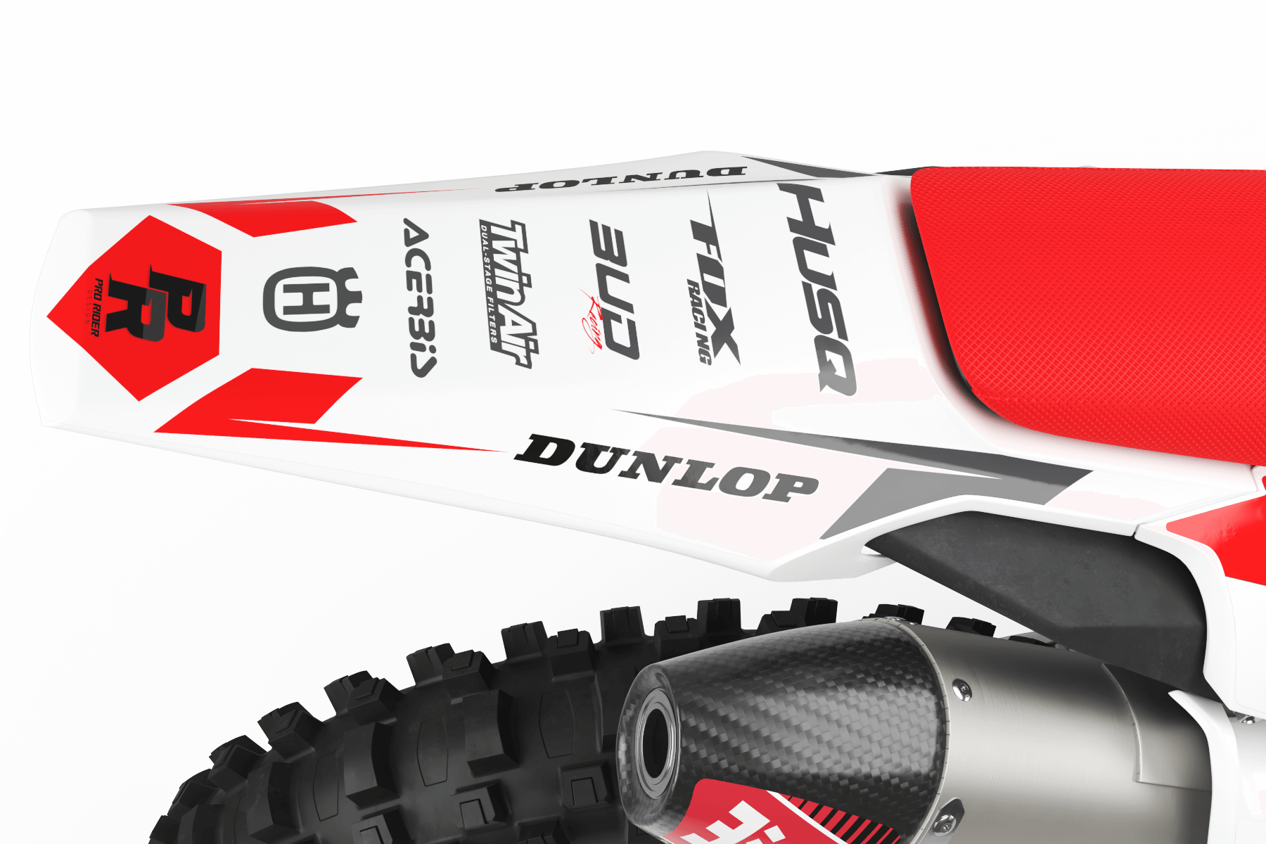
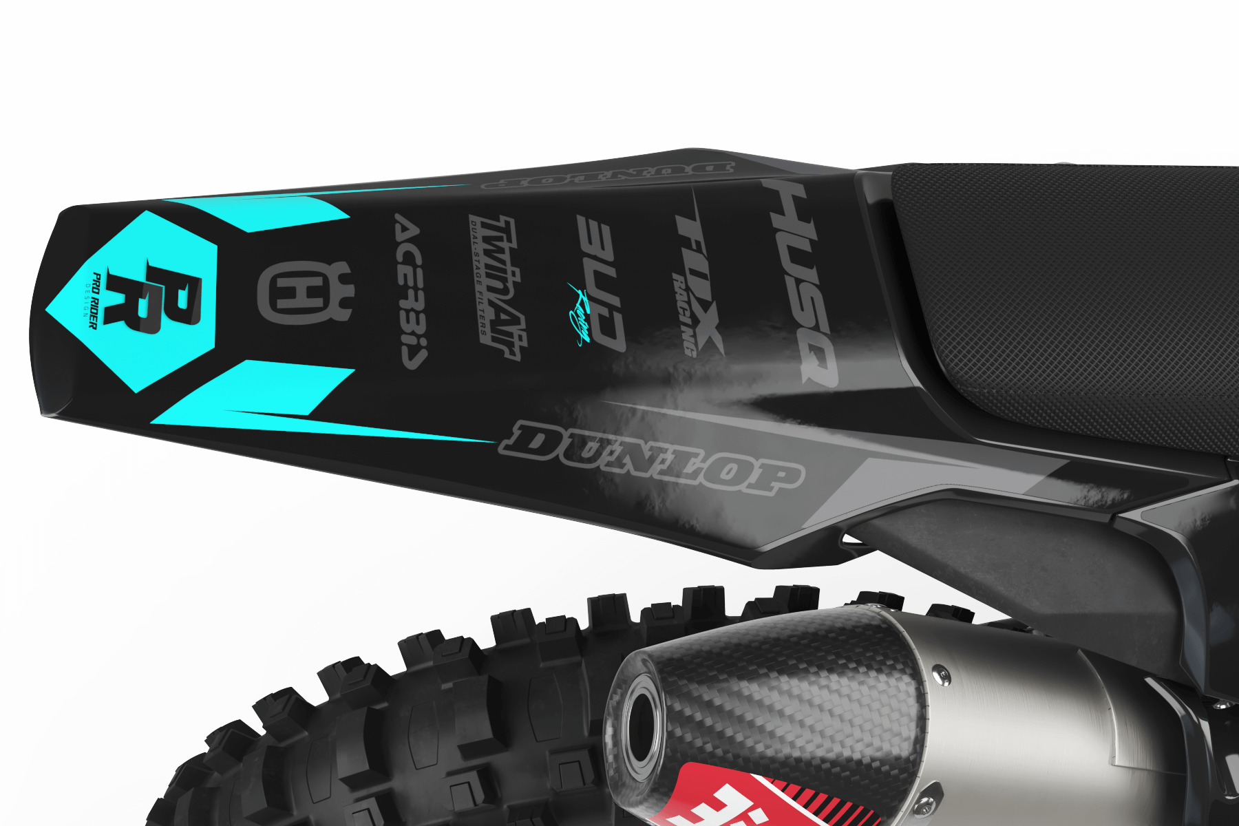
FULL REPRINT / SINGLE PARTS
Track Mishap? Reorder individual panels of your layout whenever you need.
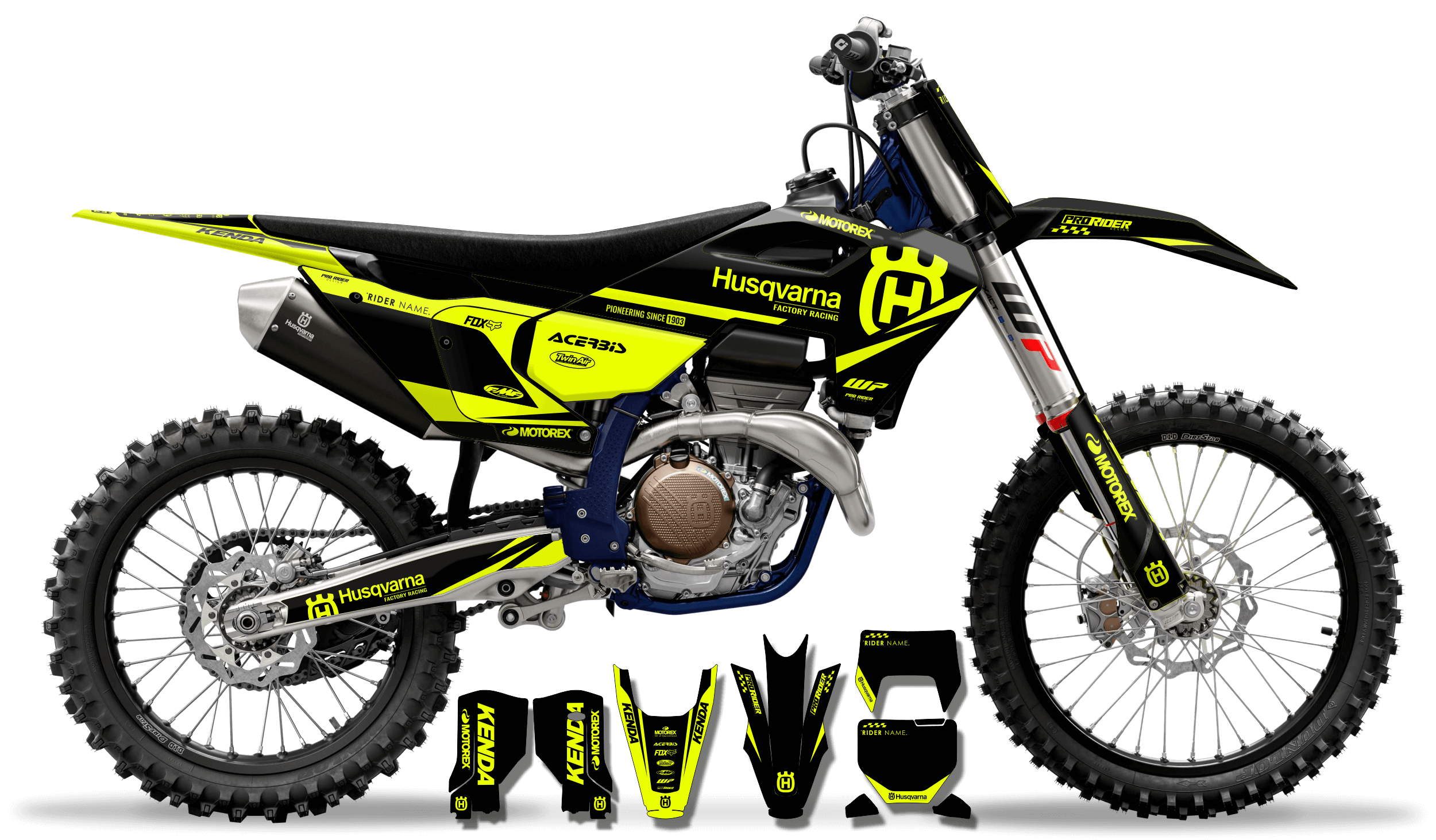


$139.99 USD

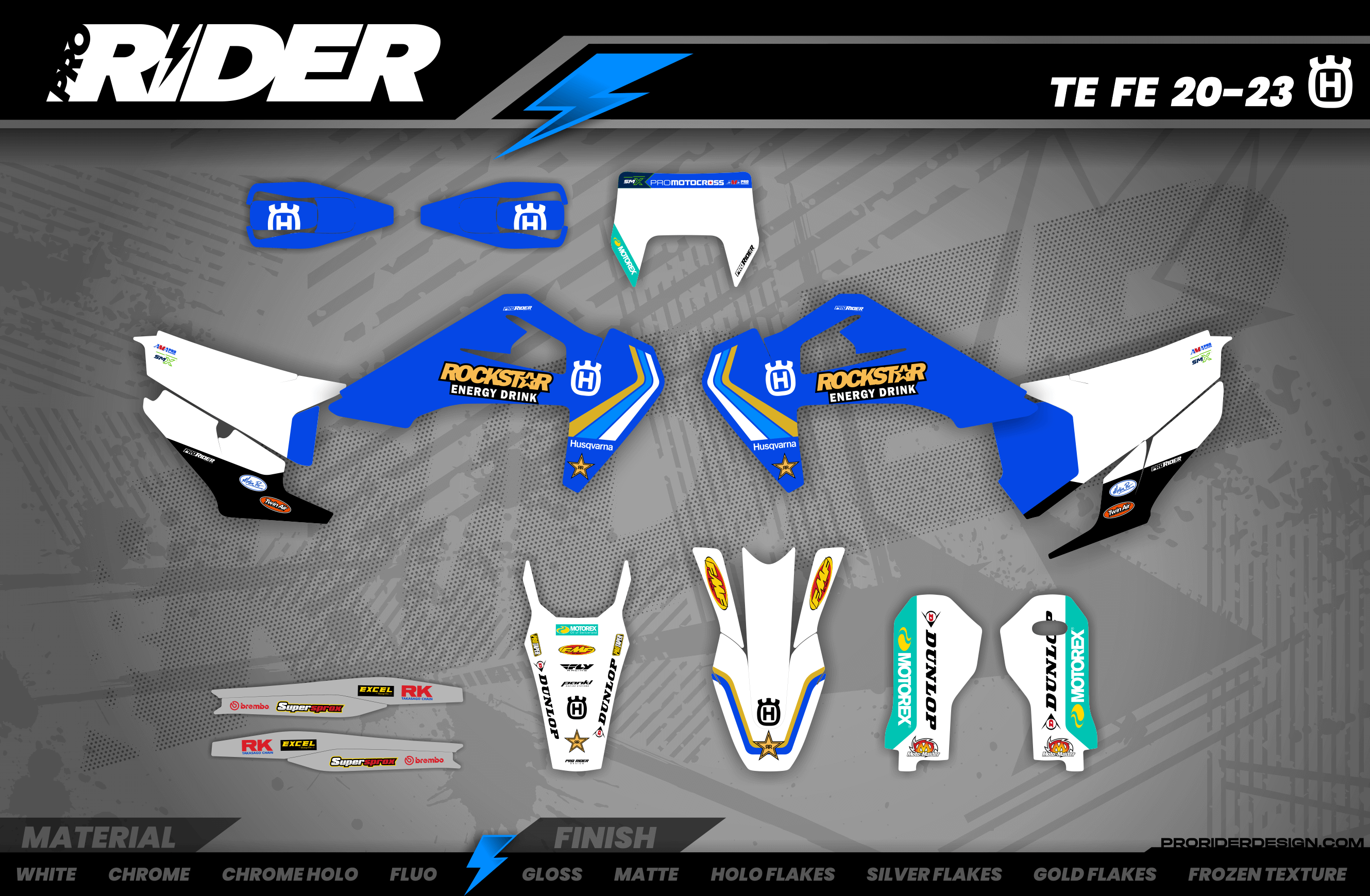
$139.99 USD
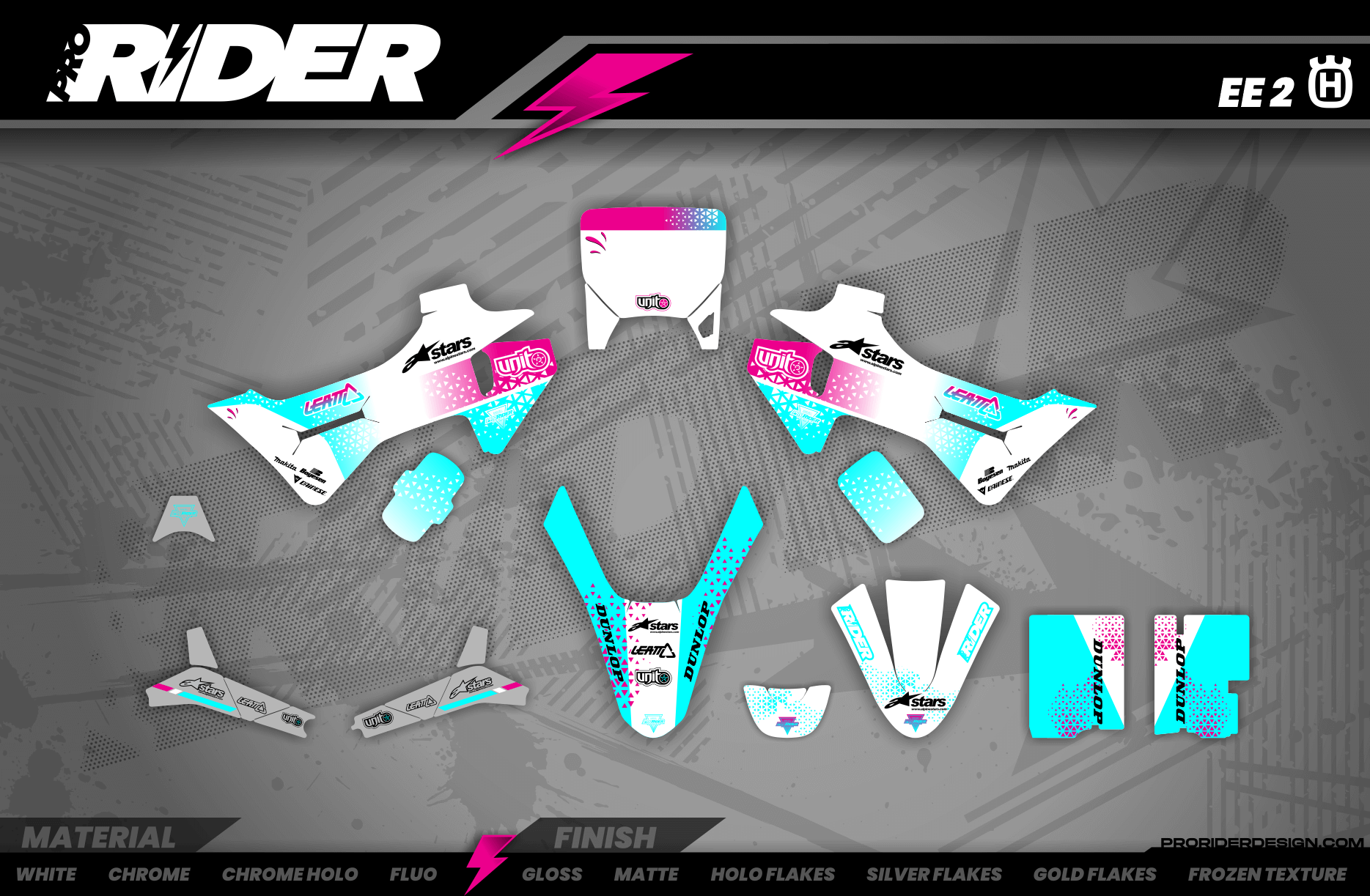
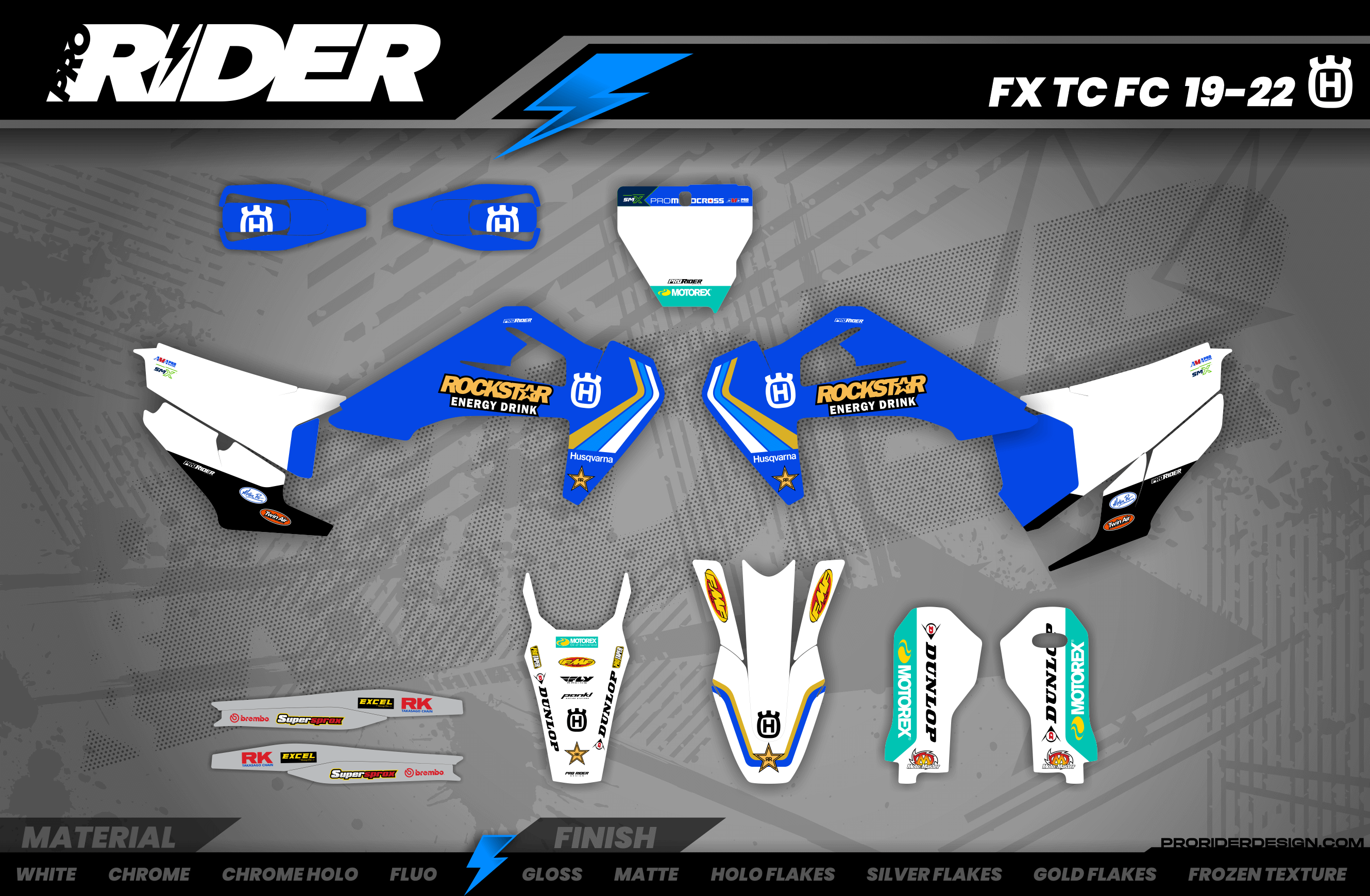
$139.99 USD
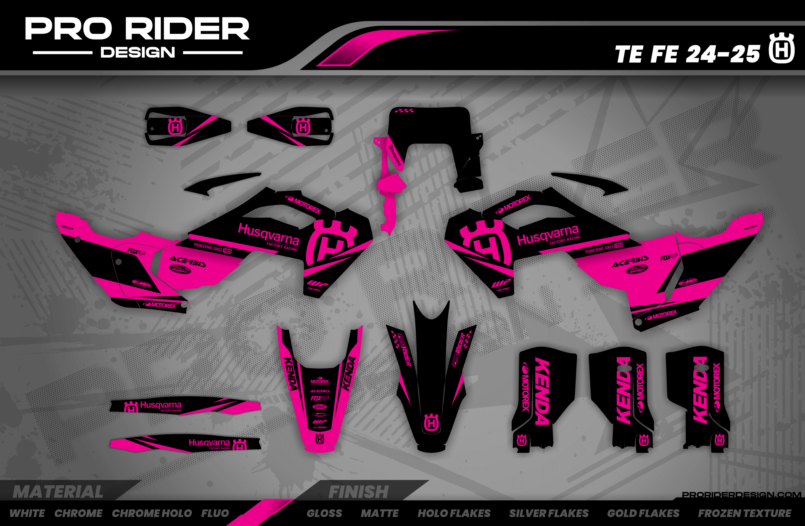
$139.99 USD
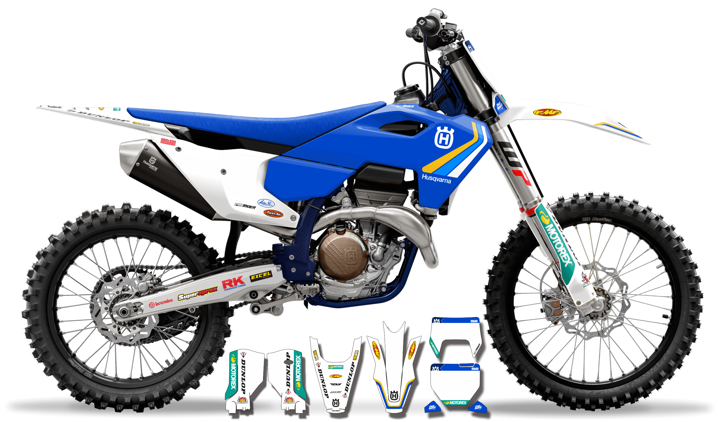
$139.99 USD
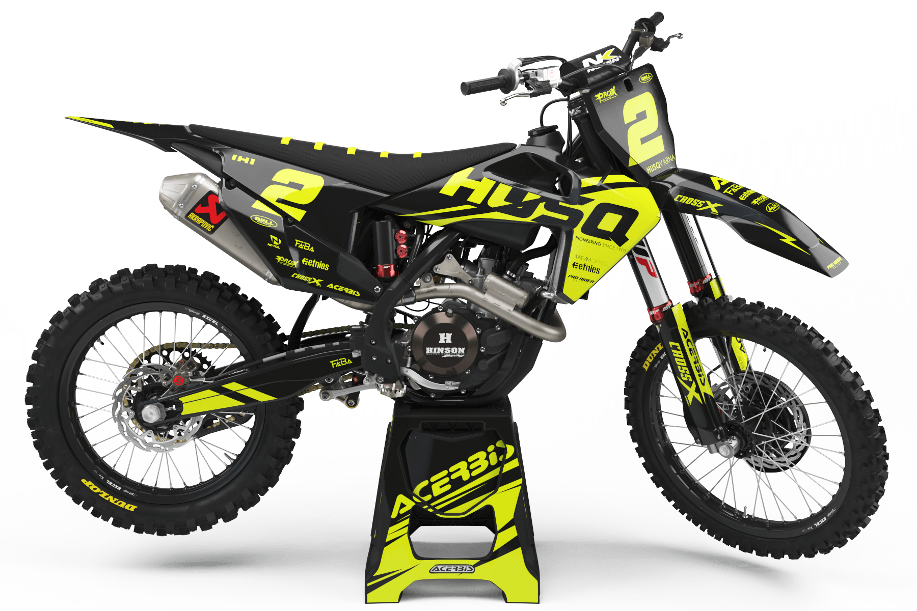
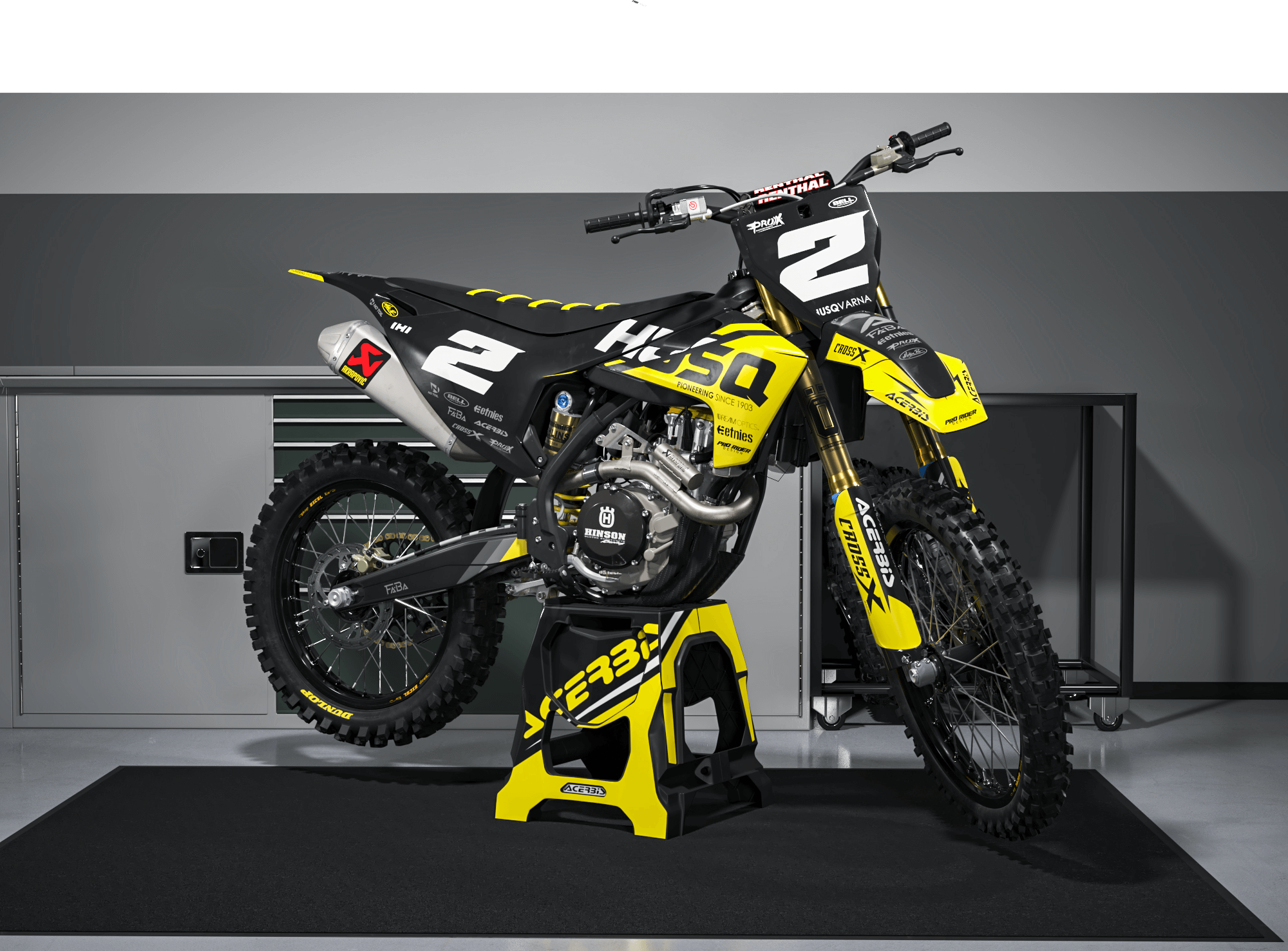
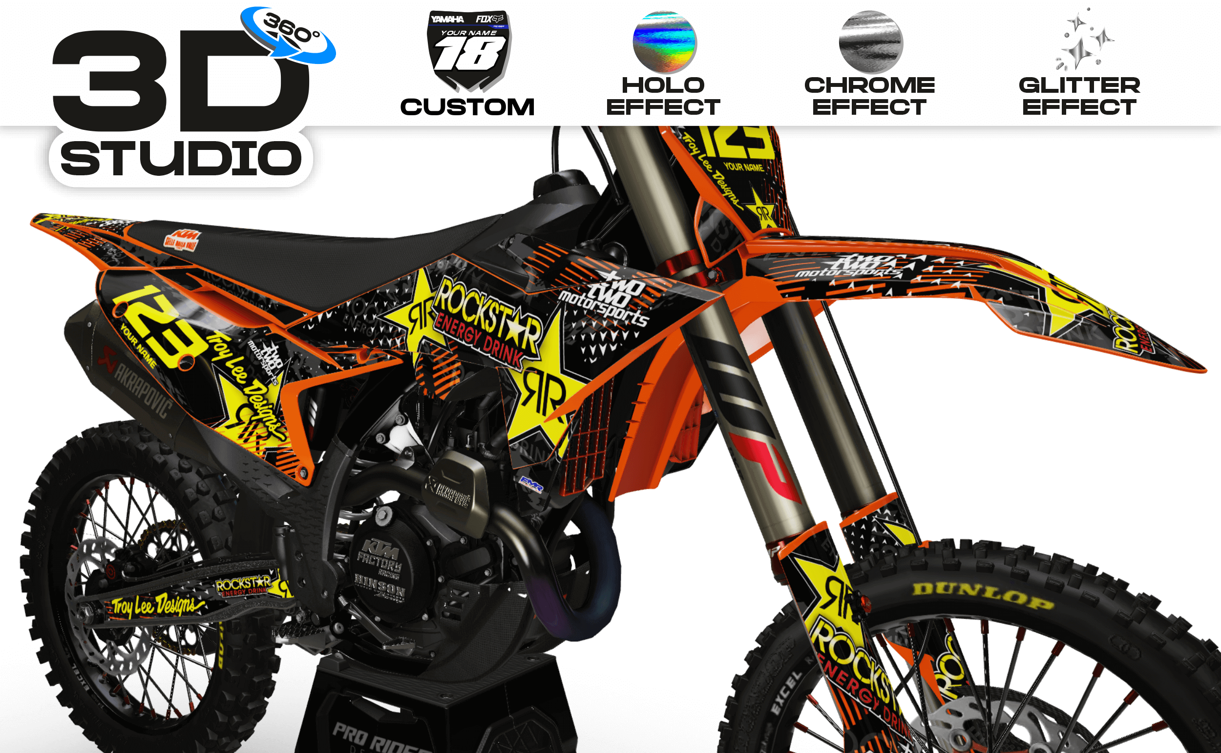
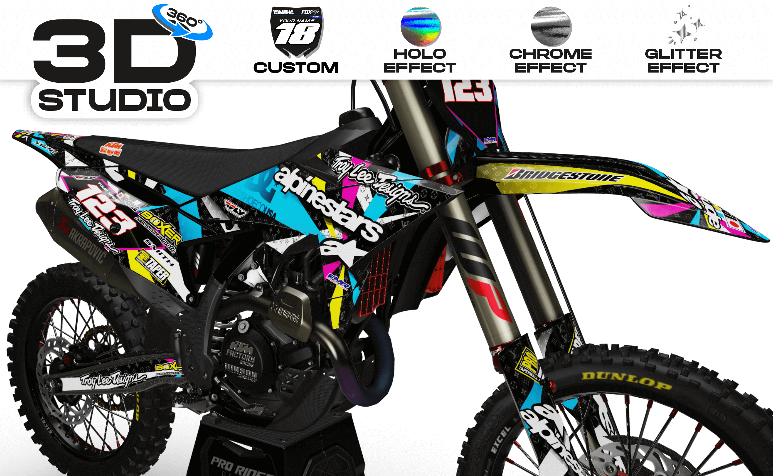
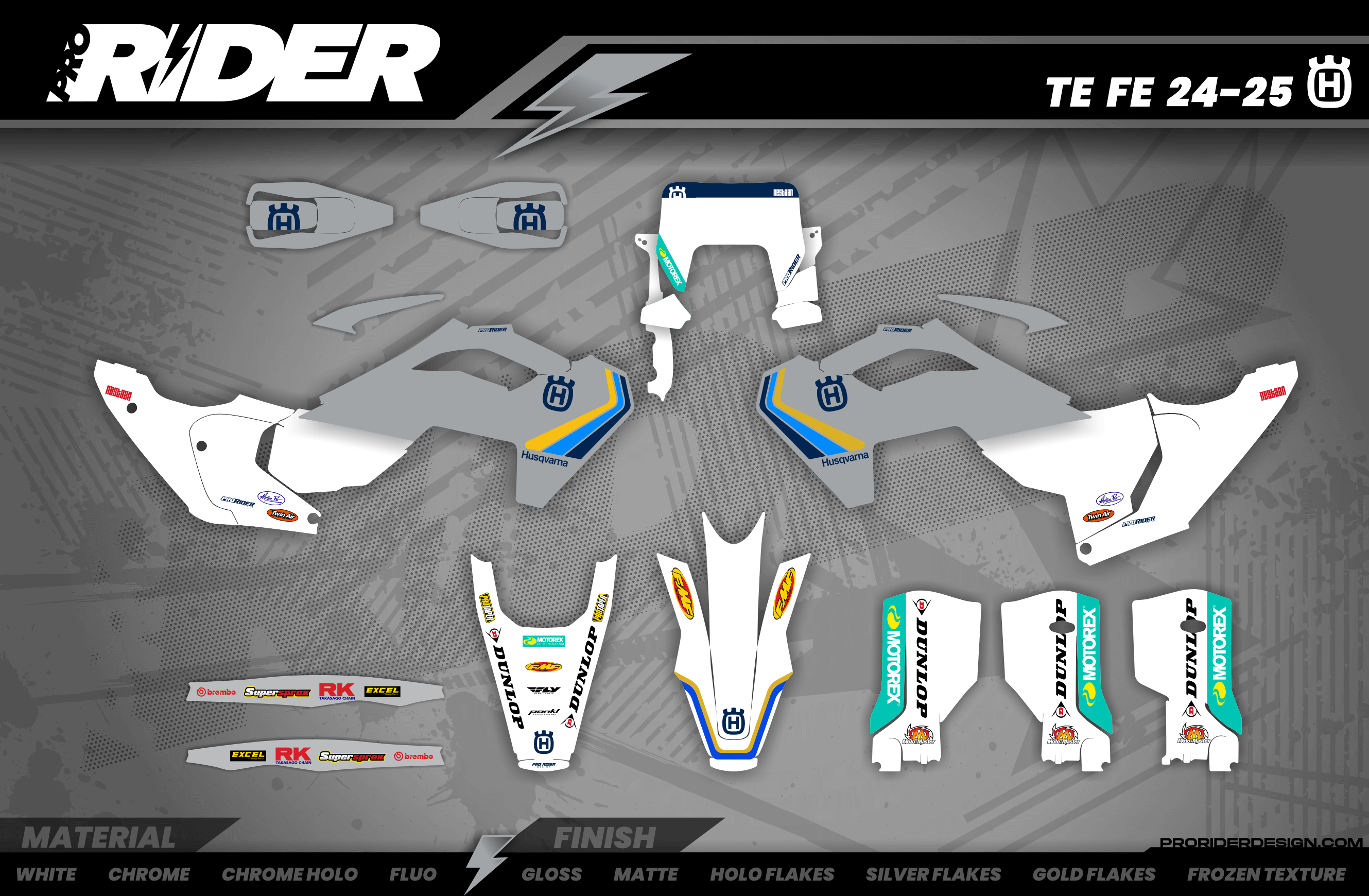
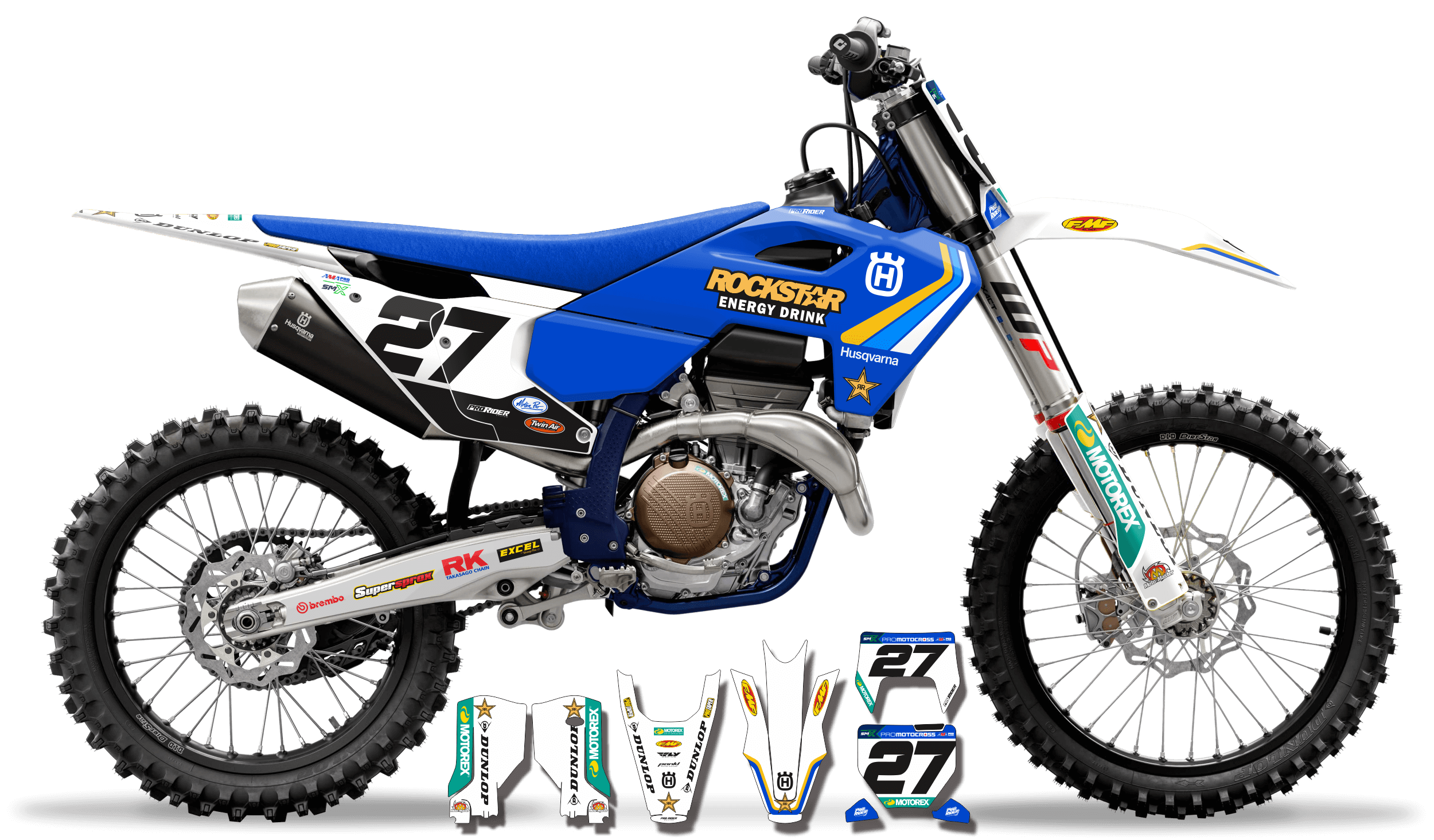
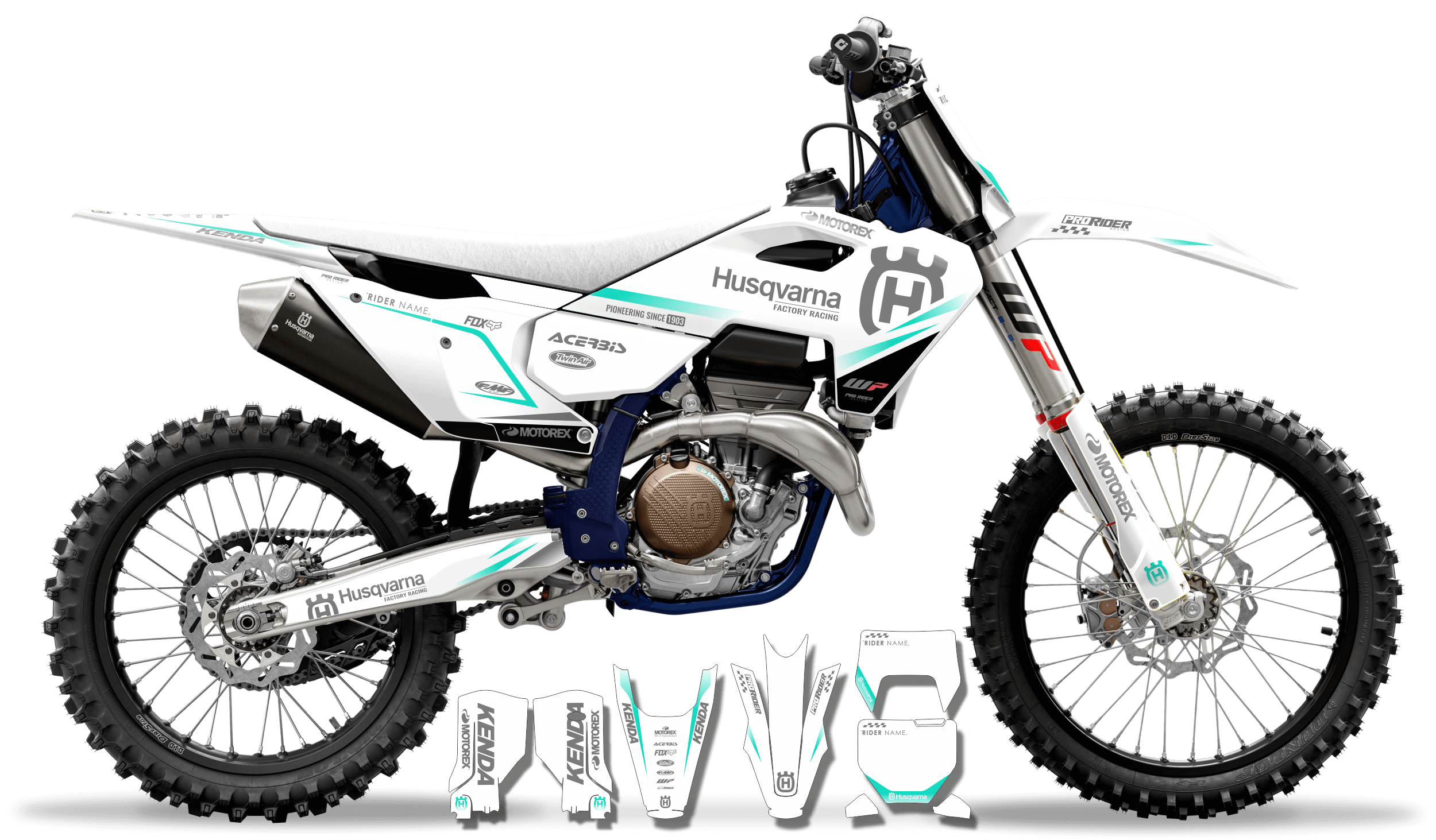
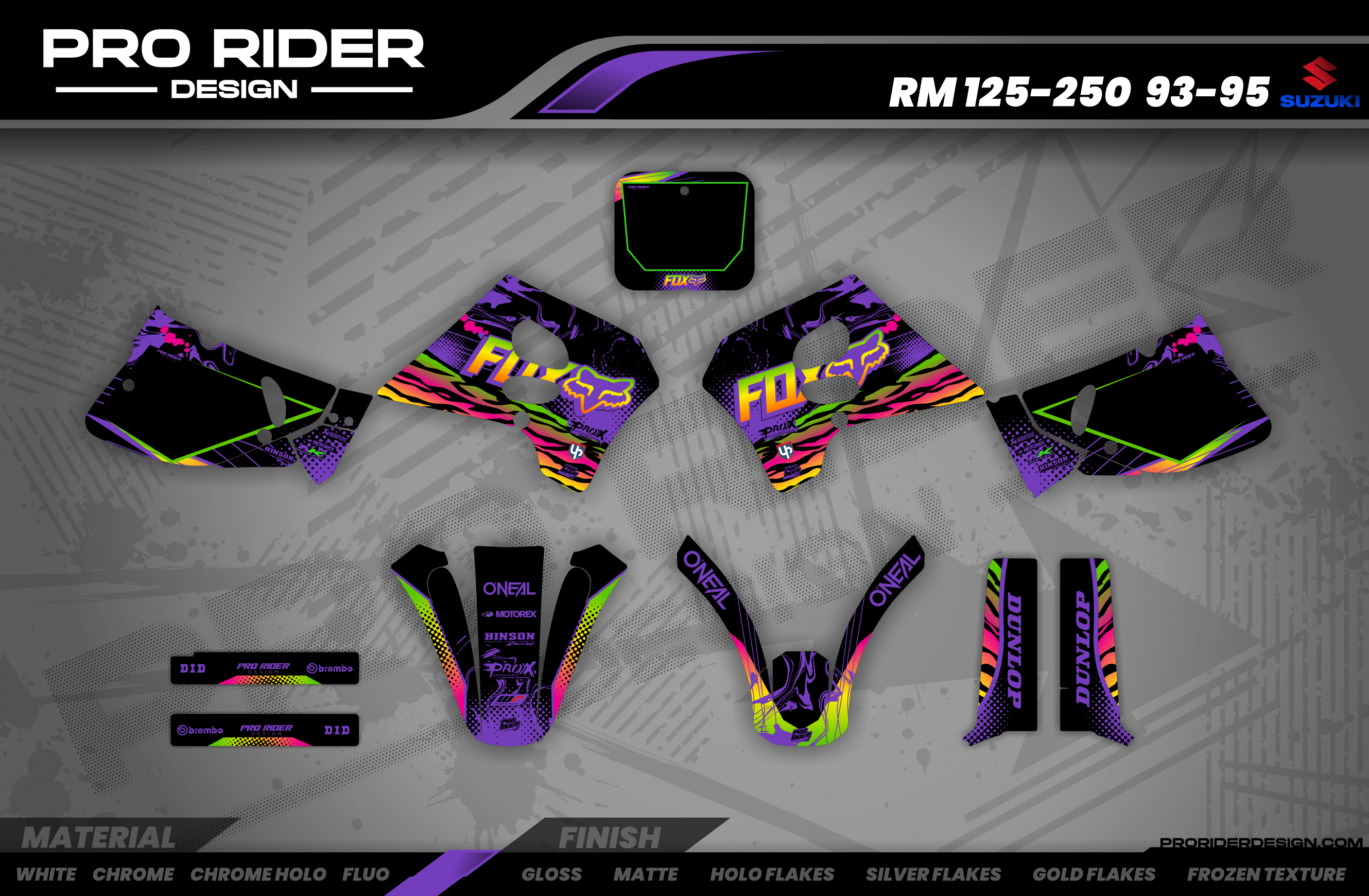
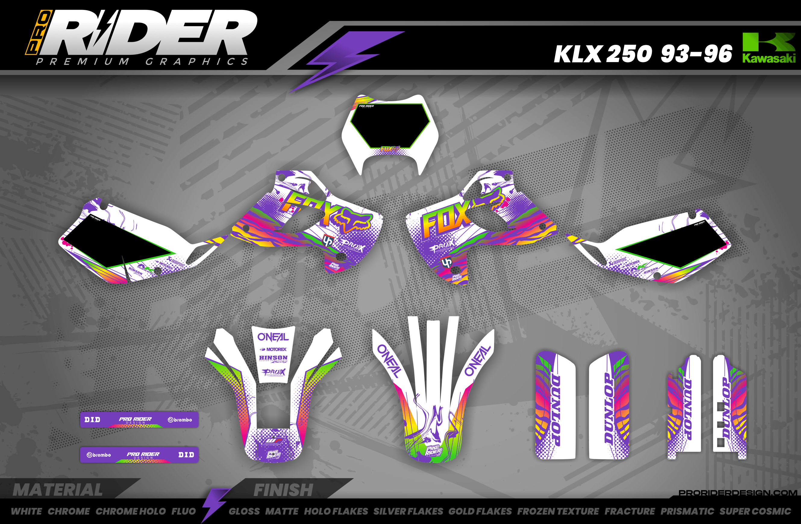
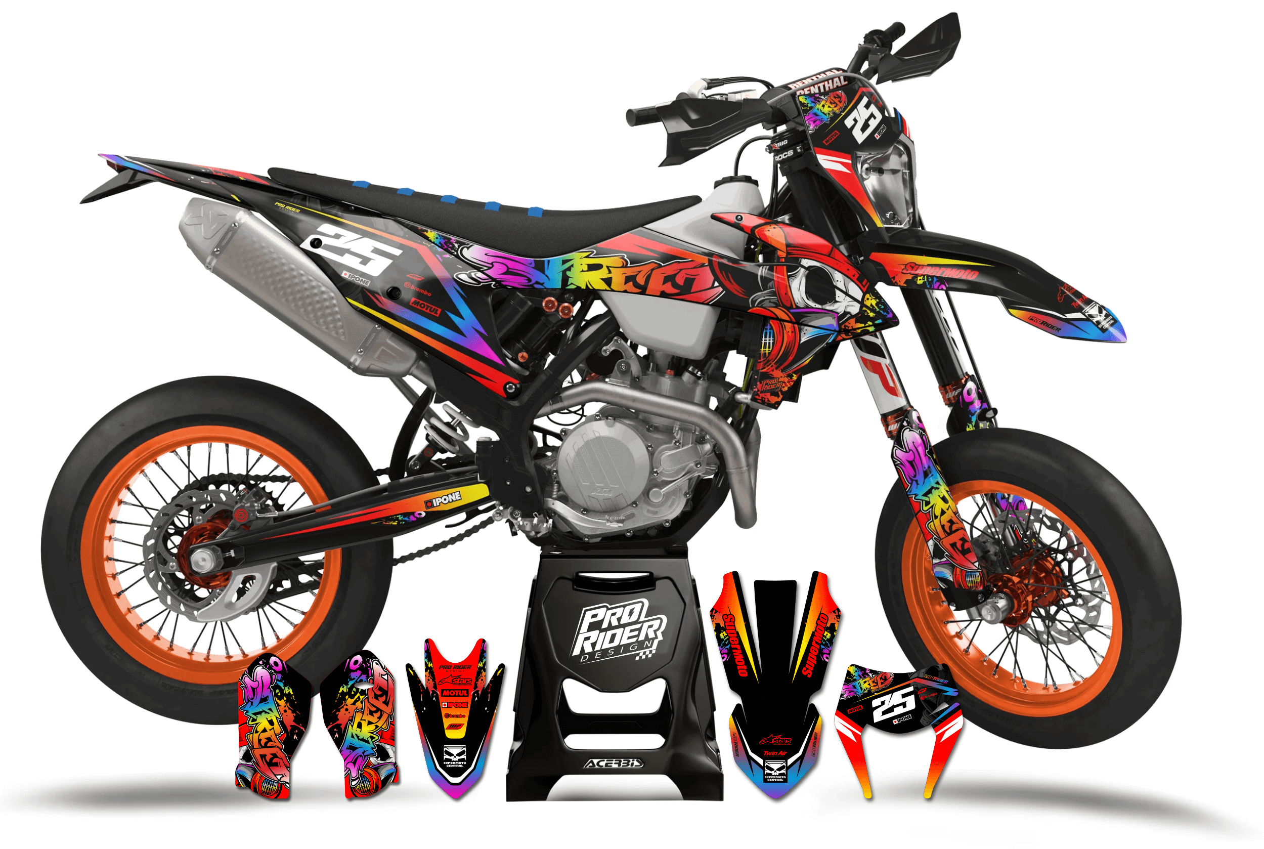
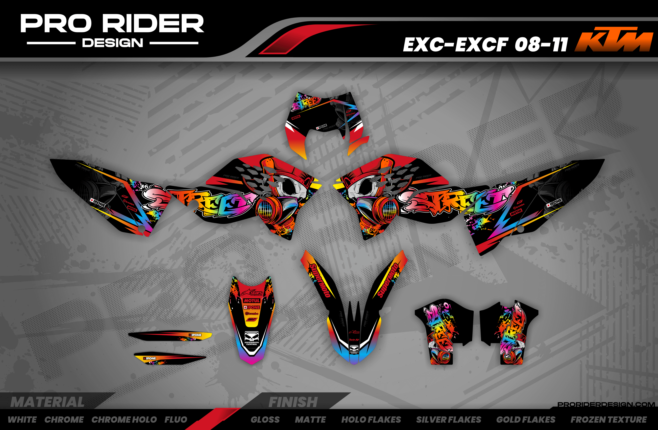
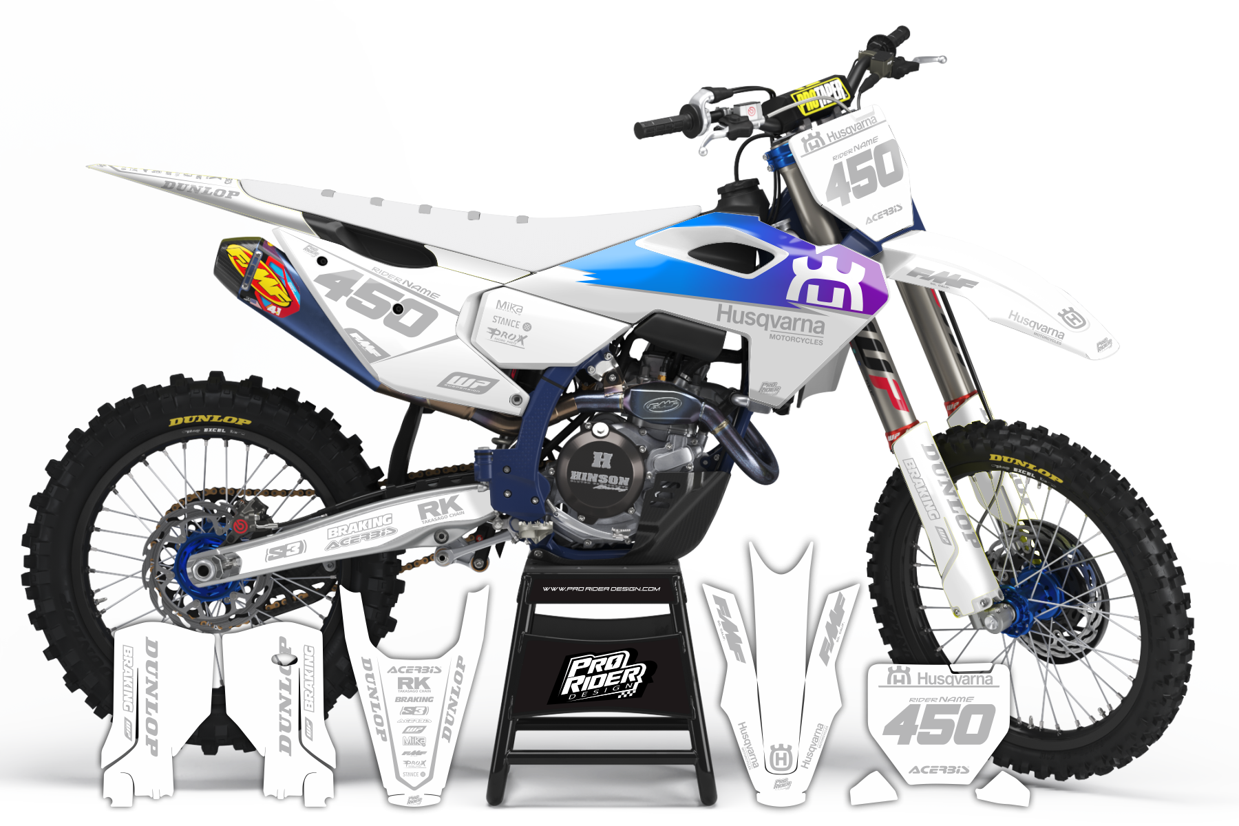
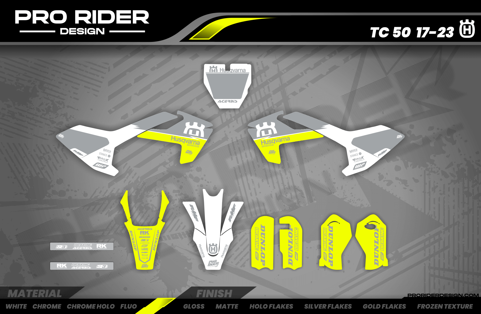
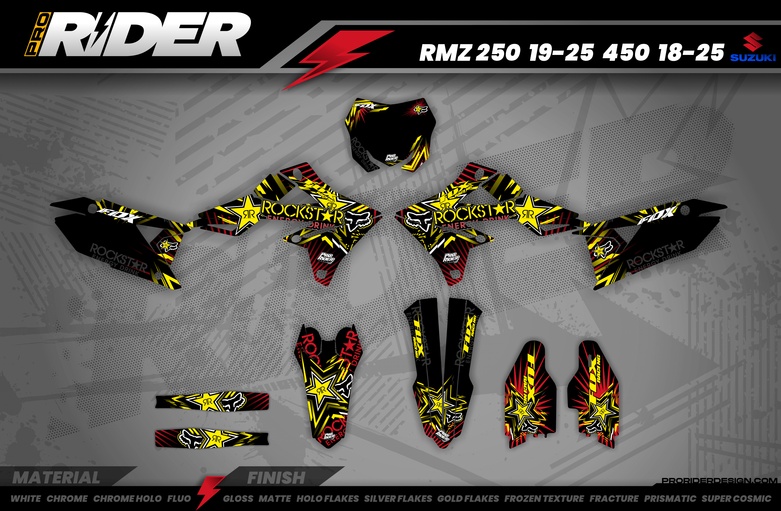
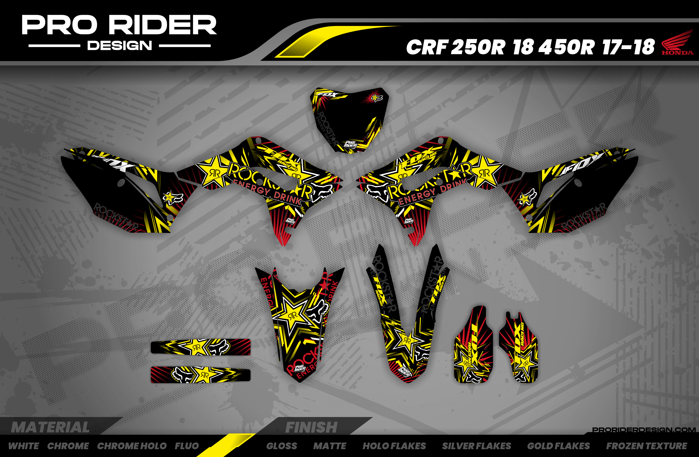
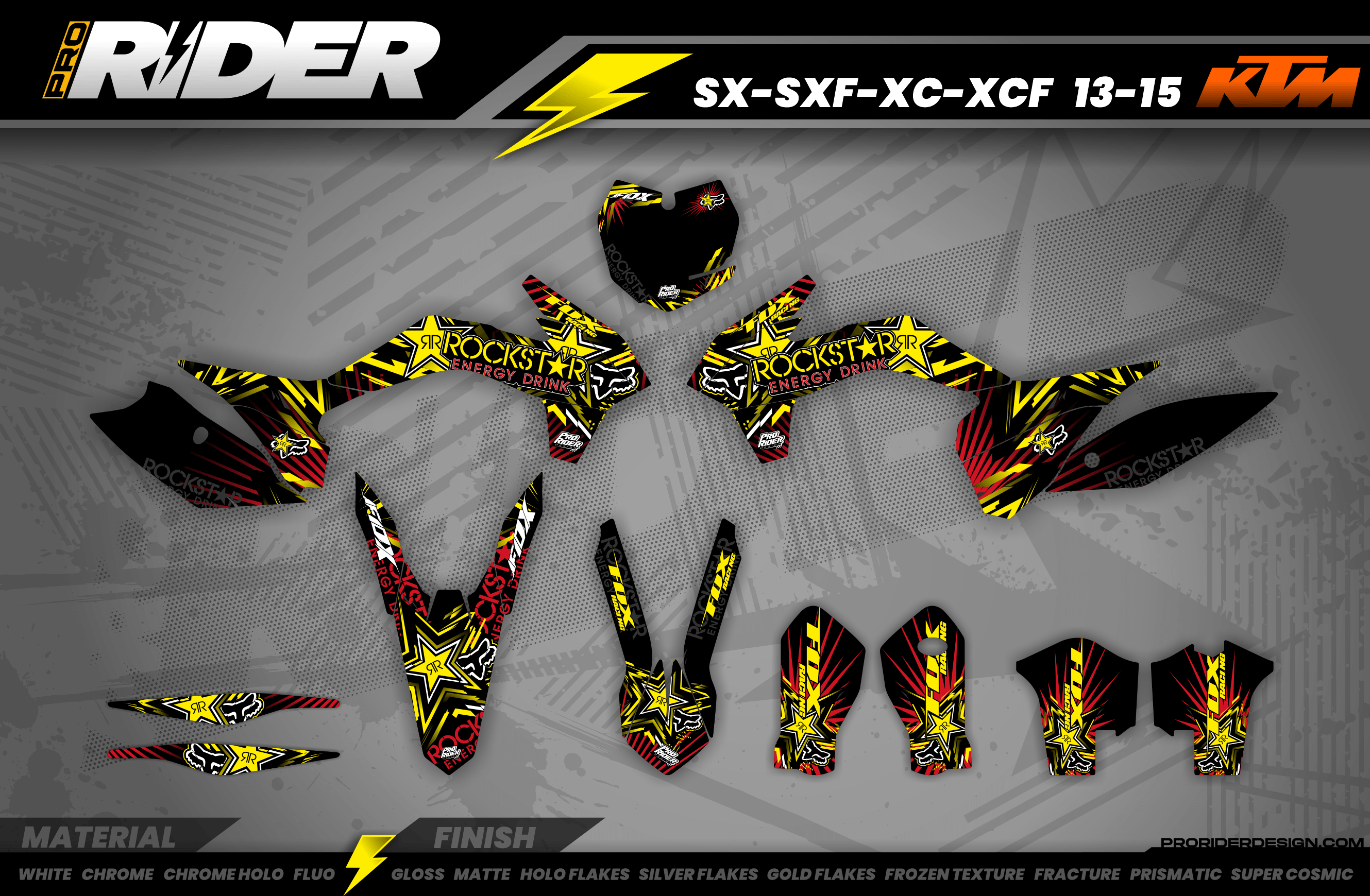
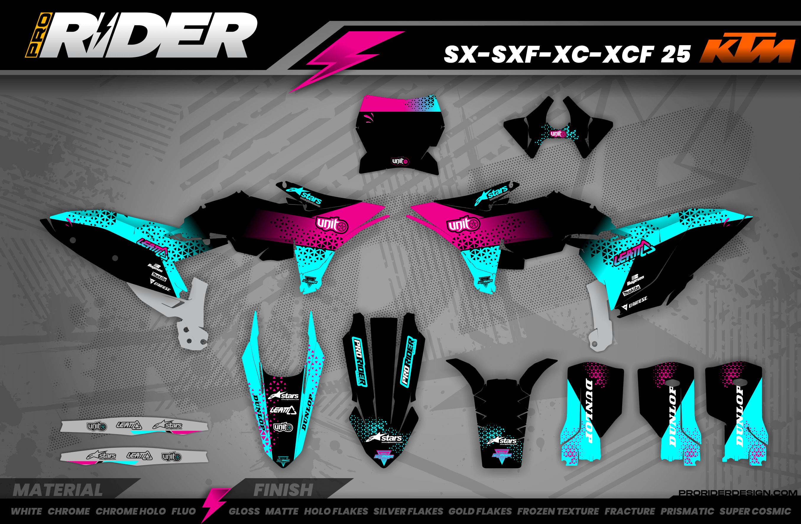
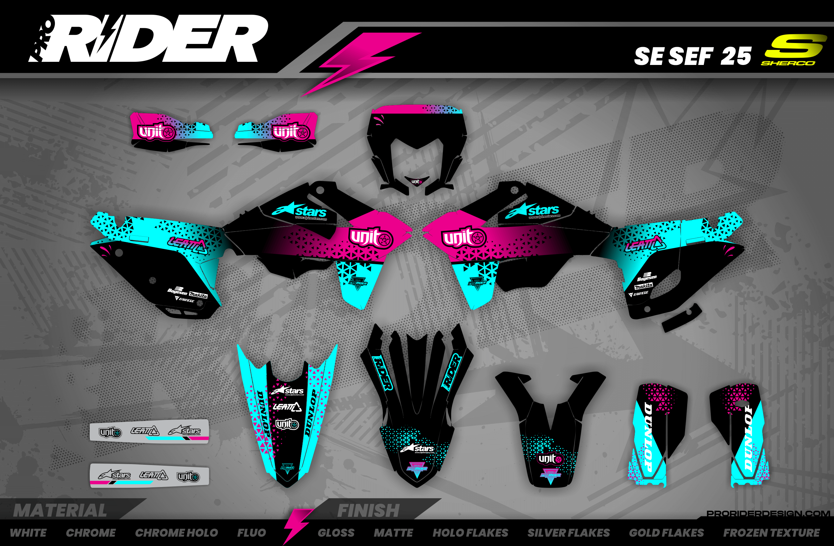
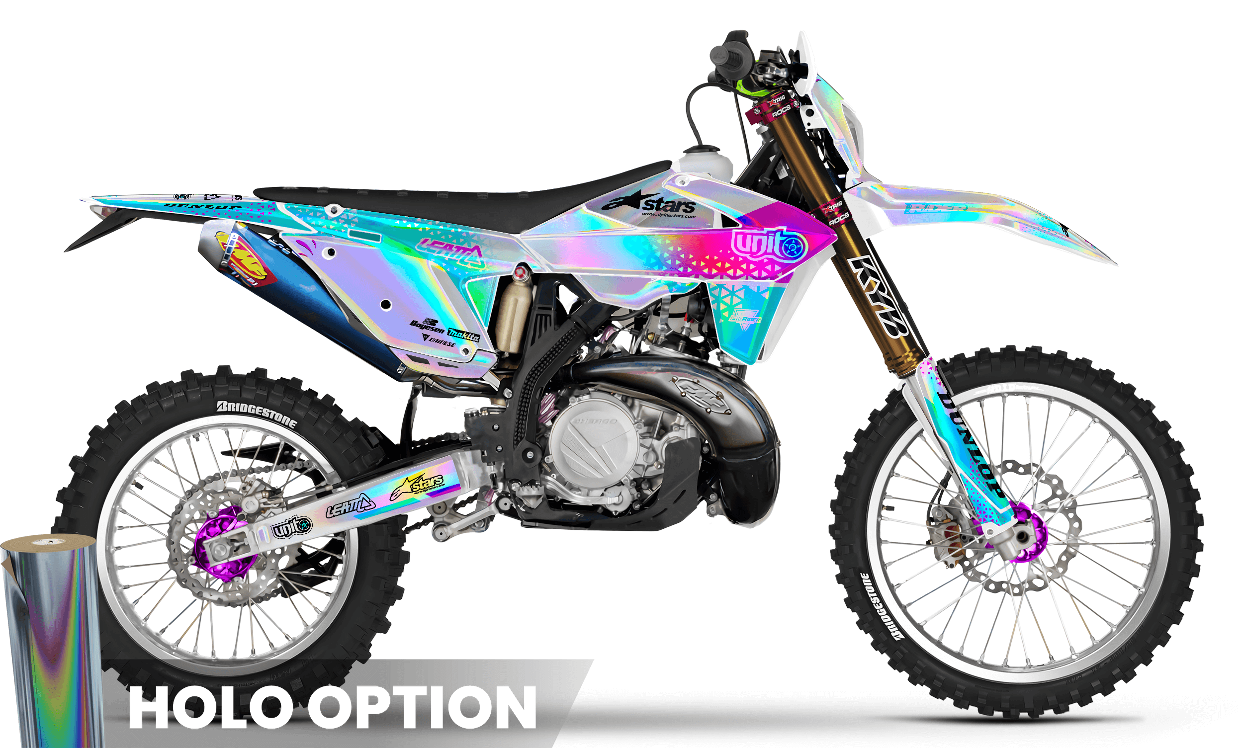
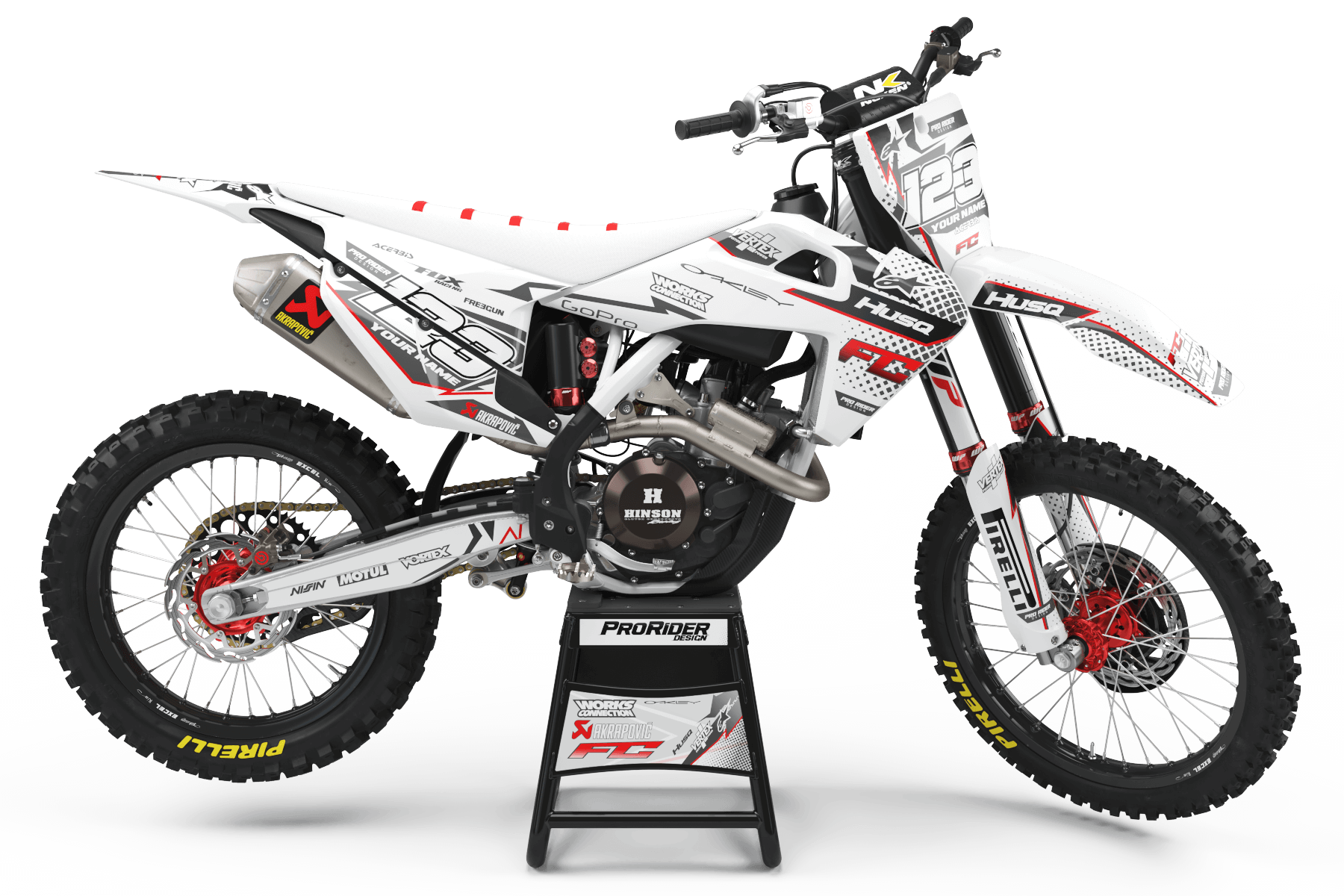
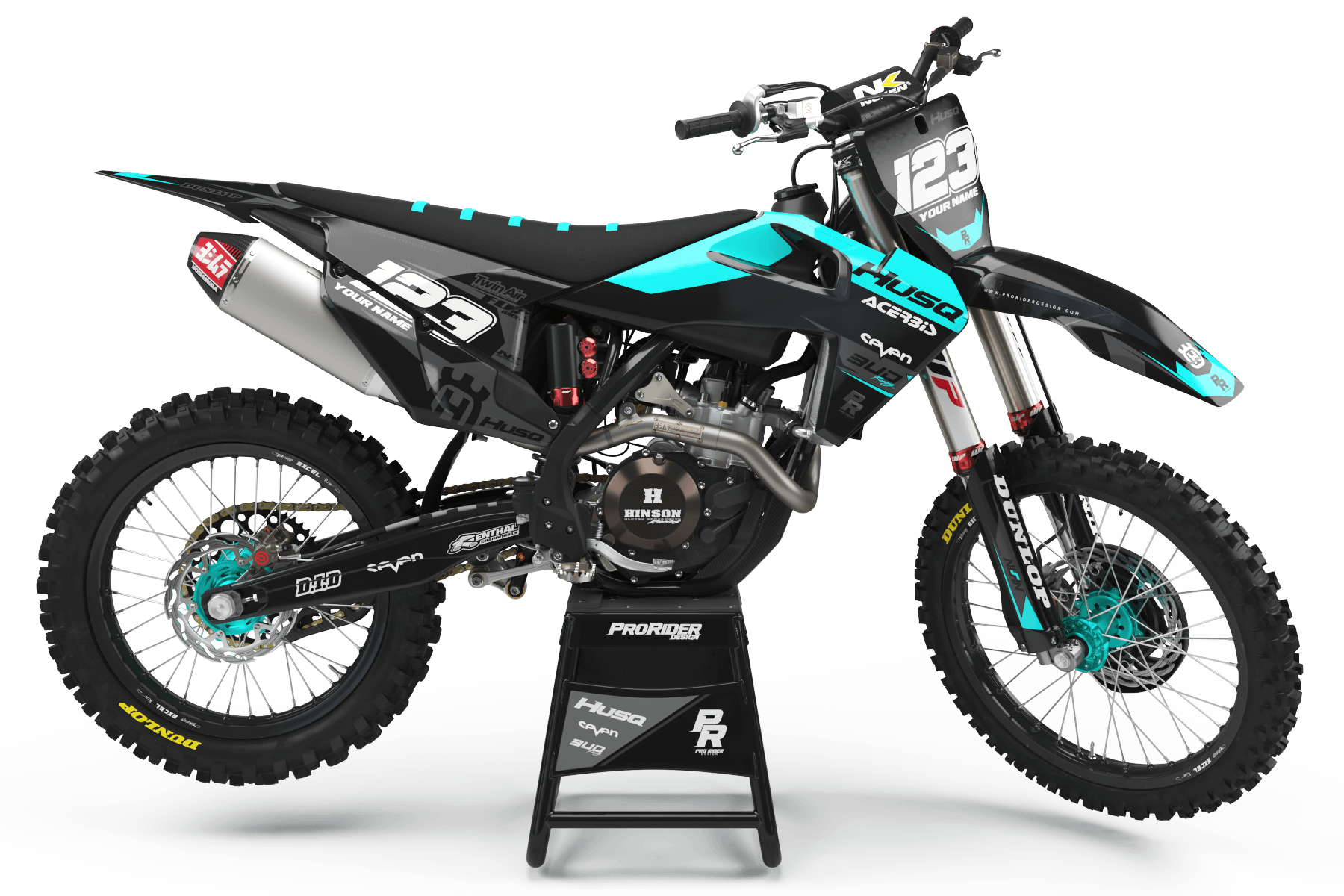
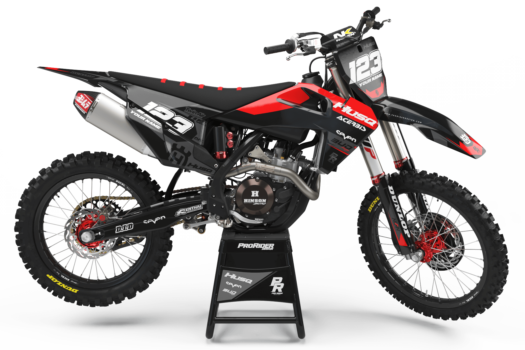
FULL CUSTOM GRAPHICS
One of One. Built from Scratch.
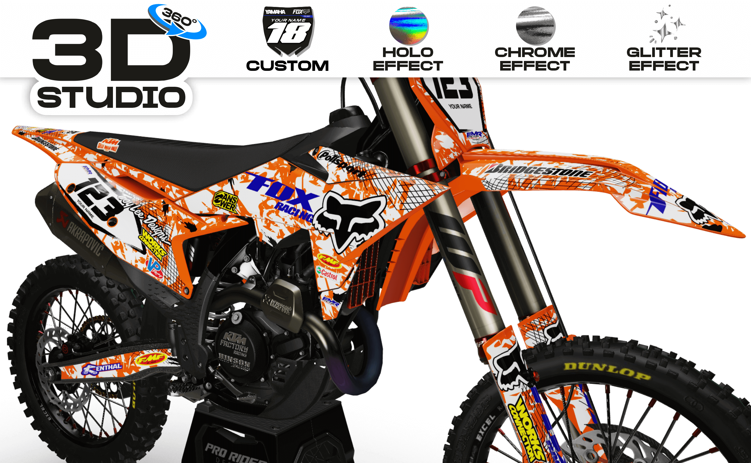
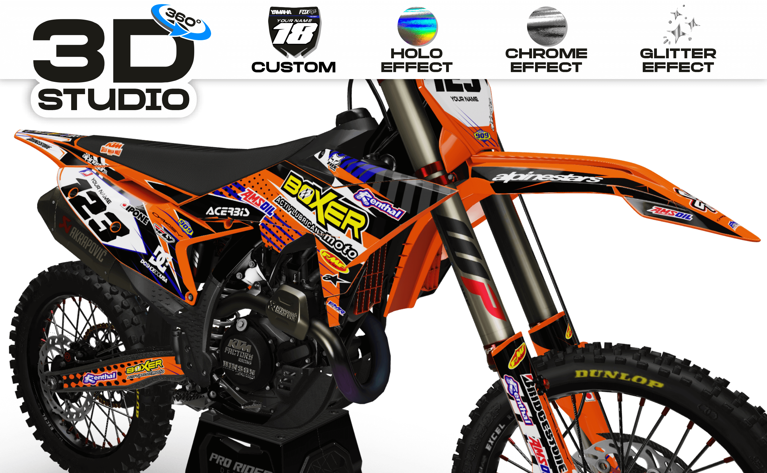
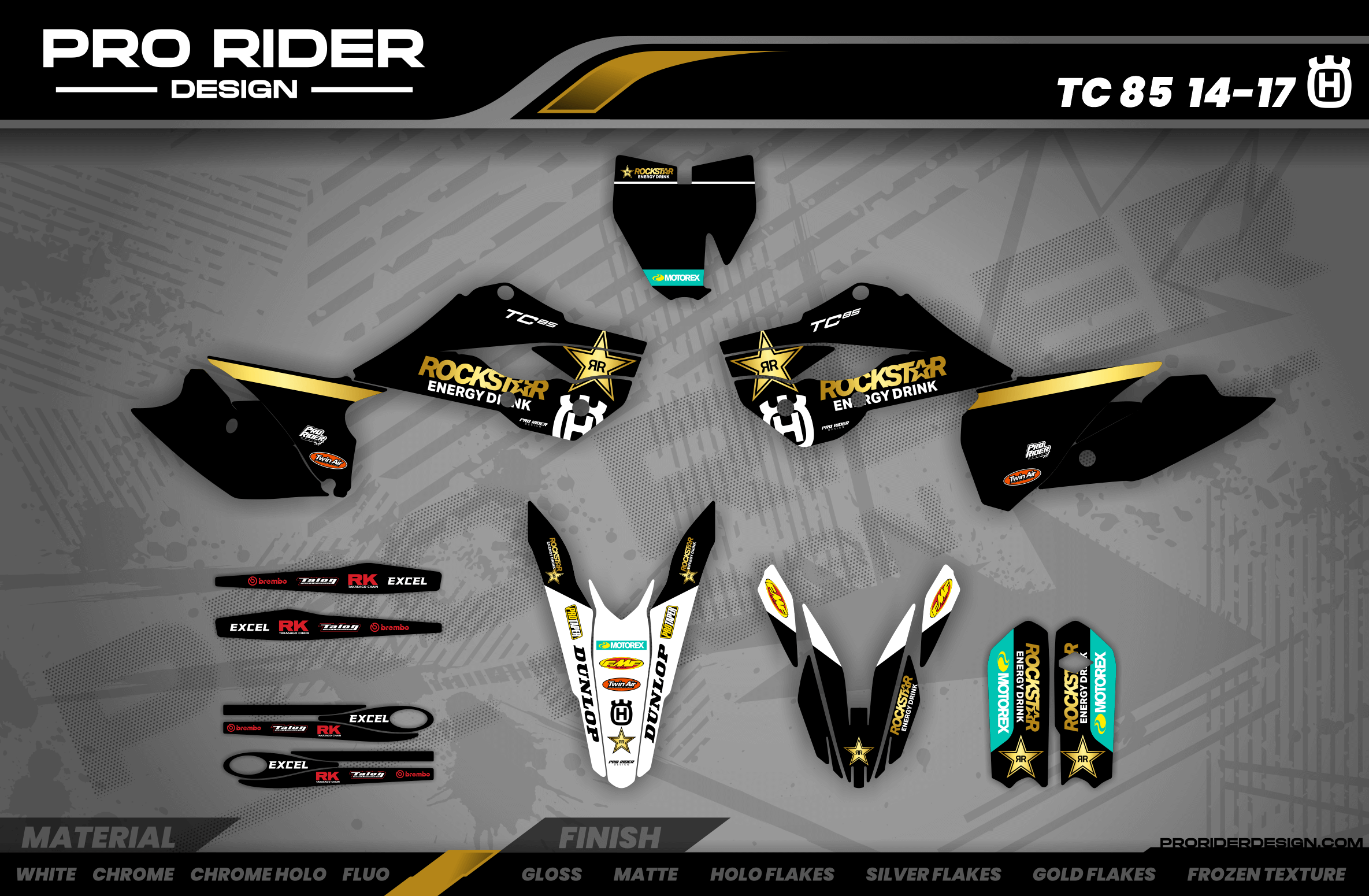
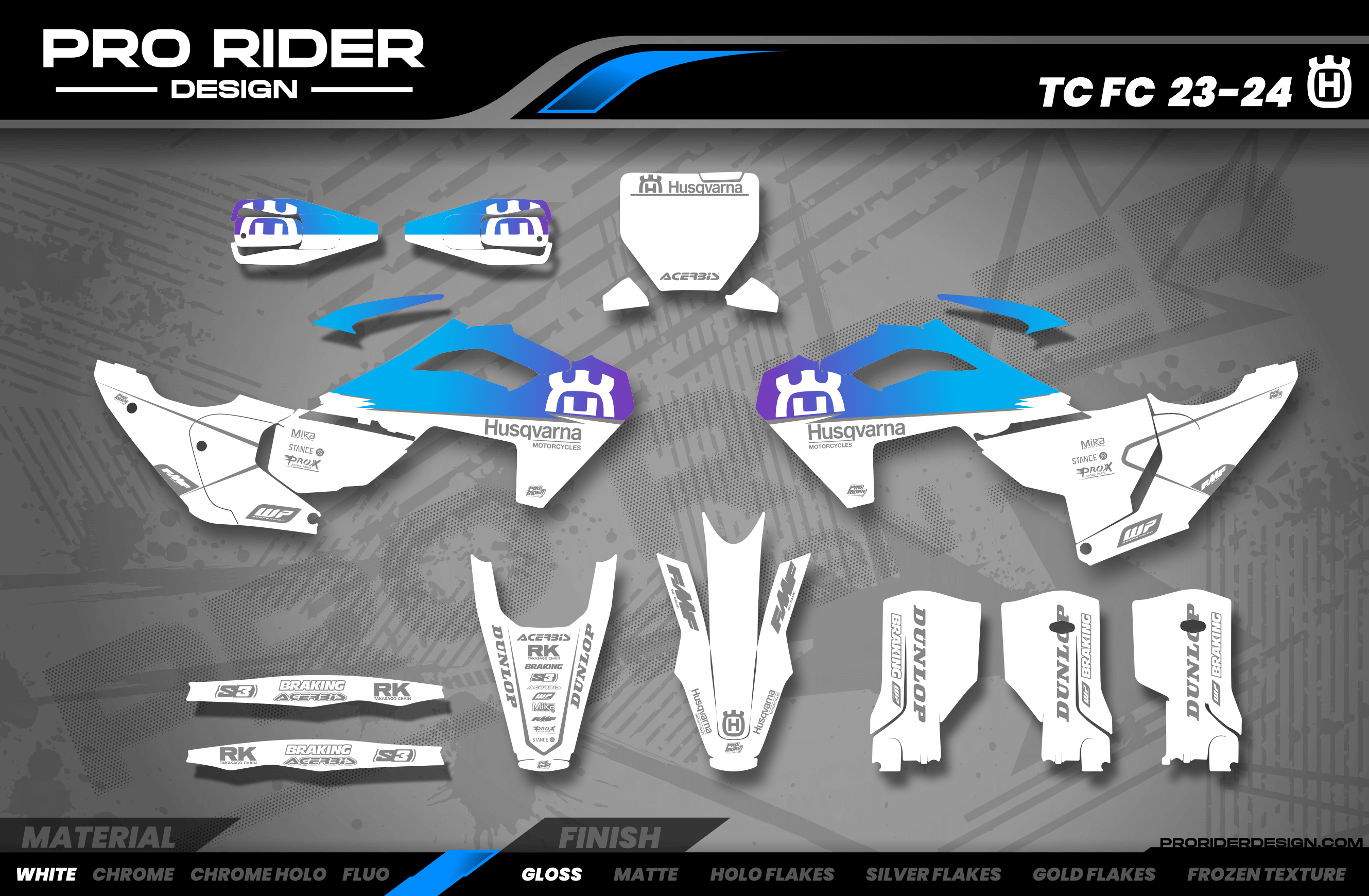
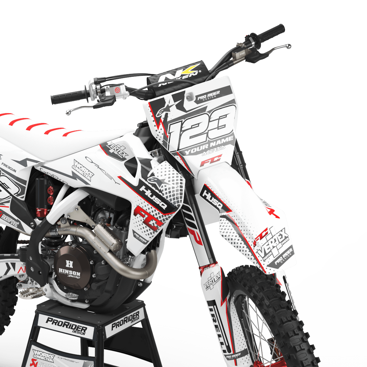
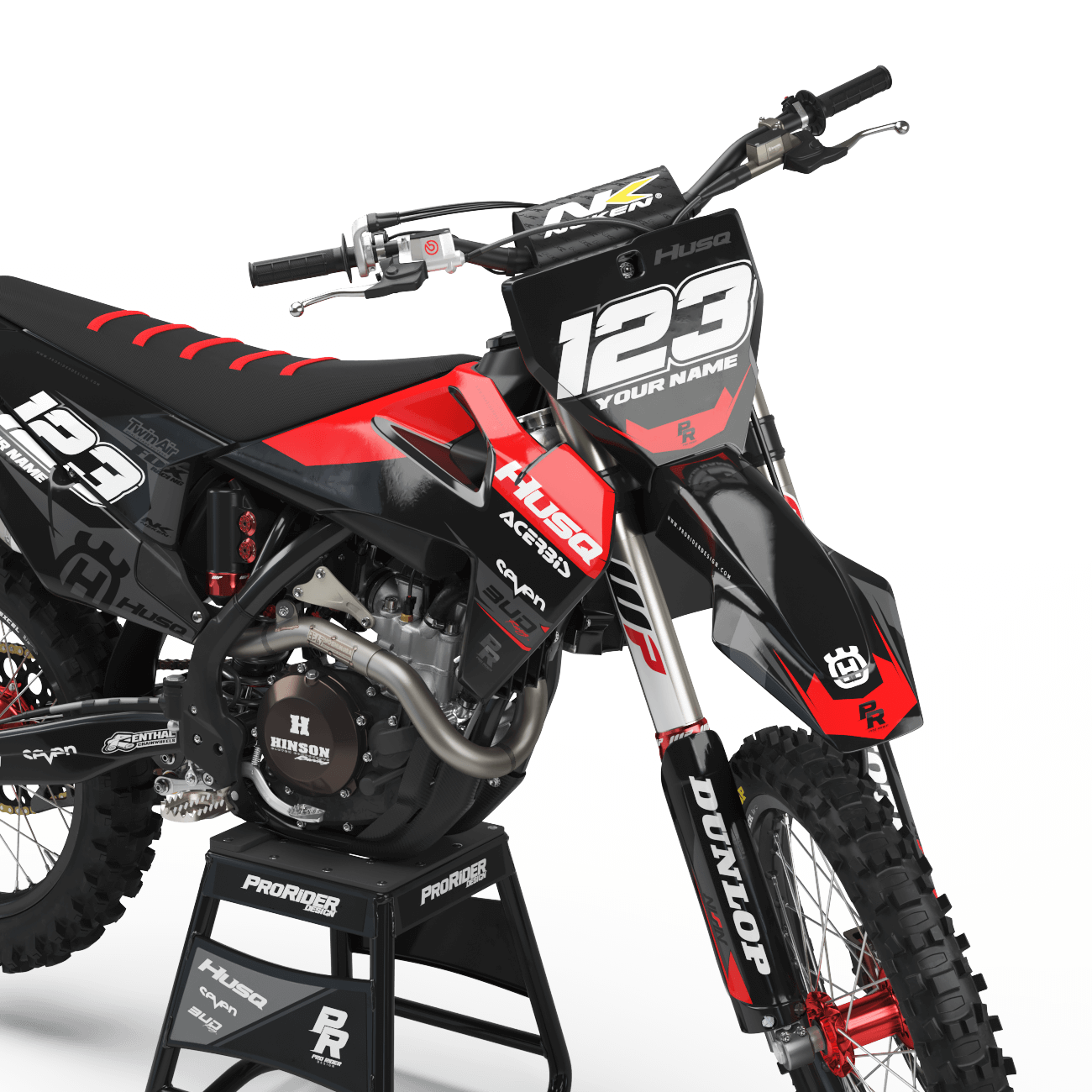
FULL REPRINT / SINGLE PARTS
Track Mishap? Reorder individual panels of your layout whenever you need.